Built for the
job site.
Not the desk.
Native iOS and Android app for the world's largest electrical distributor — designed for field electricians, site foremen, and procurement managers across two markets and two themes.
Company
Rexel
Role
Lead Product Designer
Period
2020 – 2022
Platform
iOS · Android
The Brief
The brief was three words.
The real brief took
three months to write.
Rexel's web platform was already seeing 38% of sessions on mobile— and every one of those sessions was a struggle. Small touch targets. No barcode scanner. No way to quickly reorder last week's 40 SKUs. A bright white screen in a dark basement.
The business brief was simple: “Build us an app.”
The design brief I accepted wasn't to port the website. It was to design for the context electricians actually work in — on site, under time pressure, often with gloves on, often in low light.
38%
Mobile session share before launch
0
Sessions completing on mobile web without friction
80%
Of trade purchases are reorders, not new browsing
Where the app begins — but not where the design did.
Three Users
Three users.
Three contexts. One app.
The breakthrough wasn't a feature. It was realising that all three users had one thing in common — they already knew what they needed to buy. They weren't browsing for inspiration. They were reordering. The app needed to treat purchase history as the primary navigation, not a secondary feature.
On the job site
Field Electrician
Confined spaces. Low light. Gloved hands. Time pressure. Often needs to look up a cable spec or reorder a part without leaving the location.
“I need to know if you have it in stock and when it arrives. That's it.”
What they need
- Dark mode for low-light environments
- Barcode scanning at the search bar
- One-tap reorder from history
Across multiple jobs
Site Foreman
Managing crews and budgets across several active jobs at once. Needs to place bulk orders, track quotes, and check delivery status across categories — without losing the thread of any one job.
“Six tiles on a home screen beats six tabs in a menu every time.”
What they need
- At-a-glance dashboard with quick actions
- Quotes, orders, invoices in one view
- Branch-level stock visibility
At a desk, account-led
Procurement Manager
Office-based. Managing the account-level negotiated pricing, repeat orders, and supplier relationships. Cares about price transparency more than UI flourish — the discount is real money on every order.
“If I can't see the discount applied, I don't trust the price.”
What they need
- Negotiated price visible at every step
- Base → discount → net breakdown
- Bulk quote management
The insight that unified all three
Trade buyers don't browse. They reorder.
80% of trade purchases are repeats of products already bought. That single insight became the most consequential design decision in the project — and led directly to the “Already bought” indicator on the PLP, the highest-impact feature we shipped.
Design Decisions
Five decisions.
Each grounded in research.
Not opinions. Not preferences. Each decision below traces back to a specific observed behaviour, a specific user need, or a specific failure mode in the existing mobile web experience.
Dark mode is a context decision, not a preference
Designed simultaneously, not retrofitted
Initially scoped as a 'nice to have' toggle. Research with field electricians changed that — working in confined spaces and unlit basements makes a bright white screen an active liability. Dark mode shipped as an equal citizen, designed across every screen at the same time as light.
Light
Dark
“Already bought” belongs on the PLP
Reorder is the primary job, not a secondary feature
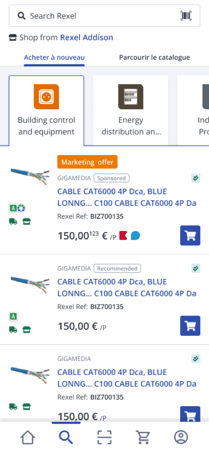
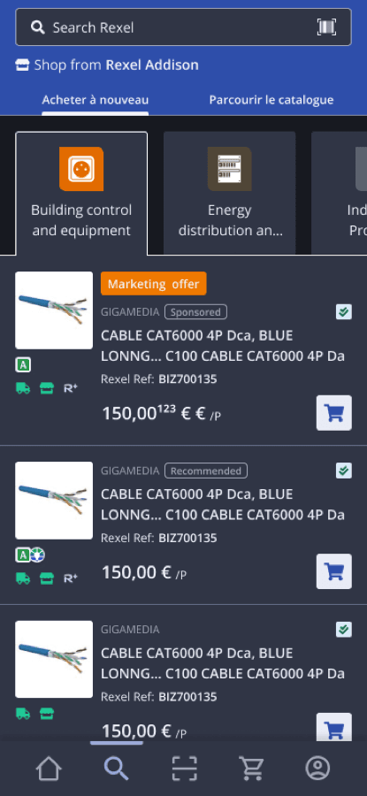
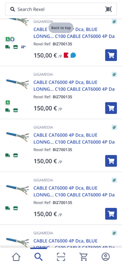
Most B2B apps bury purchase history in an account section. We surfaced it directly on the product listing — a checkmark on every previously ordered item, visible while browsing. Trade buyers reorder 80% of their catalogue. The browse list is where the decision is made.
Light
Dark
Show negotiated pricing in full
Trust on the price drives conversion
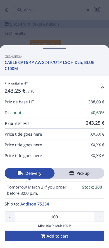
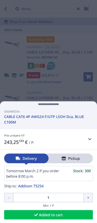
B2B buyers at Rexel have account-level negotiated discounts. On the web, this was opaque — the discounted price just showed up. The native quick-add bottom sheet surfaces the full math: base price → discount percentage → net price HT. When buyers see their own discount applied, they trust the platform.
Negotiated B2B price, shown in full
Design the full error taxonomy
Every edge case has a resolution path
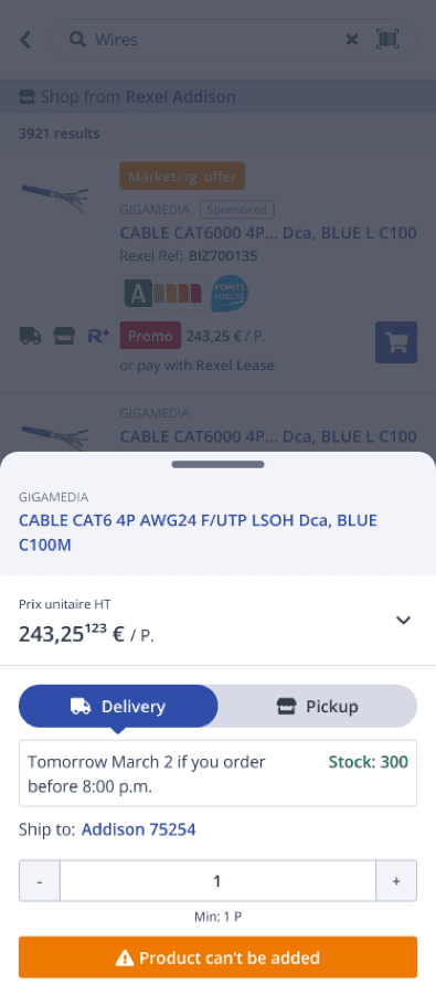
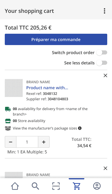
B2B commerce has edge cases consumer apps never see. Cart already contains a quote. Stock overcommitted. Product obsolete. Substitute available. Each of these shipped as a resolved state — with a clear next action, not just a red message. The substitute product flow alone saved buyers from dead ends across multiple journeys.
Success
Error
Conflict
Search is a compound surface
Three buyer types search three different ways
Some buyers search by exact Rexel ref. Some by category pathway. Some by general product name. One typeahead surface had to serve all three at once — text suggestions, category routes (dans Fils & Câbles), and live product matches with add-to-cart, all in a single overlay. The filter sheet underneath carries B2B-specific facets — Classe électrique, Diamètre, Matériel.
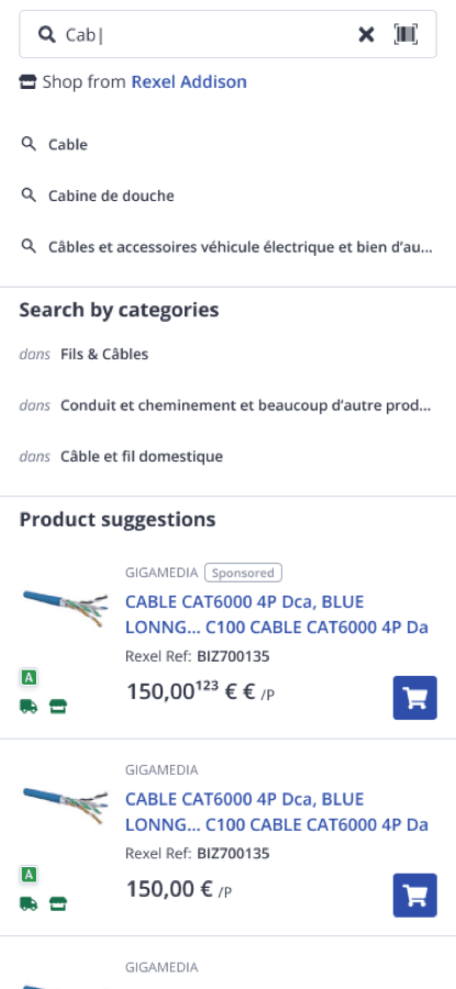
Typeahead — Light
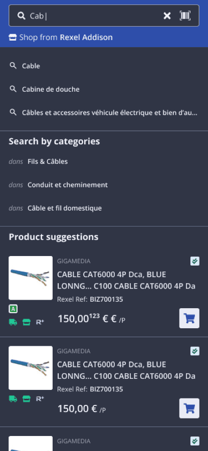
Typeahead — Dark
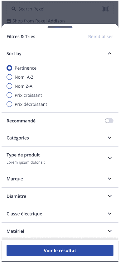
Filter sheet
Dark Mode Deep-Dive
Same screens.
Both themes. Side by side.
Dark mode isn't a colour inversion — it's a re-tuning of every component for a different context of use. Below, three core screens in both themes — note how spacing, density, and contrast all shift while the layout stays consistent.
Light
Dark
Pair 01
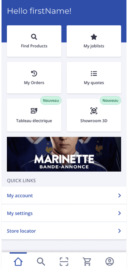
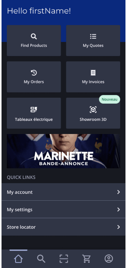
Homepage dashboard
Six tiles, dual theme — quick actions stay the same, contrast inverts intentionally.
Light
Dark
Pair 02
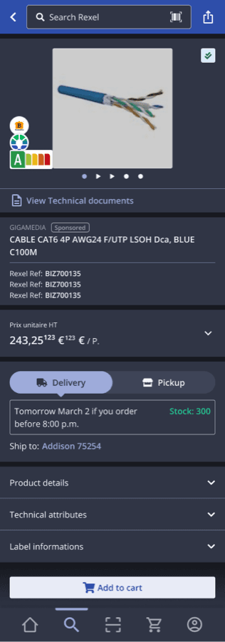
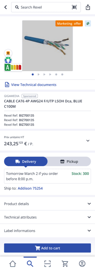
Product detail page
Delivery/pickup toggle, stock count, energy class — every component re-tuned for low-light readability.
Light
Dark
Pair 03
Product listing
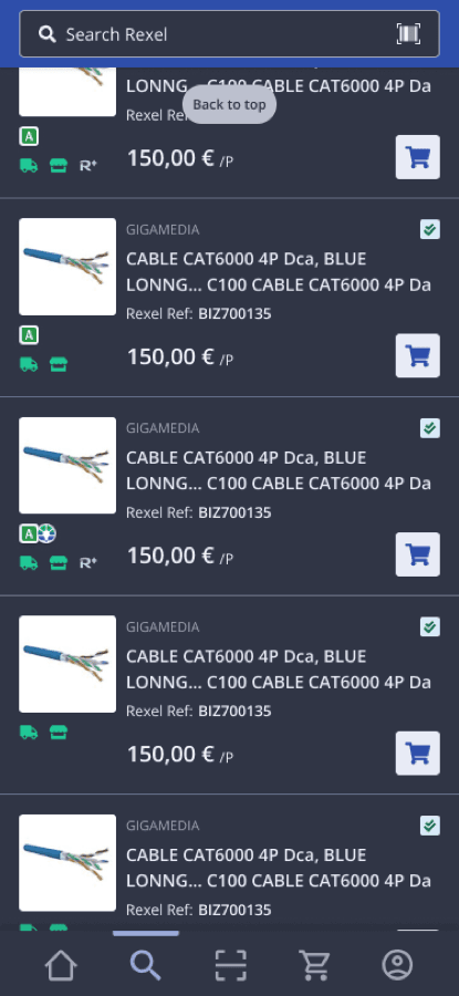
The 'Already bought' checkmark uses the same green in both modes — but adjusted in saturation for OLED visibility.
Dark mode adoption exceeded light mode in the first quarter post-launch.
The decision to ship it as an equal citizen — not a toggle bolted on — was validated within 90 days.
Feature Spotlight · 01
The checkmark
that became the product.
A single visual cue — a small green checkmark in the corner of every previously ordered product — became the most-used feature in the app. It removed a step that took minutes (search account history, copy SKU, paste in search) and replaced it with instant recognition while browsing.
80%
of trade purchases are reorders
1 tap
to identify a previously bought item
#1
most-used feature, by analytics events
Light · top of list
Light · scrolled
Dark · top of list
Dark · scrolled
Unavailable variant
Light · top of list
Light · scrolled
Dark · top of list
Dark · scrolled
Unavailable variant
Light · top of list
Light · scrolled
Dark · top of list
Dark · scrolled
Unavailable variant
Feature Spotlight · 02
From browse to cart
in four taps — with the price honest.
The complete add-to-cart flow, designed around one principle: never hide the math. Every B2B buyer sees their negotiated discount applied at the moment of decision, not buried in a receipt later.
Browse
See it. Recognise it.
Product list with 'Already bought' indicators. Buyer spots the SKU they need.
Tap quick-add
Pricing made transparent.
Bottom sheet expands. Base price → discount % → net HT — all visible before adding.
Add to cart
Confirmation in the same surface.
Success state — green CTA confirms. No page change. Buyer keeps browsing.
Or — handle the edge
Errors resolve, not block.
Quantity exceeds stock, or product obsolete? Amber state with a clear next action.
Why this matters
Trust on the price drives conversion in B2B more than UX polish ever will.
A procurement manager who can see theirdiscount applied — base 388 € → 40.6% off → net 243 € HT — orders confidently. One who can't calls sales to verify. The breakdown sheet eliminated that call.
Feature Spotlight · 03
The edge cases
that close B2B deals.
Most portfolios show the happy path. This one shows the three states where most B2B apps lose the buyer — out of stock, cart conflict, missed cross-sell — and how each one was designed to recover the conversation, not end it.
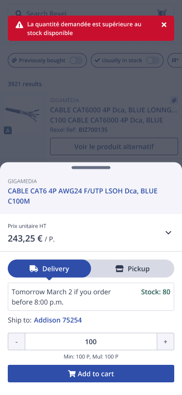
Product unavailable — substitute offered
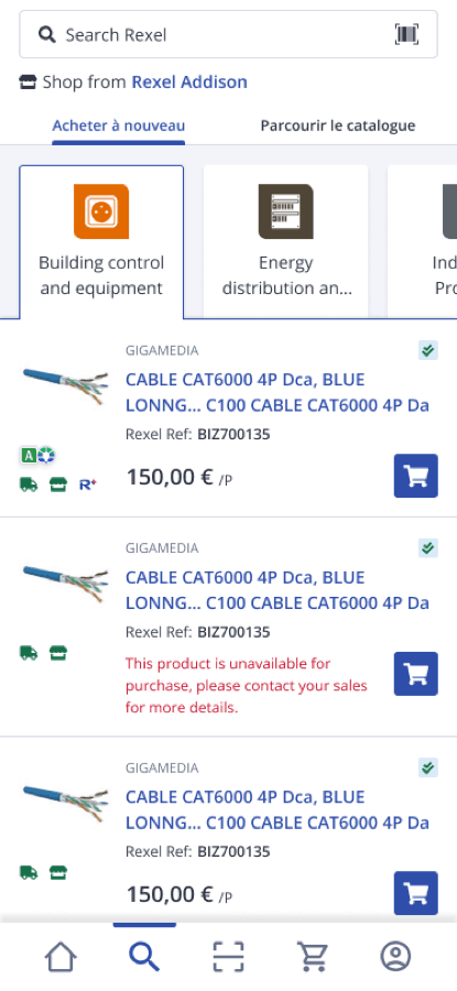
When stock runs out or a SKU is obsolete, the buyer sees a clear red banner at the top, plus a 'Voir le produit alternatif' (see alternative) CTA on the affected card. Dead-end avoided. Sale preserved.
Quote already in cart — resolution modal
B2B carts can hold a quote OR products — not both. Instead of silently blocking, the modal asks: 'Empty and add my products' or 'Cancel'. The user keeps control of which one wins.
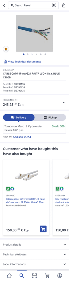
Customers who bought this — also bought
Native horizontal carousel of related products under every PDP. Trade buyers often need accessories — cable + connectors, switch + face plate. Recommendations are sourced from real co-purchase data, not editorial guesses.
Every edge case is a resolution path — never a dead end.
The substitute product flow alone moved buyers past zero-result dead ends across the PLP and search. The cart conflict modal turned a silent failure into a confident choice. In B2B, error states aren't edge cases — they're the moment trust is built or lost.
What Shipped
25 screens.
11 flows. Both themes.
Every screen below shipped to production across iOS and Android. Click any phone to open the full screenshot — keyboard navigation, zoom, and a thumbnail strip for jumping between screens. Hover the reel to pause auto-scroll.
Outcome
The brief was “build an app.”
The outcome was a platform
electricians preferred.
58%
Mobile share of total platform traffic
within 12 months of native launch, up from 38% on mobile web
Dark > Light
Dark mode adoption in Q1
validated the research-led decision to ship both themes simultaneously
2 markets
FR pilot + EN rollout
same codebase, localised content, both shipped within 6 months of each other
The Rexel mobile app launched first to the French market, then rolled across European markets on the same React Native codebase with locale-specific content. The dark mode decision — initially scoped as a toggle — became one of the most visible signals that the product was designed for the actual context of use, not the office.
“Built for the job site, not the desk” wasn't a tagline. It was the constraint every design decision was measured against — and it's the reason electricians preferred the native app to the web platform within a single quarter.
Some artifacts in this case study represent conceptual recreations of work completed during the engagement. Real customer data, personally identifiable information, and pre-release product details have been anonymized or replaced with representative placeholders to respect client confidentiality.