B2B E-Commerce · Rexel Group · 2019 – 2022
B2B Commerce
Redesign
Embedding Agile UX into a global electrical distributor operating across 26 countries — redesigning mobile and desktop commerce experiences through 2-week sprint cycles with multinational product teams.
40+
Sprints delivered
26
Countries served
30%
Cart task completion ↑
3
Platform surfaces
The Scale
Global product.
Local nuance.
Rexel is one of the world's largest distributors of electrical supplies — a digital platform used by electricians, contractors, and procurement teams across Europe, Asia-Pacific, and the Americas.
8
Product squads
across 3 time zones
26
Markets
each with local requirements
6
Stakeholder groups
business, tech, ops
2 wk
Sprint cadence
design → dev → ship
8
Product squads
26
Markets
3
Time zones
2019–22
Engagement
Agile UX Framework
Design wasn't a handoff.
It was a loop.
I introduced a UX layer inside each squad's sprint — not as a blocker but as a parallel track. Research, design, and validation ran one sprint ahead of engineering.
01
Intake
Requirement from product backlog or stakeholder
02
Story + Research
User story written, existing research surfaced
03
Design
Wireframes → prototype in Figma, Jira linked
04
Review
Stakeholder sign-off across markets
05
Ship
Dev handoff via Zeplin, QA with UX present
Design Backlog in Jira
Every design ticket linked to user story and acceptance criteria — no orphaned specs.
Multinational Reviews
Fortnightly stakeholder calls with France, Australia, and US teams for market-specific sign-off.
Parallel Tracks
UX ran one sprint ahead of engineering — design was never on the critical path.
Team collaboration · Workshops · Sprint ceremonies
Competitive Analysis
Three direct competitors.
One cult favourite. Where the gaps were.
Methodology
Heuristic evaluation + buyer task replay across 4 B2B e-commerce platforms over a 4-week sprint. 8 patterns scored on trade-buyer needs — SKU search, account pricing, reorder, branch stock, mobile, quotes, industry filters, and split-billing.

Amazon Business
The generalist giant
200M+ products, fastest fulfilment in B2B — but built for any-buyer-anything, not the trade specialist.
Grainger
The industrial standard
1.5M MRO products, deep account integration with enterprise procurement — the legacy benchmark.

Sonepar
The direct rival
Rexel's #1 global electrical distribution competitor — same buyers, same SKUs, every visit a head-to-head.

McMaster-Carr
The UX cult favourite
Dense, fast, opinionated — a reference standard for B2B catalogue UX, even outside their category.
Pattern comparison
Key findings
Sonepar's mobile was the open door
Rexel's only direct head-to-head was barely investing in mobile. Sonepar's mobile site felt like a desktop port — small touch targets, no quick reorder, no scanner integration. For field electricians, this was the most acute gap.
→ Design implication
Prioritise native mobile + scanner + one-tap reorder. Win the field by being the better tool on the job site.
McMaster sets the speed bar — but lacks B2B depth
McMaster-Carr's search-to-cart speed is industry-defining, but they don't handle negotiated pricing, multi-site billing, or quote workflows. Trade buyers admire the speed and forgive the missing depth — for now.
→ Design implication
Match McMaster's response time. Then add the B2B depth they don't have — negotiated pricing inline, quote-to-cart, branch stock — as the competitive moat.
Nobody handled split-billing well
Electricians routinely split orders across 3-5 job sites and billing codes. None of the four competitors made this a first-class checkout flow — it was a post-purchase configuration at best, a sales call at worst.
→ Design implication
Make split-billing a primary checkout step, not an afterthought. This becomes the feature that wins the foreman buyer — and the differentiating diamond in the heatmap.
The competitive landscape didn't show a winner. It showed an opportunity — beat Sonepar on mobile, match McMaster on speed, and out-do Grainger on the B2B depth that nobody else was solving for trade buyers.
Sprint in Practice
Two weeks.
One shippable thing.
Every sprint had a clear UX commitment — a prototype reviewed, a usability test run, or a spec shipped. Here's what a typical sprint looked like from my side.
Week 1
Week 2
Mobile Showcase
Built for the
job site, not the desk.
Electricians and contractors needed to browse, scan barcodes, and reorder supplies on-site — often with one hand, in poor light, with gloves on. The mobile experience was redesigned from the ground up for this reality.
Barcode scan as primary action
Field research showed 60% of reorders started by scanning existing stock — we made scan the hero CTA on the product list.
Glove-mode tap targets
All interactive elements minimum 56px — tested on-site with contractors wearing standard work gloves.
Offline-first stock check
Poor signal on construction sites. Stock levels cached locally, synced on reconnect.
Research · Field visits · Usability sessions
Cart & Checkout
B2B checkout is not
B2C with bigger numbers.
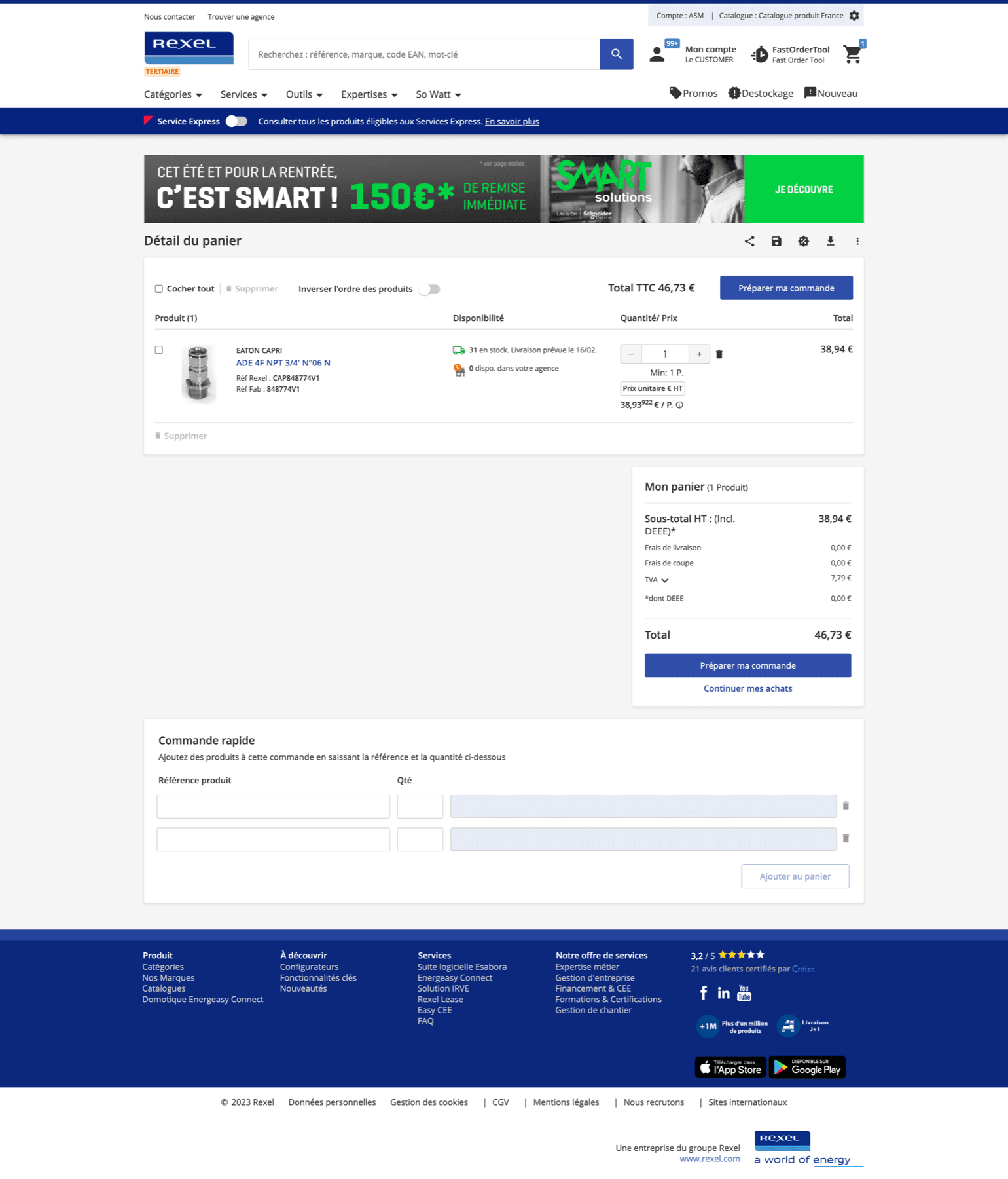
Procurement teams split orders across cost centres, delivery addresses, and approval workflows. The existing checkout assumed one person, one card, one address — it didn't exist for enterprise buyers.
"Cart task completion improved 30% after the redesign."
Before
Single delivery address only
No split billing support
No approval workflow
12-step linear checkout
After
Multi-address split per line item
Cost centre allocation built in
Approval chain integrated
5-step smart checkout with progress
Process artifacts · Stakeholder reviews · Usability testing
Product Strip
40+ sprints.
Everything we shipped.
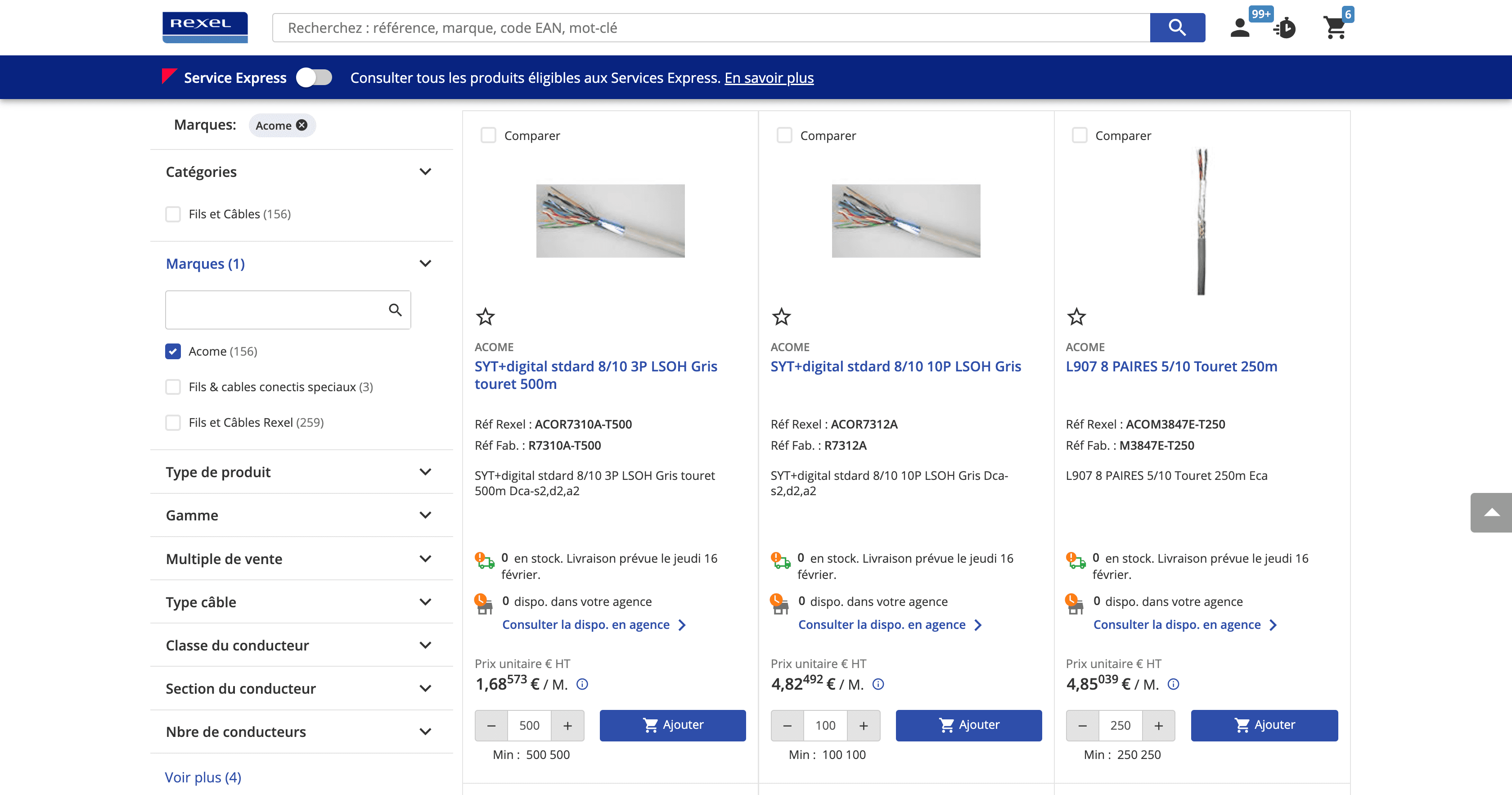
Product Listing · Grid
Category browse, grid layout
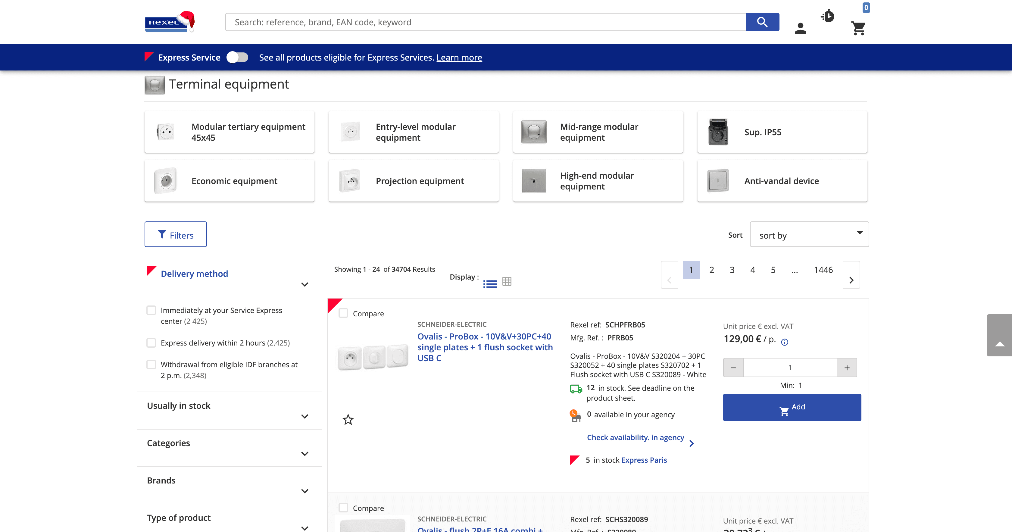
Product Listing · List
Comparison-friendly list view
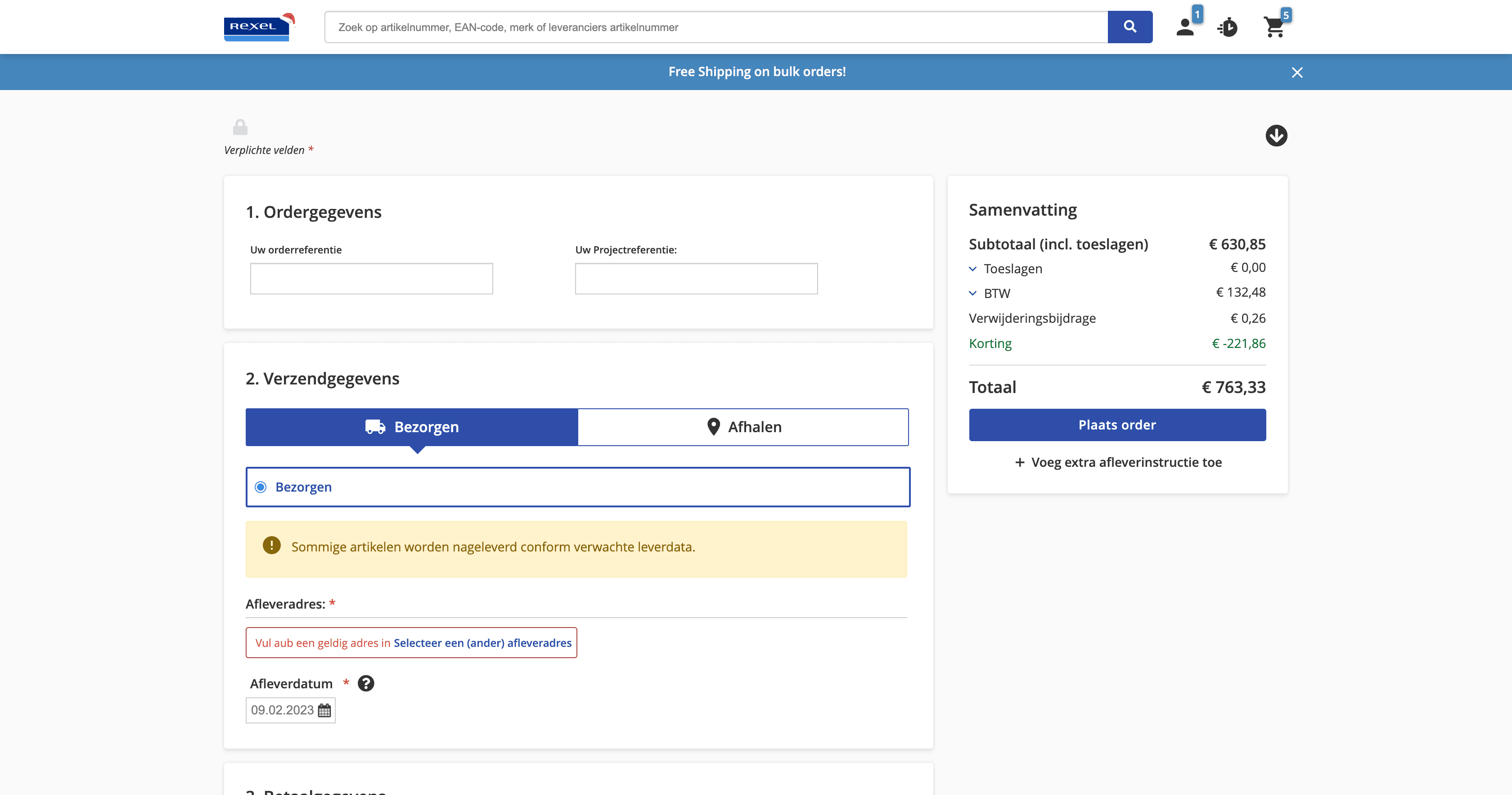
Checkout · NL Market
Multi-step checkout, NL locale
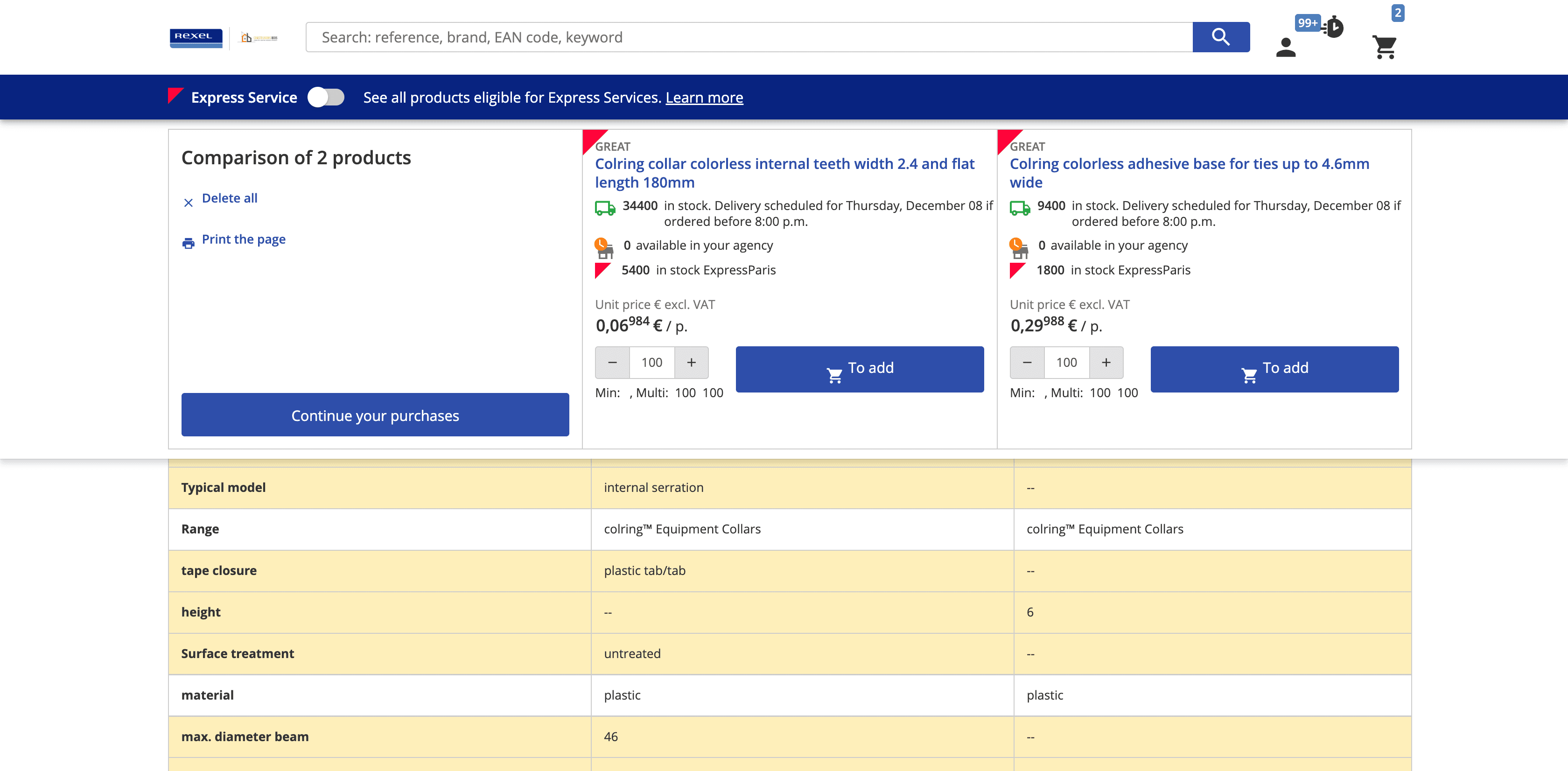
Product Compare
Side-by-side spec comparison
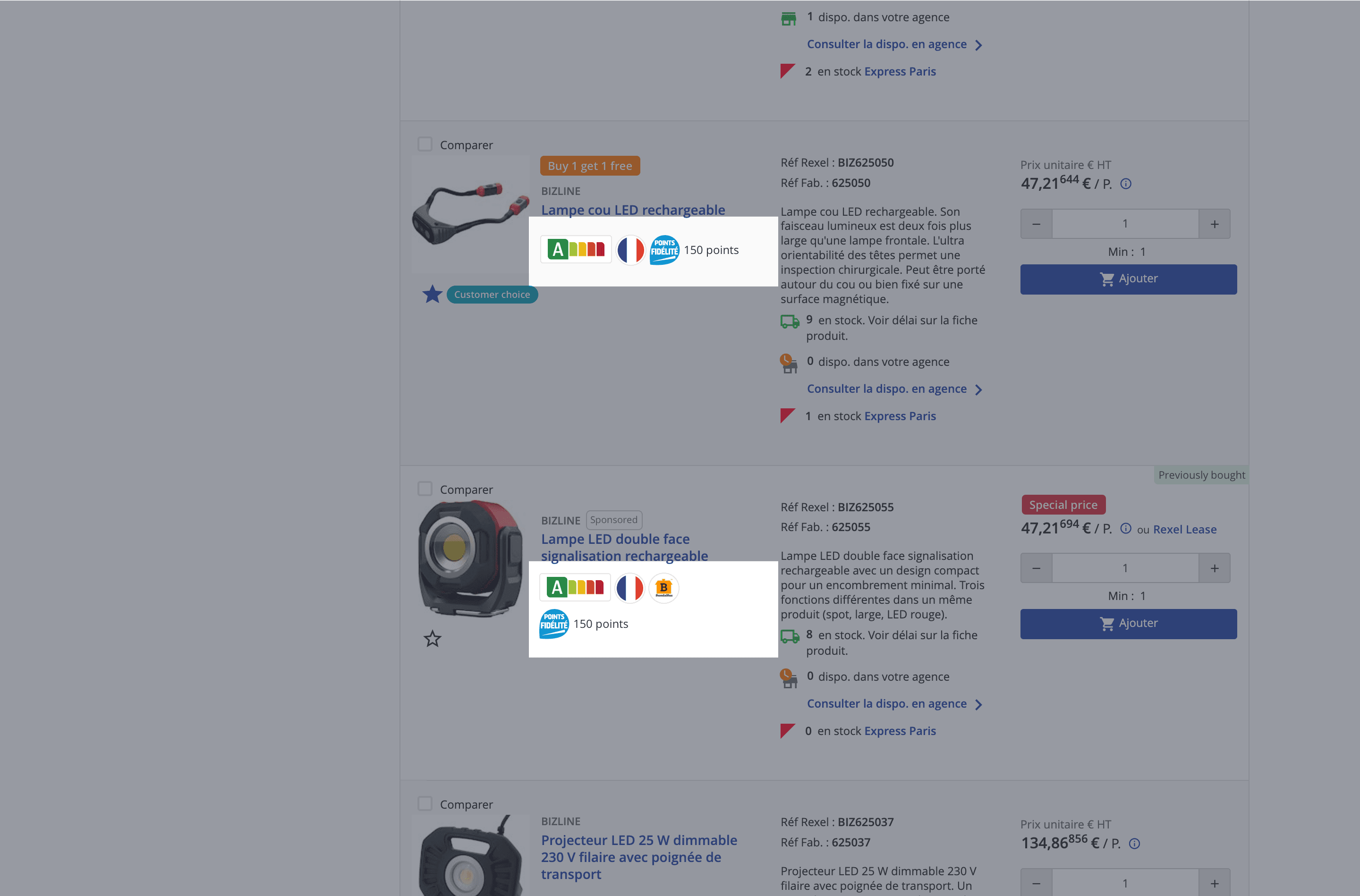
PLP · Loyalty Points
Loyalty tier integration on PLP
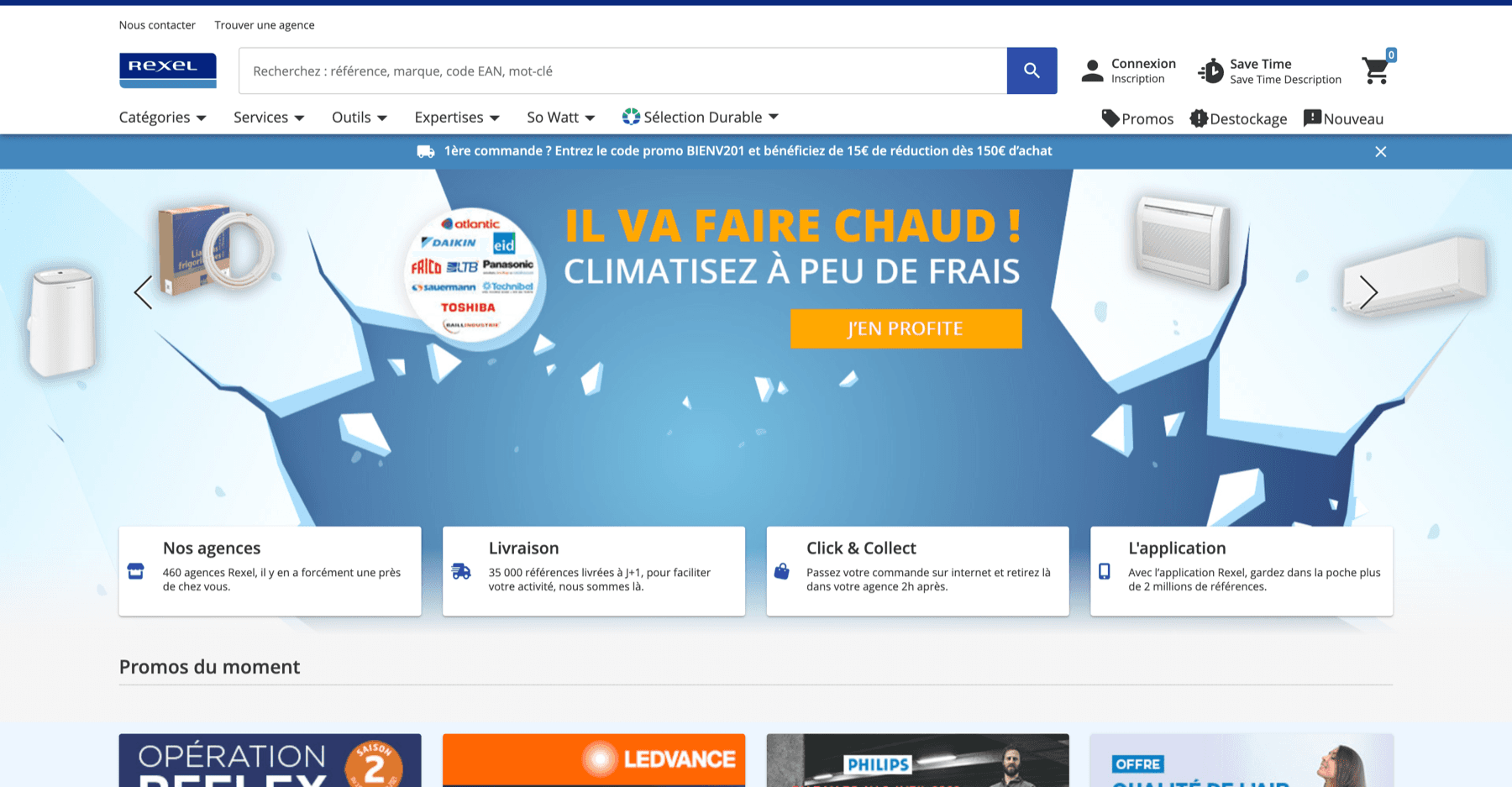
Personalised Homepage
Role-aware dashboard, FR market
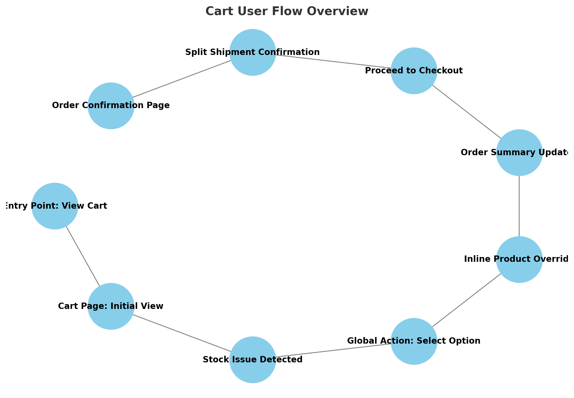
Cart Flow Overview
User flow diagram & annotations
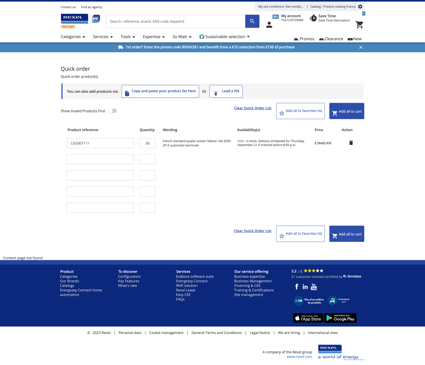
Quick Order
Bulk catalog# entry & CSV upload
Product Listing · Grid
Category browse, grid layout
Product Listing · List
Comparison-friendly list view
Checkout · NL Market
Multi-step checkout, NL locale
Product Compare
Side-by-side spec comparison
PLP · Loyalty Points
Loyalty tier integration on PLP
Personalised Homepage
Role-aware dashboard, FR market
Cart Flow Overview
User flow diagram & annotations
Quick Order
Bulk catalog# entry & CSV upload
Product Listing · Grid
Category browse, grid layout
Product Listing · List
Comparison-friendly list view
Checkout · NL Market
Multi-step checkout, NL locale
Product Compare
Side-by-side spec comparison
PLP · Loyalty Points
Loyalty tier integration on PLP
Personalised Homepage
Role-aware dashboard, FR market
Cart Flow Overview
User flow diagram & annotations
Quick Order
Bulk catalog# entry & CSV upload
Outcome
UX became part of
how the team ships.
30%
Cart task completion improvement
Measured via remote usability testing pre/post
40+
Sprints with UX coverage
Zero sprints shipped without design review
8
Squads adopted the UX sprint model
Framework scaled beyond original pilot team
The Agile UX framework became the standard operating model for the Rexel digital team. What started as a pilot on the cart project was adopted by all 8 product squads within 18 months — UX was no longer a phase, it was a constant.
The mobile experience shipped to 14 markets in the first rollout, with field electricians reporting significantly faster reorder times in post-launch surveys.
Some artifacts in this case study represent conceptual recreations of work completed during the engagement. Real customer data, personally identifiable information, and pre-release product details have been anonymized or replaced with representative placeholders to respect client confidentiality.