Industrial · Schlumberger · 2017 – 2021
Field Operations
Platform
Building the UX function from zero to unite 4 fragmented legacy applications into one unified platform — deployed across 30+ global drilling sites.
30+
Global drilling sites deployed
60K+
Employees on workforce apps
4
Legacy applications unified
The Mandate
No UX function. No design templates.
Start from blank.
What existed before
4 disconnected legacy applications — Qtrack, RITE, and two others — each managing a different slice of field operations with no unified workflow.
Field engineers were context-switching between systems under operational pressure, at active drilling sites, often with intermittent connectivity.
No UX function existed. No design process, no templates, no shared language between product and engineering.
Downtime at a drilling site costs hundreds of thousands of dollars per hour. Fragmented tools weren't just a UX problem — they were an operational risk.
What I was brought in to do
Build the UX function from scratch — define the process, establish design standards, and create a practice that didn't exist.
Unify all 4 legacy applications into FMP: a single platform that field engineers could trust to manage their entire workflow.
Design for extreme constraints: gloved hands, bright sunlight, variable connectivity, high-stakes task switching — requirements no standard UX heuristic accounts for.
Operate across 4 parallel product teams simultaneously, maintaining consistency without a centralised design team to enforce it.
The Scale
One platform.
Four teams.
Quarterly cycles.
FMP was large enough to require 4 parallel design workstreams, each embedded within a dedicated product team. Each team owned a distinct module — Activity Monitor, Planning & Scheduling, Tool Tracking, and Asset Management.
The design challenge wasn't just building good screens within each team. It was maintaining a consistent product experience across all 4 workstreams moving simultaneously — without a centralised design team to enforce it.
Work ran in quarterly delivery cycles. Each quarter had a defined scope, a fixed research-to-handover rhythm, and a shared design system that prevented the platform from fracturing across modules.
Core
How Each Quarter Actually Worked
Every quarter followed
the same disciplined rhythm.
Requirements In
Feature scope defined each quarter with product leads and engineering. No design begins until requirements are anchored.
Legacy App Testing
Internal SLB users tested against Qtrack and RITE. Friction surfaced in the existing system — before a single wireframe was drawn.
Stakeholder Workshop
Cross-functional alignment sessions with operations managers, drilling supervisors, and IT leads across regions.
Sketch Mocks
Paper wireframes first — Crazy 8s to generate volume, then digital mocks in Sketch once direction was validated.
Validation
Concepts tested with the internal user pool. Iterated based on findings. Only then did designs move forward.
High-Fidelity Design
Final screens built using the shared design system. Component-first, edge cases documented.
Dev Handover
Annotated specs, interaction notes, and direct collaboration with engineering through implementation.
Running in parallel throughout: Agile sprint cycles handled ongoing product updates via user stories — separate from the quarterly delivery rhythm but using the same design system and handover standards.
Research Foundation
Test the legacy system
before drawing anything.
Before a single wireframe, we ran structured sessions with 7 internal SLB users — field engineers who were living in the legacy applications every day. We weren't showing them prototypes. We were watching them work in Qtrack and RITE.
The questions weren't abstract. "Walk me through how you complete a tool request." "What are the 3 things you would change about Qtrack today?" "What is an example of your most complex daily task?"
What surfaced reshaped the entire feature priority list. The 4 dominant pain points that emerged — Delay, Tracking gaps, Long Procedures, and missing System Feedback — became the design principles that every subsequent decision was tested against.
User Pain Points Summary
The 4-quadrant pain point diagram or the HMW framing artifact from the define phase.
Research to Direction
The work behind
the work.
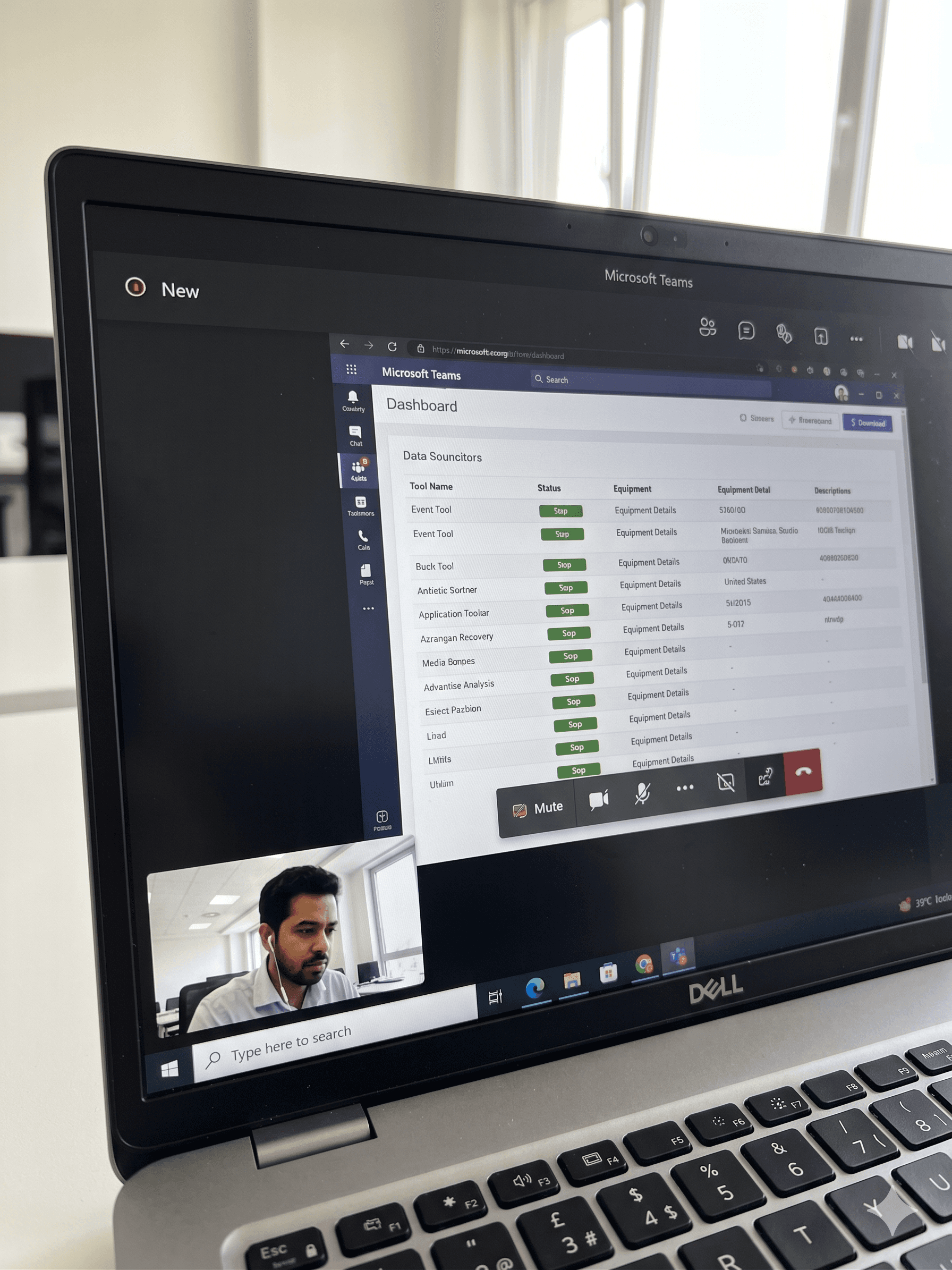
01 · Legacy App Testing
Before touching Sketch, we ran structured sessions with 7 internal SLB users — field engineers working in Qtrack and RITE daily. We weren't showing prototypes. We were watching them do real work in the systems we were replacing.
Each session ran 30–45 minutes. We asked them to complete actual tasks — requesting tools, checking status, delegating work orders — while we observed. What broke, what they skipped, what they'd worked around so long they'd stopped noticing.
7
Users interviewed
2
Legacy apps tested
30+
Min per session
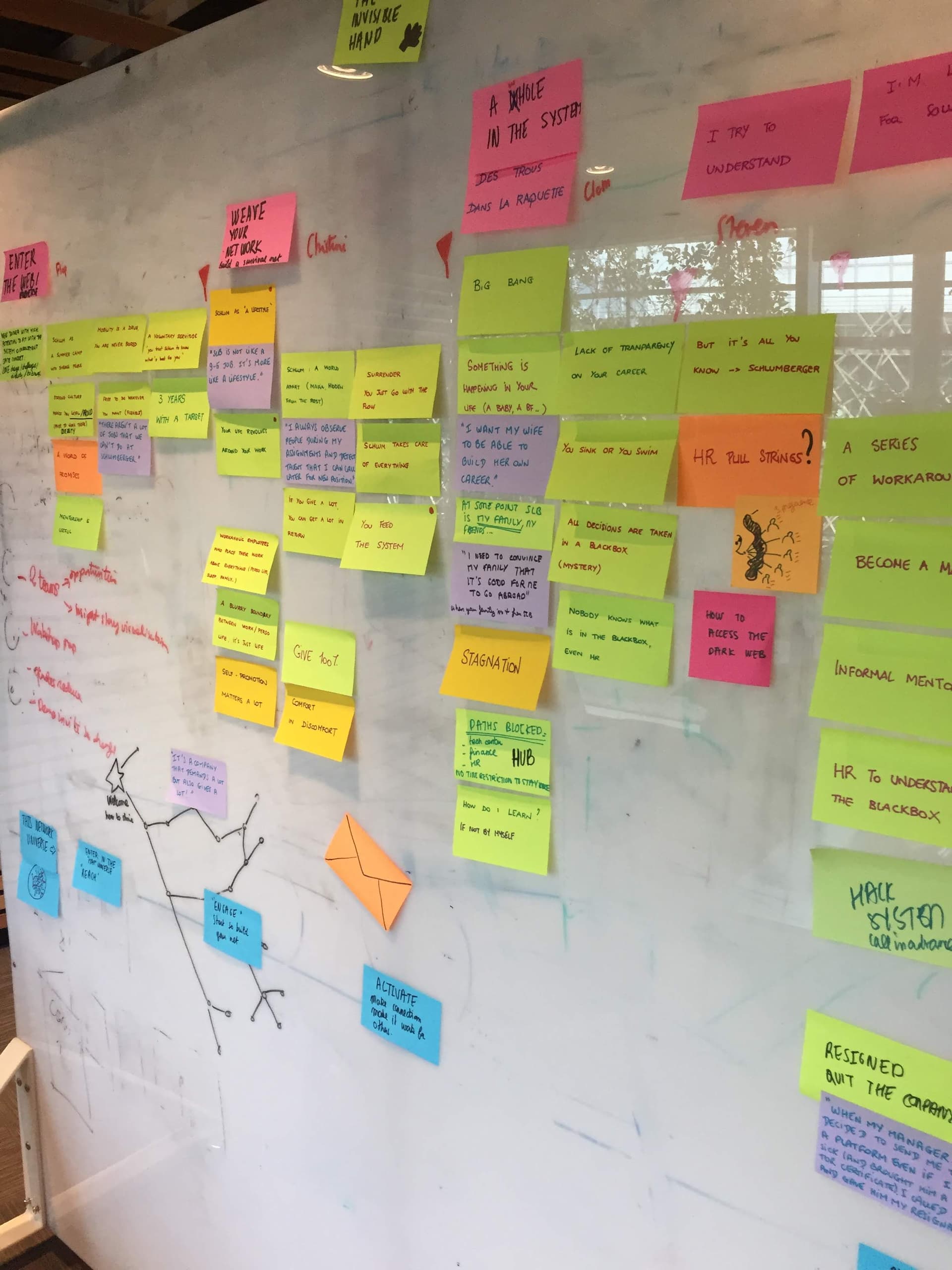
02 · Gathering & Synthesising Insights
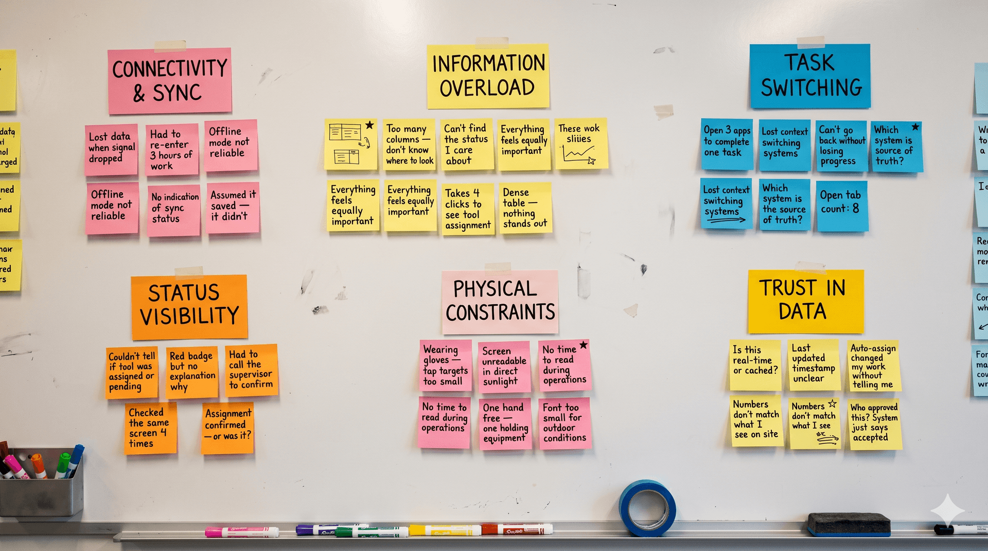
7 interviews produced a lot of noise. The synthesis stage was about finding the signal — clustering observations into themes, then themes into design principles. We used affinity mapping to let the patterns emerge from the data rather than confirm what we already suspected.
"How might we help field engineers monitor and manage their tools with the same speed and confidence they operate drilling equipment?"
HMW statement — emerged from synthesis, drove all subsequent design decisions
Delay
Context switching between apps slowed every task
Tracking Gaps
No single view of tool location or status across sites
Long Procedures
Multi-step workflows with no progress visibility
System Feedback
Actions completed with no confirmation or status update
03 · Designing the Flow
Before opening Sketch, the task flow was mapped end-to-end. Every path a field engineer needed to take — from login to task completion — was defined on paper first. This became the skeleton every wireframe was built on.
Primary user flow — Tool tracking & assignment
Launch App
SSO login
Dashboard
Activity overview
Activity Monitor
Tool status
Tool Selection
Filter & assign
Work Order
Create / update
Complete
Sync & confirm
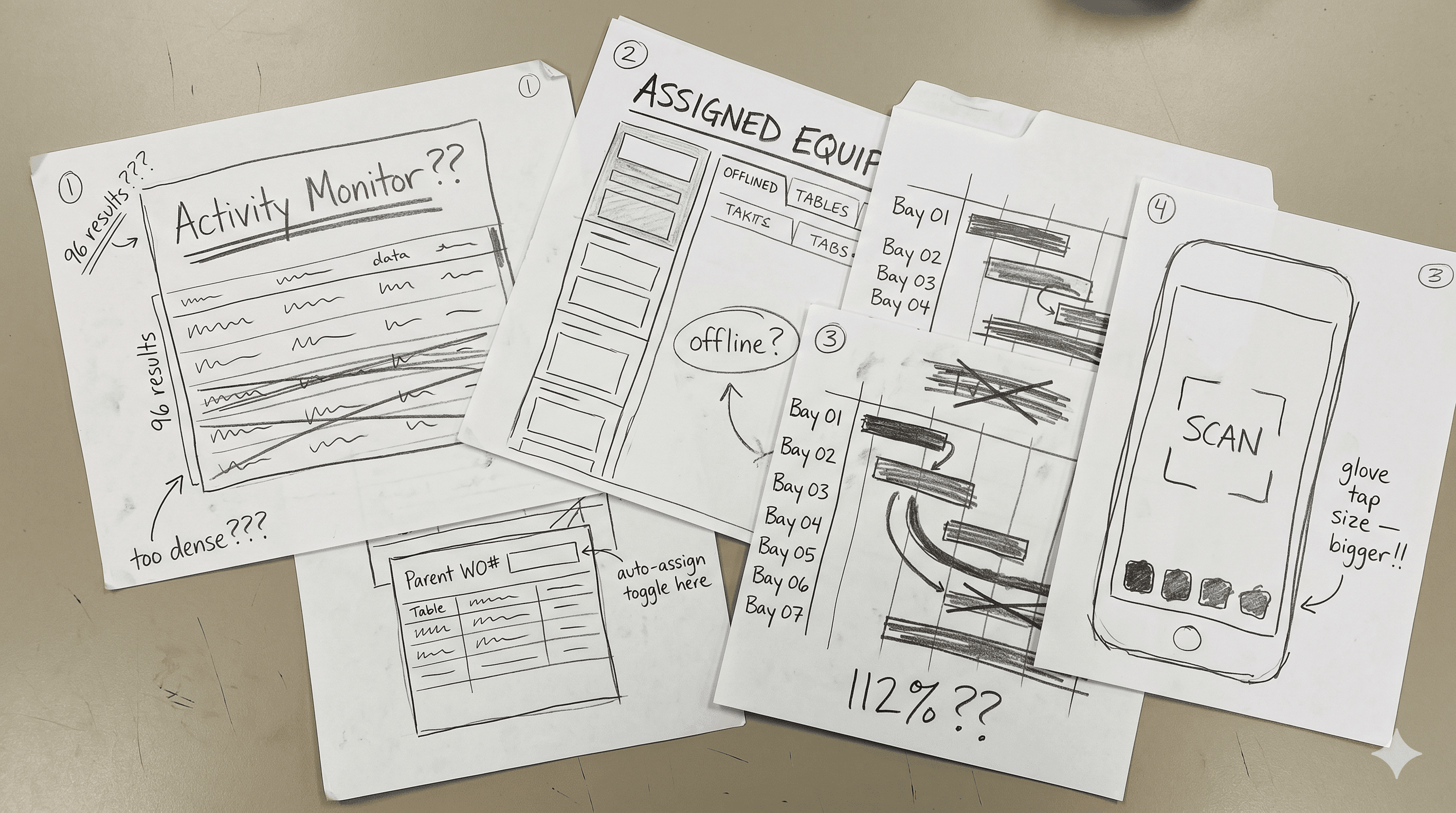
04 · Stakeholder Workshop & Design Review
Before any design went to hi-fi, we ran structured stakeholder workshops — getting product leads, engineering, and operations in the same room. The goal wasn't to present designs. It was to align on priorities and surface constraints before they became expensive problems in development.
Each session had a fixed structure: review findings, prioritise scope, agree on constraints, define what success looked like. Every output was documented and fed directly back into the design backlog.
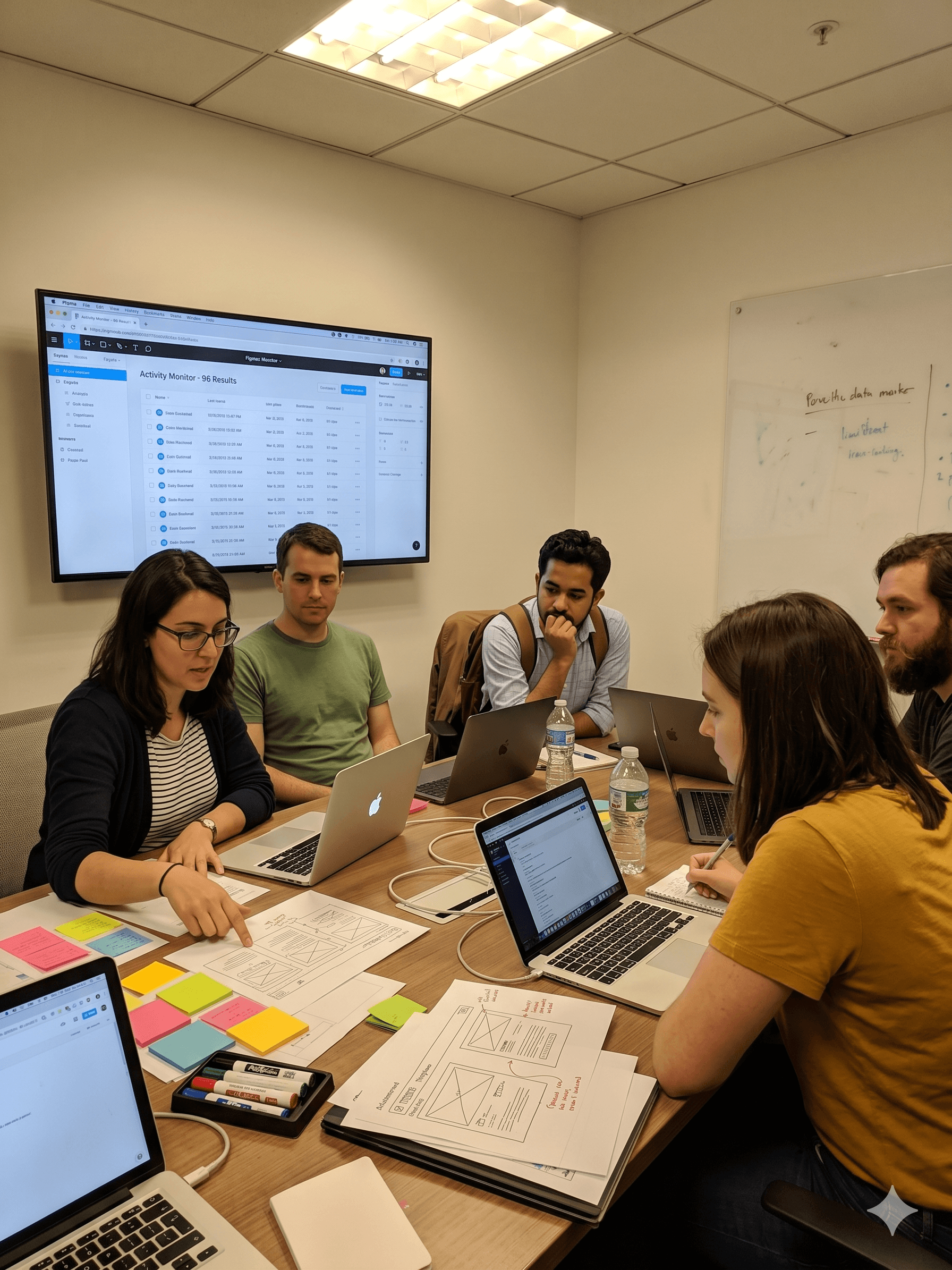
Stakeholder Workshop — Design Review
Attendees: Product Manager · Engineering Lead · Ops Supervisor · Drilling Manager
Review research findings
Shared understanding of user pain points
Prioritise feature scope
Agreed Q1 feature list
Align on technical constraints
Offline-first confirmed as baseline
Define success metrics
KPIs tied to field engineer task completion
Key Decisions
Three calls that
shaped the product.
Paper before pixels
The pressure
The instinct at the start of every sprint was to open Sketch immediately.
The call
We enforced paper wireframing and Crazy 8 sessions first — every quarter, without exception.
Why it mattered
Paper forces information hierarchy decisions before visual execution gets in the way. The 8-minute Crazy 8 format consistently surfaced ideas that never would have appeared if we'd started with a blank Sketch artboard. It also created a shared artefact that engineers and stakeholders could react to without the conversation becoming about visual style.
Design system before screens
The pressure
Stakeholders wanted to see feature screens immediately. The pressure to skip foundations was real.
The call
Invested the first weeks of the engagement in building a shared component library before any feature design began.
Why it mattered
Four teams building on inconsistent foundations would have produced a platform that felt fractured — even if individual screens looked good. The design system was the only mechanism we had for enforcing consistency across parallel workstreams without a centralised design function to police it.
One research repository, four teams
The pressure
With 4 teams moving simultaneously, there was a real risk of 4 different interpretations of user needs driving divergent design decisions.
The call
Established a single shared research repository that all teams drew from — one source of truth for user evidence.
Why it mattered
This meant that when a team made a design decision — on navigation, on error states, on data density — that decision could be traced back to the same user evidence every other team was working from. It was the difference between 4 teams building one product and 4 teams building 4 products that happened to share a name.
Final Screens
What shipped.
High-fidelity screens across Activity Monitor and Planning & Scheduling — the two primary modules of FMP. Hover to pause.
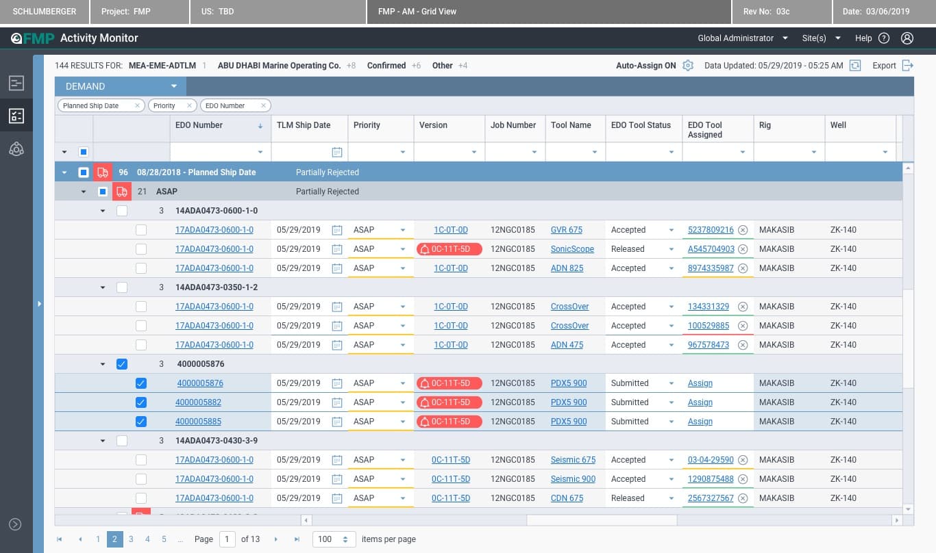
Activity Monitor
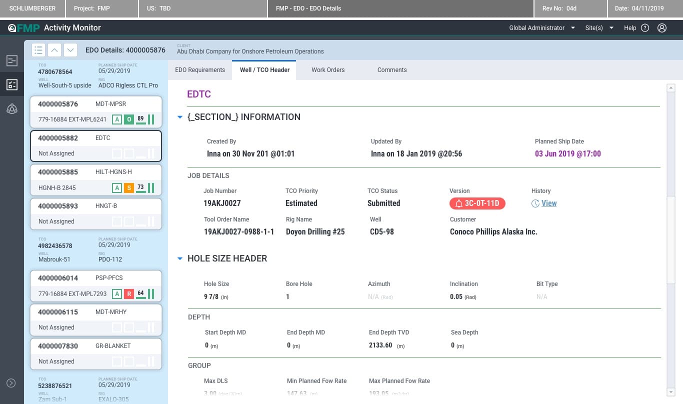
EDO Details
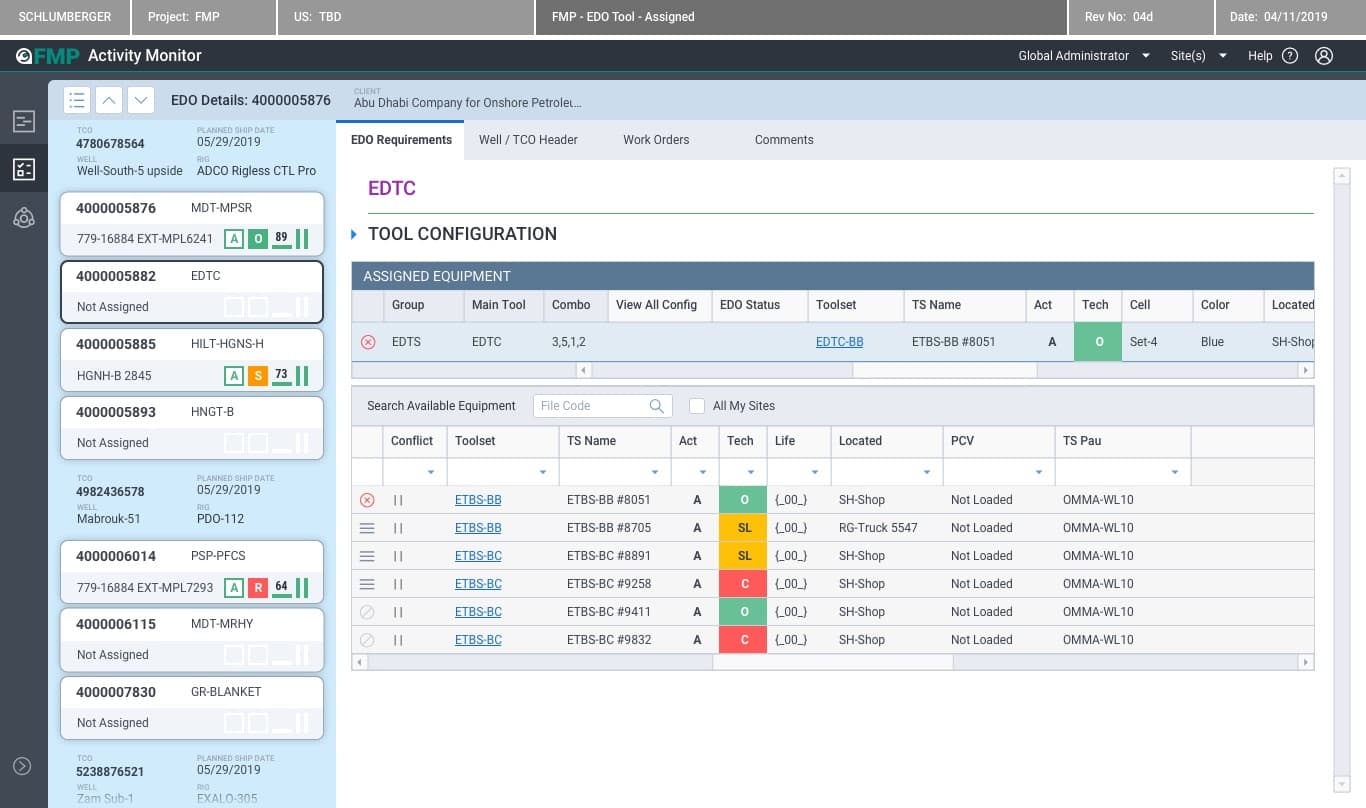
Tool Assignment
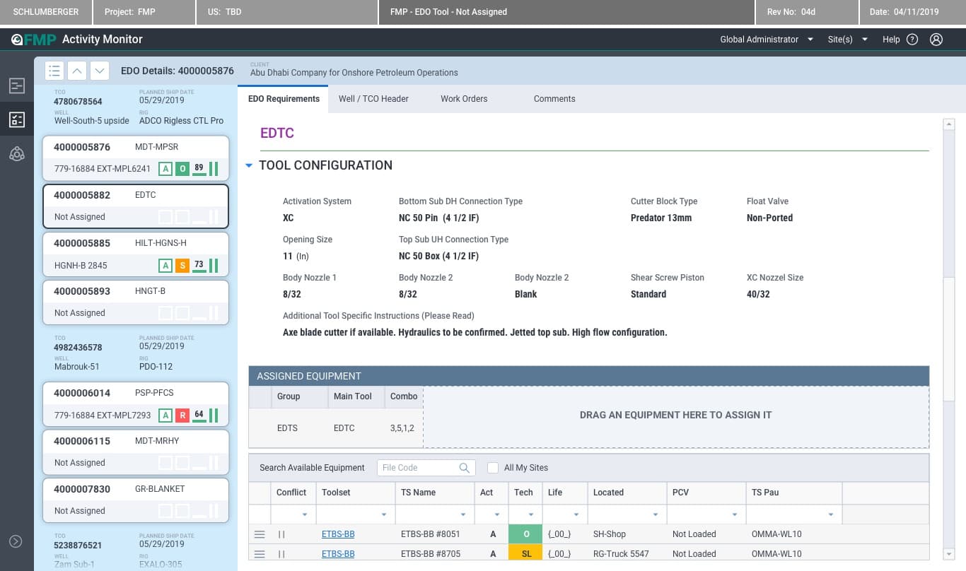
Tool — Not Assigned
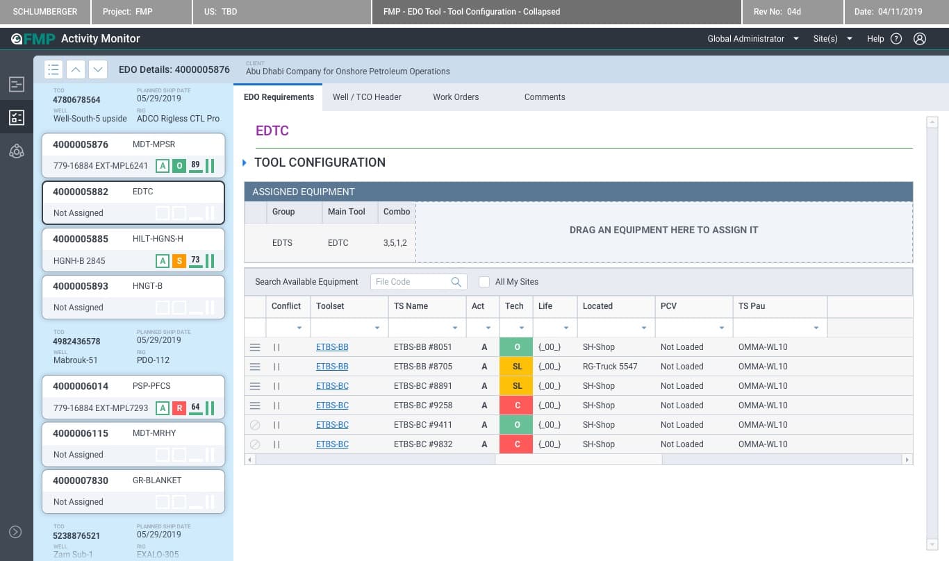
Tool Configuration
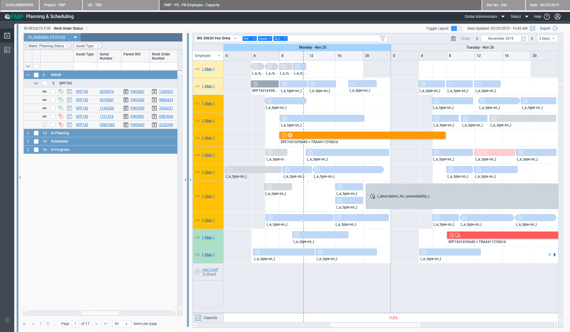
Planning & Scheduling
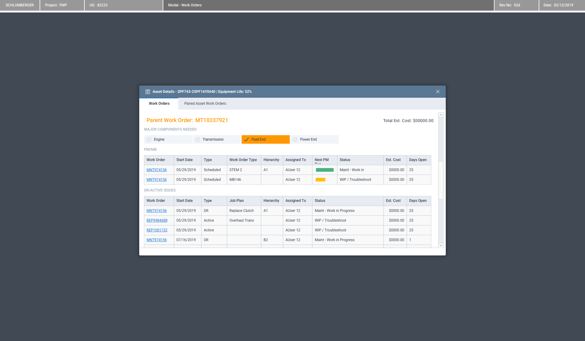
Work Orders
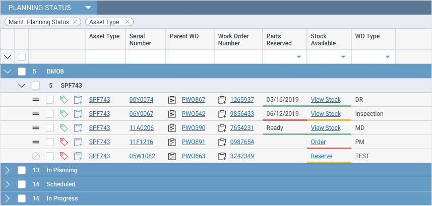
Parts & Stock
Activity Monitor
EDO Details
Tool Assignment
Tool — Not Assigned
Tool Configuration
Planning & Scheduling
Work Orders
Parts & Stock
Activity Monitor
EDO Details
Tool Assignment
Tool — Not Assigned
Tool Configuration
Planning & Scheduling
Work Orders
Parts & Stock
On the Ground
Dubai.
An active drill site.
The real users.
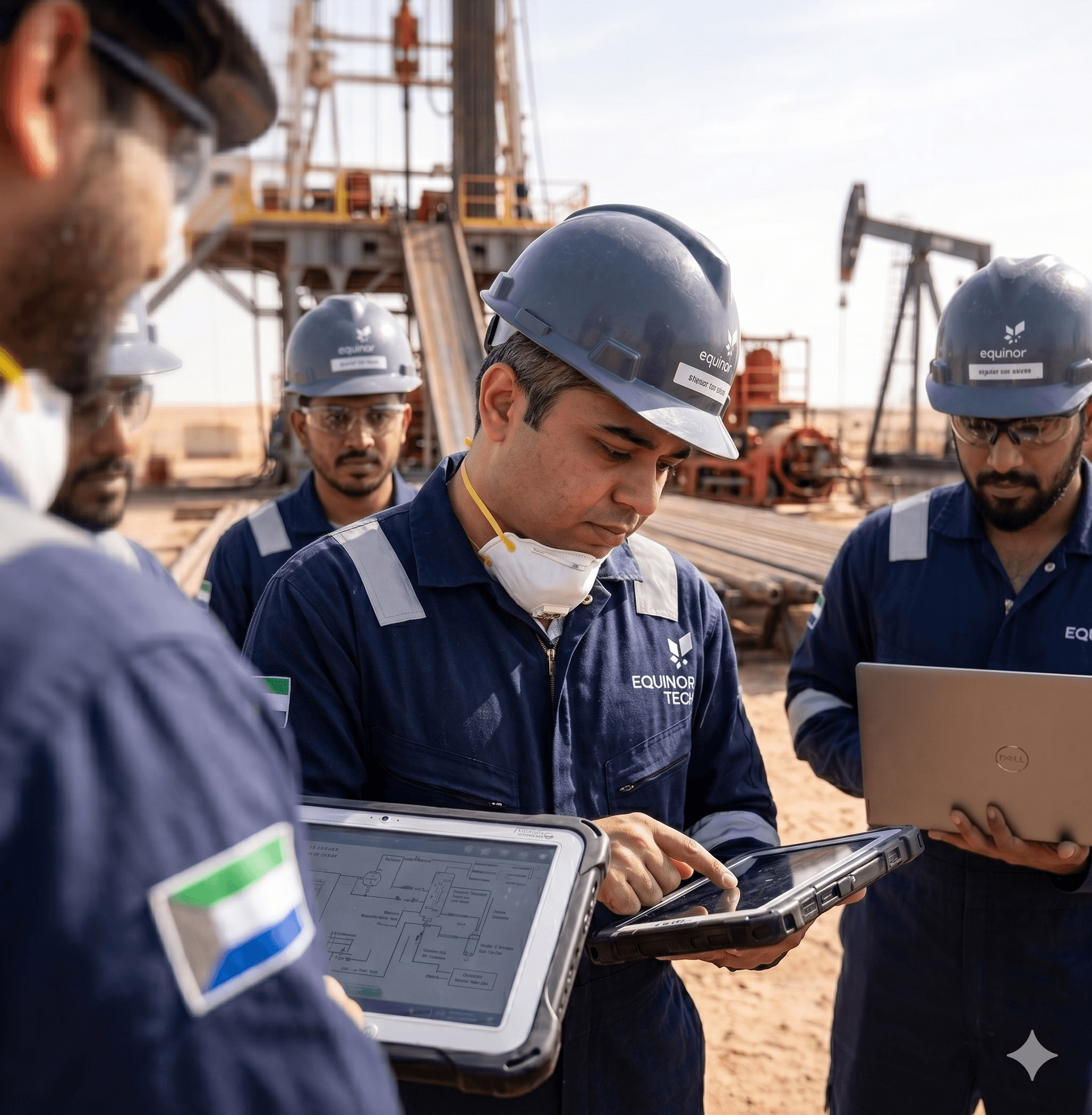
Designing for field engineers is one thing. Standing in the environment the product was built for is another.
I travelled to an active Schlumberger drilling site in Dubai to participate in the FMP demo and training — working directly with the field engineers who would use the platform daily. Watching them navigate FMP in the actual conditions we had designed for — the heat, the operational pressure, the gloved-hand interactions — was the only validation that truly mattered.
It also surfaced a handful of things no remote research session would have caught. Edge cases in the field are different from edge cases in a meeting room.
Dubai, UAE — Active Schlumberger Drilling Site
Outcome
What it became.
30+
Global drilling sites deployed
60K+
Employees on workforce applications
4
Legacy systems retired
4 yrs
UX function built from scratch
The Federated Maintenance Platform was recognised by senior Schlumberger leadership and deployed across 30+ global drilling sites — replacing 4 fragmented legacy systems and measurably reducing field-engineer task friction. It became the foundation for Schlumberger's enterprise mobility strategy, and the UX practice built to deliver it continued after the engagement ended.
Some artifacts in this case study represent conceptual recreations of work completed during the engagement. Real customer data, personally identifiable information, and pre-release product details have been anonymized or replaced with representative placeholders to respect client confidentiality.