Four products.
One analytics
ecosystem.
Designing across Metric Factory, Vantage Insights, Dashboard Customisation, and Embed Slider — turning ADP's reporting catalogue into a workforce intelligence system.
Role
Senior UX Designer
Company
ADP
Period
2015 – 2017
Tools
Sketch · Axure RP
The Problem
HR teams had data.
They didn't have understanding.
200+
static reports in ADP's catalogue
4 min
average time to surface a single workforce metric
0
tools that connected authoring → display → context
ADP had a reporting product.
It needed an analytics system.
Competitive Analysis
The HR analytics market
had four players. None had the full system.
Methodology
Heuristic evaluation + market positioning analysis across the four leading HR analytics platforms. 8 patterns scored across self-serve usability, benchmark depth, customisation, admin authoring, time-to-insight, embeddability, integration cost, and ecosystem coherence.

Visier
The HR analytics specialist
Purpose-built for people analytics — benchmarks, predictions, deep workforce models. Best-in-class, but standalone and expensive.

Workday
The integrated suite
Analytics layered on top of the HCM platform — integrated by design, but generic in its analytic vocabulary.

SAP SuccessFactors
The enterprise default
Deeply configurable, deeply entrenched — but slow to evolve. The 'safe' choice for the largest enterprises.

Tableau
The data-team workhorse
Powerful general-purpose viz — but assumes a data team. HR rarely has one. Used by IT to serve HR, not by HR directly.
Pattern comparison
Key findings
Visier won the product. Lost the distribution.
Visier's analytics product was the clear best-in-class — but it required a separate purchase, separate integration, and separate login. Most HR teams could justify ADP for payroll. They couldn't justify Visier on top.
→ Design implication
ADP didn't need to beat Visier feature-for-feature. ADP needed to make Visier-quality analytics live where the HR team already worked — inside the platform that owned the data.
Workday and SAP shipped generic analytics
Both integrated suites treated analytics as a layer on top of the HCM — using generic chart libraries, generic filters, no workforce-specific vocabulary. Functional but uninspiring. HR teams used them for compliance, not for decisions.
→ Design implication
Design analytics with HR's actual mental model — turnover by manager, comp ratio by tenure band, hire velocity by source. Specific beats general every time.
No competitor had the full ecosystem
Visier owned analytics. Workday owned the suite. Tableau owned viz. SAP owned the enterprise. But none owned all 4 layers — authoring, display, customisation, contextual embedding — as a coherent system designed by one team.
→ Design implication
Build the 4-product ecosystem (Metric Factory + Vantage Insights + DC3 + Embed Slider) as one connected design language. That coherence becomes ADP's structural advantage — the differentiating diamond no competitor could match.
The competitive landscape made the strategy clear: ADP didn't need to be the best at any one thing. It needed to be the only one that did all four — and design them to feel like one product.
The Ecosystem
Four layers.
One workforce intelligence system.
Each product solved one layer of the problem. Together they replaced the report catalogue.
Metric Factory
Where workforce metrics are defined
For
ADP analysts
Vantage Insights
Where HR leaders read them
For
HR leaders
DC3
Where they customise their view
For
HR leaders
Embed Slider
Where the rest of ADP sees them
For
Any ADP user
I designed across all four —
making them feel like one product.
Product 01 · Vantage Insights
The flagship.
A KPI grid that earned the home screen.
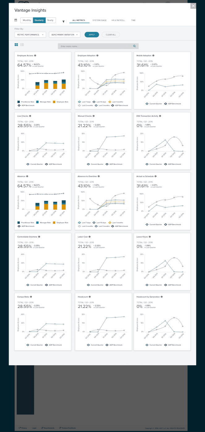
24 curated workforce metrics with industry benchmarks — the analytics surface that replaced 200+ static reports as the default for HR leaders.
Design Decision
“Benchmark colour is the answer to ‘should I care?’ — green / grey / red, before any number is read.”
Product 02 · Dashboard Customisation (DC3)
Make it yours.
Drag. Drop. Configure.
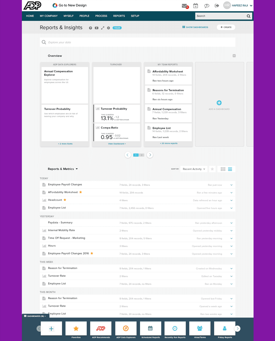
HR leaders set their own dashboards inside Vantage Insights — built around four distinct drag states because failure has to teach the user, not block them.
Design Decision
“Four states for one reason — failure has to teach. The ‘no drop’ state explains why, not just that.”
Product 03 · Metric Factory
The factory floor.
Where every metric was authored.
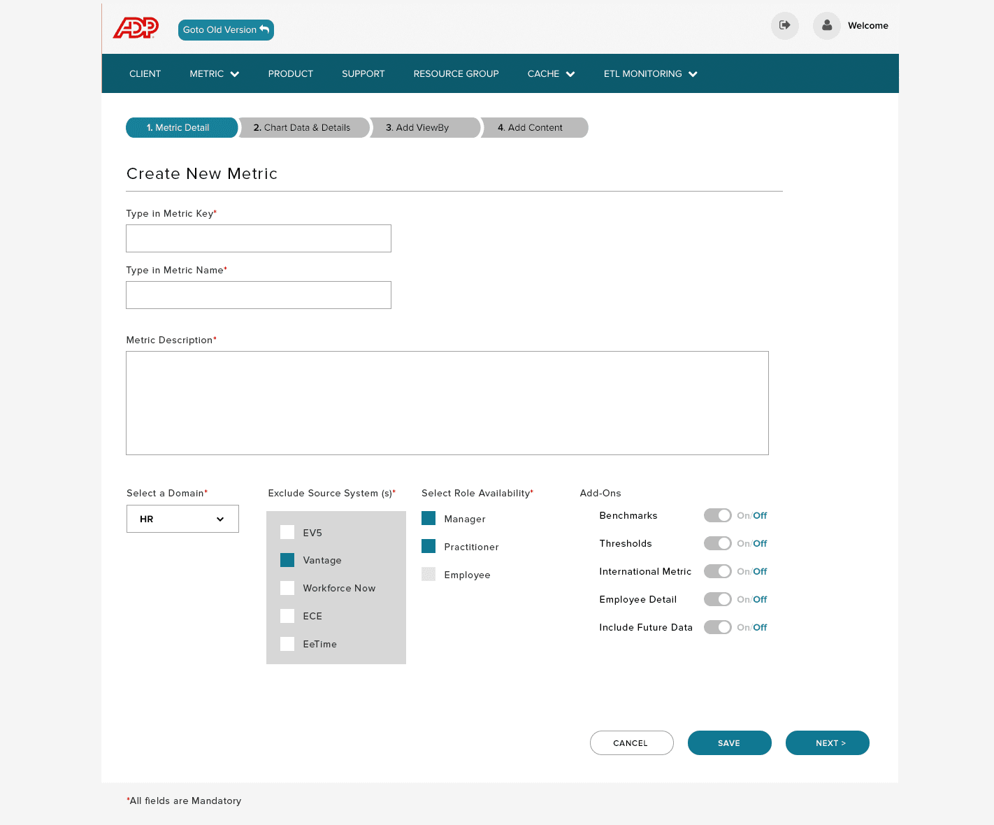
An internal tool for ADP analysts to define new workforce metrics — a 4-step wizard from definition through chart configuration, view-by axes, and publishing.
Design Decision
“The unsexy half of analytics — but the dashboard was only ever as good as the tool that built it.”
Product 04 · Embed Slider
Analytics, in context.
Where the user already was.
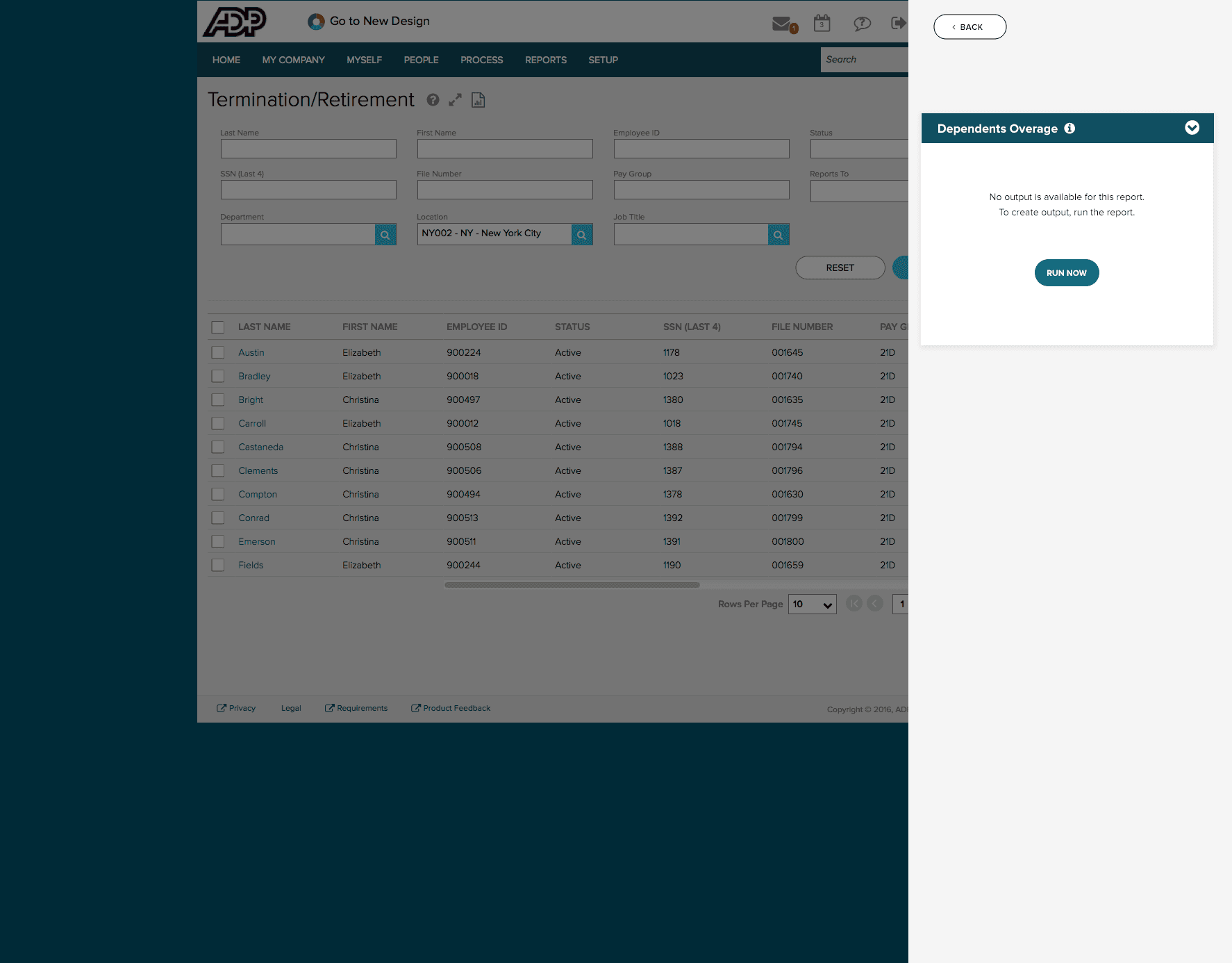
A panel that slides analytics into other ADP screens — Payroll, Termination, Direct Deposit — bringing insight to the moment of decision instead of forcing the user to leave the task.
Design Decision
“Most insights die because the user has to leave the task to see them. The slider made it the other way around.”
The Connective Tissue
One designer.
Four products. Same patterns.
Research
- 12 months of support-ticket analysis
- Power-user interviews with HR analysts
- Iterative prototyping in Axure RP
System
- Shared component patterns across all 4 products
- Single visual language (VDL)
- Consistent data viz framework
Output
- Adopted as ADP's template for analytics products
- WCAG 2.1 compliance established as baseline
- Handoff-ready specs to engineering
What Shipped
4 products.
30 shipped screens.
Every real screen across the analytics suite. Click any to open the full view — keyboard arrows to navigate, Esc to close. Hover to pause auto-scroll.
Outcome
From a report catalogue
to a workforce intelligence system.
4 products
designed as a single connected system
Metric Factory → Vantage Insights → DC3 → Embed Slider
200+ → 24
static reports collapsed into curated insights
with industry benchmarks built in from line one
Company-wide
adopted as ADP's analytics template
same data viz framework, same WCAG 2.1 baseline
Workforce analytics at ADP became a system —
and the system became the template.
Some artifacts in this case study represent conceptual recreations of work completed during the engagement. Real customer data, personally identifiable information, and pre-release product details have been anonymized or replaced with representative placeholders to respect client confidentiality.