Insurance · Marsh McLennan · 2023 – Present
Claims Intelligence
Suite
Marsh McLennan's enterprise claims analytics platform — giving risk managers, brokers, and claims operations teams a live intelligence layer over their insurance portfolios. Before this product, that meant spreadsheets.
I led design across 5+ products, owned the Figma design system, and built the pipeline that took stakeholder intent all the way to sprint-ready story — without losing design thinking in translation.
What I owned
- Design system governanceStrategic
- Stakeholder feature pipelineStrategic
- Daily PO syncsExecution
- Sprint delivery · Figma hi-fiExecution
- Design QA & dev handoffExecution
5+
Products owned
4
Designers governed
3
Product teams
2yr
Engagement
1
Design system
The Mandate
Five products. No system.
Start from governance.
What existed before
5+ internal products with inconsistent interfaces — different button styles, different chart palettes, different interaction patterns across the same product suite.
Risk managers juggling spreadsheet exports alongside the platform — the tool wasn't trusted as a single source of truth.
No design system or shared Figma library. 4 designers working in isolation, duplicating components and introducing drift every sprint.
No formal pipeline between stakeholder requests and design execution — features went from verbal ask to Jira story with no design thinking in between.
What I was brought in to do
Build and govern a Figma design system as the single source of truth across all 5 products and 4 designers.
Own the upstream: run stakeholder conversations, drive design thinking, and write feature briefs before a single story was created.
Establish the sprint rhythm — daily PO syncs, backlog grooming, Figma hi-fi as the definition of done.
Prove that a senior designer can be an active engineering partner — not a handoff point.
02 · The Product
Making claims data
actually useful
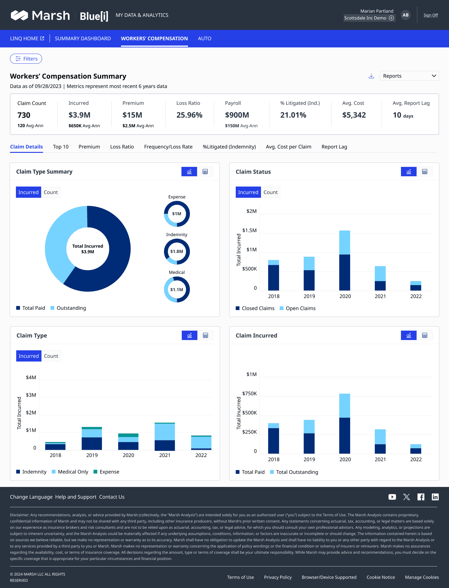
BlueJi is Marsh McLennan's enterprise claims analytics platform. It gives large corporations — manufacturers, logistics companies, healthcare groups — a live intelligence layer over their workers' compensation and auto liability portfolios.
The core job: turn raw claims data into decisions. How many open claims? What's the loss ratio trend? Which states are driving exposure? Where does our benchmark sit against the industry? All of it, in one place, filterable in real time.
The problem before BlueJi
Static PDF reports
Emailed weekly. Outdated by the time they landed.
Disconnected systems
Claims data in one tool, benchmarks in another, exposure in a spreadsheet.
No self-serve filtering
Any custom view required a request to the analytics team — days of wait time.
No geographic view
State-by-state exposure was invisible without manual pivot tables.
Who uses it
Risk Manager
Monitor loss ratio & claim counts
Report portfolio health to C-suite
Track trends across LOBs and policy years
“I need to see the full picture before my Monday morning call.”
Claims Manager
Track open vs closed claims by state
Drill from summary to individual claim
Monitor litigation rates by business unit
“The state-level breakdown is the first thing I check every morning.”
Broker
Compare business vs country benchmarks
Advise clients on coverage adequacy
Surface exposure trends before renewal
“I use the benchmark view to make the case for a coverage change.”
Persona Journey · Linda
One real user.
One real failure.
Every design decision in the Marsh claims redesign traces back to a single mapped journey — Linda, a claims manager, trying to do something her client asked for. The valley below is the design opportunity made visible.
Persona
Linda — Claims Manager
Owns client reporting across a portfolio of claims accounts. Spends her day translating ad-hoc client questions into pulled-up data — fast.
Scenario
“Get a claims performance report on the number of open claims, by state and cause type.”
Linda's emotion arc — 8 moments
From the client's ask through downloading the report — every step Linda actually took.
Linda gives up.
This is where the redesign began.
Stage 1
Identifies need
Stage 2
Looks for information
Stage 3
Finds information
Stage 4
Takes action
Stage 1
Identifies need
Linda's client asks for a report on open claims in Arizona and the top count by cause.
Happy to get a real ask. Ready to show the client a detailed count.
Stage 2
Looks for information
Opens MMA.com and logs into the Workers' Compensation Claims module.
Excited to log in — hopeful she can get the report quickly.
Opens the summary page, then clicks filters trying to surface the performance report.
Confused — wonders if she's on the right path.
Doesn't understand the filter set. Clears everything and goes back to default.
Disappointed. This isn't the report she's looking for.
Stage 3
Finds information
Clicks on the Reports tab and starts looking through dropdown options.
Encouraged to try again. Explores the other tabs on the screen.
Finds the Performance Report and realises that's the one she needs.
Optimistic. Hopeful that the search will work from here.
Stage 4
Takes action
Works through filters: open claims, region, type of cause — narrowing to what the client asked for.
Happy to find the right filters this time.
Applies filters, generates the report, downloads it, and shares with the client.
Thinks the whole thing felt easy — got exactly what she wanted.
Findings → Design Outcomes
Every observation in Linda's journey
became a design decision.
What we learned
Make it easy to find the reports.
Linda spent her first 3 steps hunting for a report that should have been one tap away.
What we built
Reports promoted to a primary nav item
Restructured the dashboard IA so Performance Reports surface directly from the main navigation — no hunting through summary pages.
What we learned
Add the right filters so users can find what they need.
The original filter set didn't map to how claims managers actually frame their questions — region, cause type, status.
What we built
Filter architecture rebuilt around real user vocabulary
Replaced generic filters with a domain-specific set: claim status, region, line of business, cause type, and date range — defaulting to the most common combinations.
These findings shaped every design decision that follows.
03 · My Role
Two layers,
one designer
My role at Marsh operated on two distinct levels simultaneously. Most senior designers are either embedded in delivery or elevated into strategy. Here I held both — and the value was in the connection between them. Strategic insight made sprint execution sharper. Execution experience made strategic decisions more grounded.
Strategic Layer
Design leadership & product shaping
Design system ownership
Single Figma SSOT across 5 products, 4 designers, 3 product teams
Stakeholder pipeline
Ran structured conversations with ops leads and account directors to surface feature needs
Design thinking facilitation
HMW framing, ideation, prototyping — before a story ever hit Jira
Feature brief authoring
Structured handoff doc translating design outcomes into PO-ready language
Execution Layer
Sprint delivery & design ops
Daily PO syncs
Aligned story scope, flagged edge cases, caught scope creep before it cost a sprint
Backlog grooming
Prioritised design stories against engineering capacity every sprint
Hi-fi delivery
Figma annotated screens as the definition of done — not wireframes, not concepts
Design QA
Reviewed dev builds against Figma spec before and after release
The two layers weren't separate workstreams — they ran in parallel every day. Strategic work informed what the team executed. Execution experience sharpened strategic decisions. Neither layer worked without the other.
What this looked like in practice
Morning
PO sync
Review yesterday's dev build, clear blockers for the sprint story, align on edge cases.
Mid-morning
Stakeholder conversation
Listen to an ops lead describe a pain point. Probe for the real need behind the request.
Afternoon
Figma design work
Hi-fi screens for the current sprint story — annotated, component-library compliant, handoff-ready.
Late afternoon
Feature brief
Draft the design brief for next quarter's big feature — problem framing, solution direction, open questions.
Figma design system workspace
Screenshot of the Figma file showing the component library, token structure, or branching governance setup.
Sprint board / backlog artifact
Jira board, sprint backlog, or story map showing the PO-to-designer workflow in action.
04 · Feature Pipeline
From stakeholder ask
to sprint-ready story
Big features didn't start in Jira. They started in conversations — with operations leads, account directors, and power users who knew what was painful. My job was to take that raw input and run it through a rigorous design thinking process before a single story was written.
Feature pipeline — Discover → Define → Deliver
Stakeholder
Request surfaces
Research
User needs validated
Define
HMW + scope
Ideate
Concepts explored
Prototype
Figma flow built
Brief
Feature doc written
Stories
Sprint-ready
01 · Stakeholder Conversations
Features came from two directions — pressure from leadership who understood the business, and friction from users who lived in the product daily. My role was to sit at the intersection. I ran structured conversations with account directors and claims managers to map what they were asking for against what users actually needed.
These weren't requirements-gathering sessions. They were alignment sessions — getting business intent and user pain into the same frame before any design decisions were made.
What they asked vs what users needed
“Can we add a report that shows claims by state?”
Risk managers need to spot geographic exposure hotspots before they become a renewal problem.
“We need a way to filter by policy year.”
Claims managers are comparing current year data against prior years to spot trend anomalies — the summary view collapses all years by default.
“Can you show the count and the dollar amount together?”
Finance and risk teams look at the same data through different lenses — one thinks in counts, one in dollars. A toggle handles both without duplicating screens.
Stakeholder session
Photo from a stakeholder conversation or design review — conference room, virtual call, or whiteboard session.
02 · Design Thinking — Condensed
HMW / workshop artifact
How Might We framing, opportunity mapping, or ideation workshop output — sticky notes, affinity clusters, or Figma workshop board.
In enterprise, you can't run a 3-week double diamond for every feature. The discipline is knowing which steps to compress and which can never be skipped. HMW framing and structured ideation were non-negotiable — rapid Figma prototyping replaced formal usability testing wherever time didn't allow.
HMW examples from BlueJi
- 1
HMW help a risk manager spot a geographic exposure spike before it reaches the C-suite report?
- 2
HMW let a claims manager compare year-over-year trends without leaving the summary view?
- 3
HMW serve both finance and risk perspectives on the same dataset without building two screens?
- 4
HMW make benchmark comparisons actionable, not just informational?
03 · Feature Brief → PO Handoff
Every design thinking cycle ended with a feature brief — a structured document POs used to write stories without losing design intent in translation. It became the contract between design and product: clear enough that any designer picking up a story in sprint could work confidently without re-excavating context.
Feature brief anatomy
Problem statement
The validated user need, not the business ask
Solution direction
The proposed interaction approach with rationale
Key decisions
Design choices made and why — for dev context
Edge cases
Known exceptions that need story-level coverage
Open questions
Unresolved items PO needs to answer before sprint
Figma link
Prototype or hi-fi screens backing the brief
Feature brief / Figma spec
Figma annotation, feature spec document, or handoff screen showing the design-to-PO translation artefact.
Stakeholder sessions · Design reviews · Feature workshops
Stakeholder session
Design review
Workshop artifact
Figma workspace
Sprint board
PO sync
Stakeholder session
Design review
Workshop artifact
Figma workspace
Sprint board
PO sync
Stakeholder session
Design review
Workshop artifact
Figma workspace
Sprint board
PO sync
05 · Sprint Execution
Two weeks.
One shipped story.
Once features were broken into stories, execution moved into two-week sprints. The output was always the same — annotated Figma hi-fi screens, component-compliant, edge cases covered, ready for dev. The rhythm was the discipline that made that repeatable.
Week 1 — Design
Mon
planningSprint kickoff
Pull stories from backlog, confirm scope with designers, flag dependency risks to PO
Tue
designDesign execution
Hi-fi screens for assigned story — components pulled from design system library
Wed
syncPO check-in
Mid-sprint alignment — share WIP, surface edge cases, catch scope drift early
Thu
designDesign execution
Refine based on PO feedback, complete annotations, prep for review
Fri
reviewDesign review
Internal review with team, final annotation pass, Figma ready for handoff
Week 2 — Handoff & Next
Mon
handoffDev handoff
Walk dev through Figma spec, answer questions, log open items in Jira
Tue–Wed
designNext story
Pick up next sprint story while dev works on previous — parallel tracks
Thu
reviewDev QA
Review dev build against Figma spec, log discrepancies as tickets
Fri
planningSprint close
Retrospective, backlog grooming for next sprint, design velocity review
Definition of done — design
All states covered
Every interaction state — default, hover, active, disabled, empty, error
Component-compliant
Every element pulled from the design system library, no one-offs
Annotated
Behaviour notes on every non-obvious interaction — not just the happy path
Edge cases documented
Empty state, zero data, long text, loading — all specced in the same file
Responsive
Desktop and tablet breakpoints for all dashboard views
Handoff note
Short Figma comment to dev: what changed from wireframe, what to watch for
What caused friction — and how we handled it
Late requirement changes
Mid-sprint PO check-ins caught scope drift on Wednesday instead of Friday — saving a full day of rework.
Dev questions post-handoff
Annotation quality became the metric — fewer dev questions per story meant better Figma specs.
Design system drift
Component audits every other sprint caught drift before it compounded — one designer reviewing everyone's work.
Figma screen in progress
Figma workspace showing a dashboard component or screen in hi-fi — the actual design output of a sprint.
Sprint board / Jira backlog
Sprint board or story list showing the PO-to-designer pipeline — stories in progress, review, done.
Sprint planning · Figma reviews · Dev handoff sessions
Stakeholder session
Design review
Workshop artifact
Figma workspace
Sprint board
PO sync
Stakeholder session
Design review
Workshop artifact
Figma workspace
Sprint board
PO sync
Stakeholder session
Design review
Workshop artifact
Figma workspace
Sprint board
PO sync
06 · Design System
The invisible infrastructure
that kept 5 products consistent
Before I joined, 4 designers were working in 4 separate Figma files with no shared components. Every sprint introduced new drift. I built the design system from scratch — tokens, type scale, components, branching rules — and governed it across all 3 product teams.
The drift problem — before the system
Before
After system
4px, 6px, 8px, 10px, 12px, 16px
Button border-radius
8px — one value
Blues, teals, greys — mixed per designer preference
Chart colour palette
4-token data palette — consistent across all charts
3 different padding and type size combinations
KPI card layout
1 component, 2 size variants
Modal in 2 products, slide-in in 3
Filter panel behaviour
Slide-in drawer — standardised
Colour tokens
Marsh Blue
Primary brand
color.brand.primary
BlueJi Navy
Surface / header
color.surface.dark
Data Teal
Charts & data
color.data.primary
Alert Red
Critical KPIs
color.status.critical
Neutral 100
Background
color.bg.default
Text Primary
Body text
color.text.primary
Type scale
Display
32px · 700
Heading 1
24px · 700
Heading 2
18px · 600
Body
14px · 400
Label
12px · 600
Caption
11px · 400
Core components — live previews
KPI Card
Claim Count
730
128 Avg Min
Value · label · trend indicator · benchmark delta
Data Tab — Count / Amount toggle
Used on every chart view — serves both risk and finance mental models without duplicating screens
Filter Drawer — selected state
Active filters shown as dismissible chips — consistent across all 5 products
Chart Card — wrapper pattern
Claim Type
Consistent header, action icons, and chart area — all visualisation types share this wrapper
Governance rules
Main branch = published library
Never commit to main directly. All changes go through a feature branch first.
Component review before merge
Every new component reviewed by at least one other designer before it enters the library.
Deprecation over deletion
Old components marked deprecated with migration note — never deleted mid-sprint.
Token-first decisions
No hard-coded colour or spacing values anywhere in the product files.
Figma component library
Screenshot of the Figma design system file — component page, token list, or the published library panel.
Before / after consistency
Side-by-side showing an inconsistent pre-system screen vs the post-system version — same component, one truth.
07 · What Shipped
The product in motion
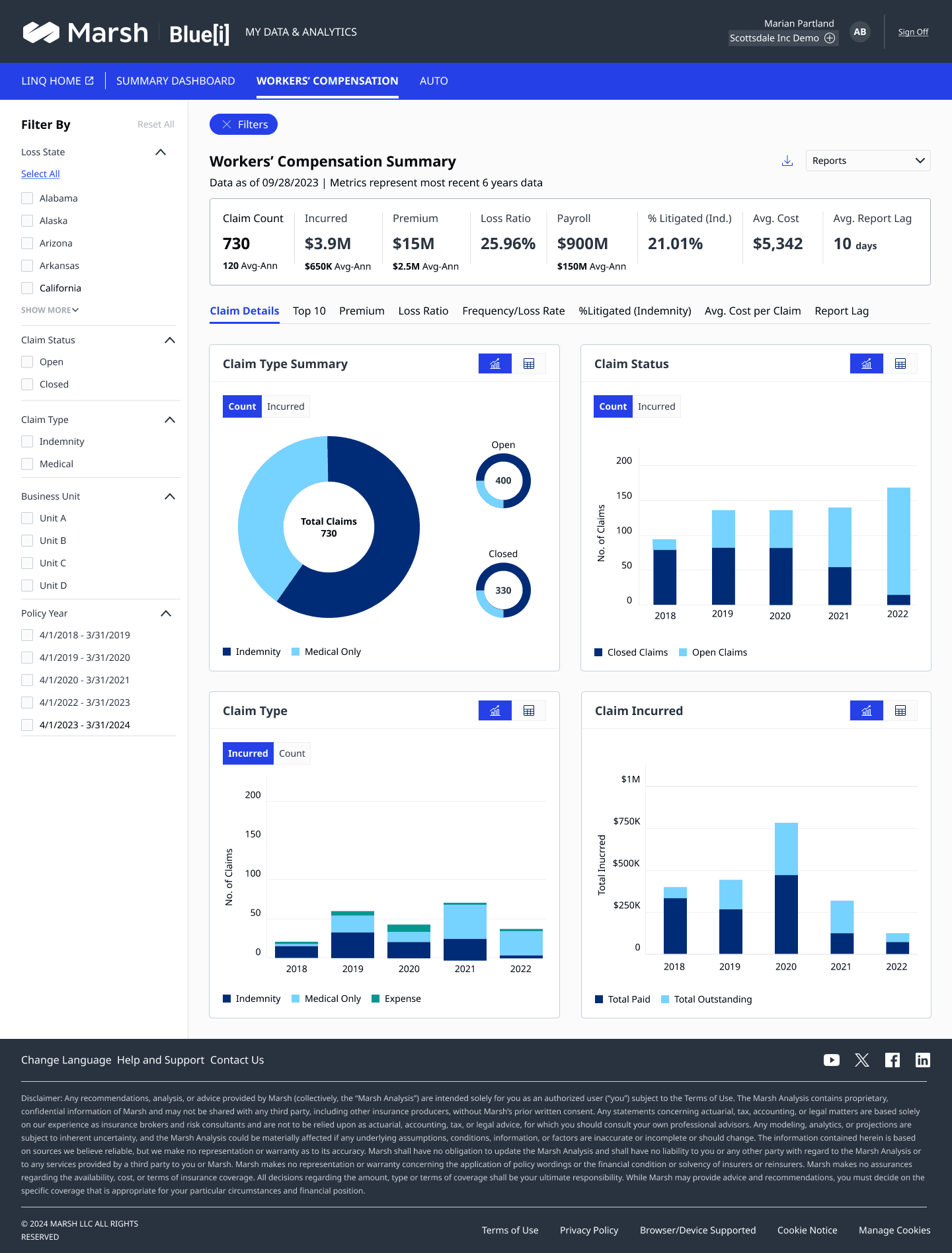
Eight views spanning workers' comp, auto liability, state-level reporting, and contextual filtering — each designed to handle dense actuarial data without overwhelming the user. Every screen went through the full pipeline: stakeholder alignment, design thinking, sprint execution, dev handoff.
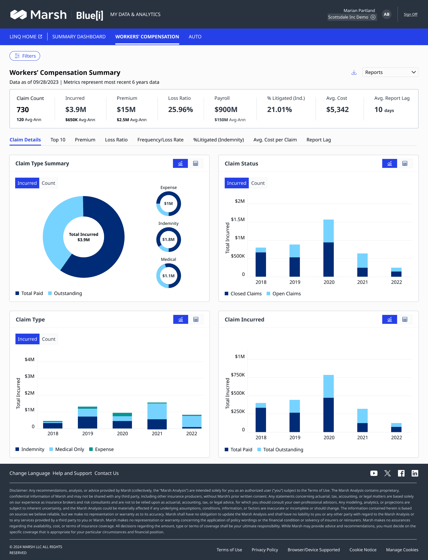
Summary — Claim Count
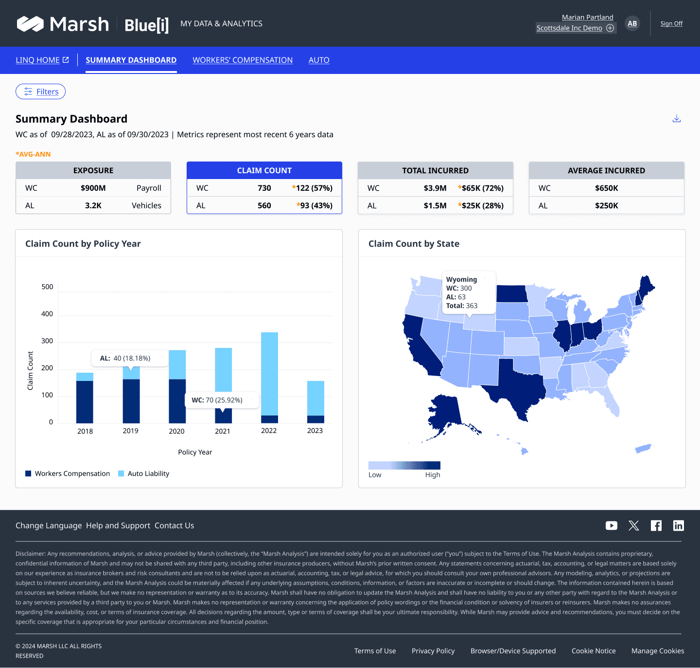
Summary Dashboard
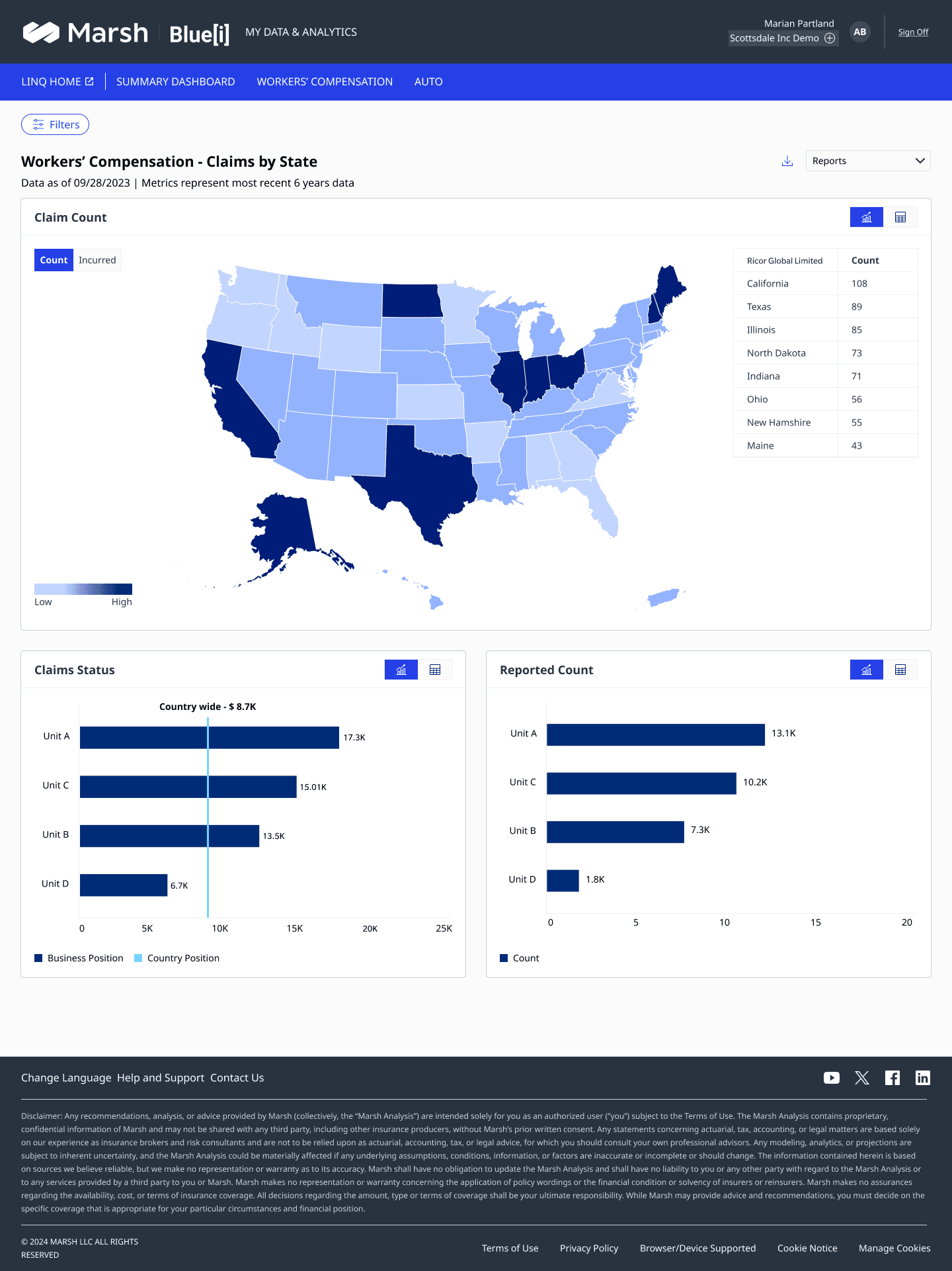
Reports — Claims by State
Filter — Claim Count
Claim Details view
Top 10 Claims
Auto Liability Summary
Report Export view
01 · Decision — Summary Dashboard
Count vs Amount — one toggle, not two screens
Risk managers think in claim counts. Finance teams think in dollar amounts. Early versions had separate views — double the maintenance, split mental models, twice the sprint effort to keep in sync.
The toggle unified both into one screen. The KPI strip always shows both values — the toggle only switches the chart visualisations below it. Users get the headline at a glance and drill into their preferred lens.
One screen to maintain instead of two
Both teams served without building parallel flows
KPI strip anchors the full picture regardless of toggle state
02 · Decision — Geographic View
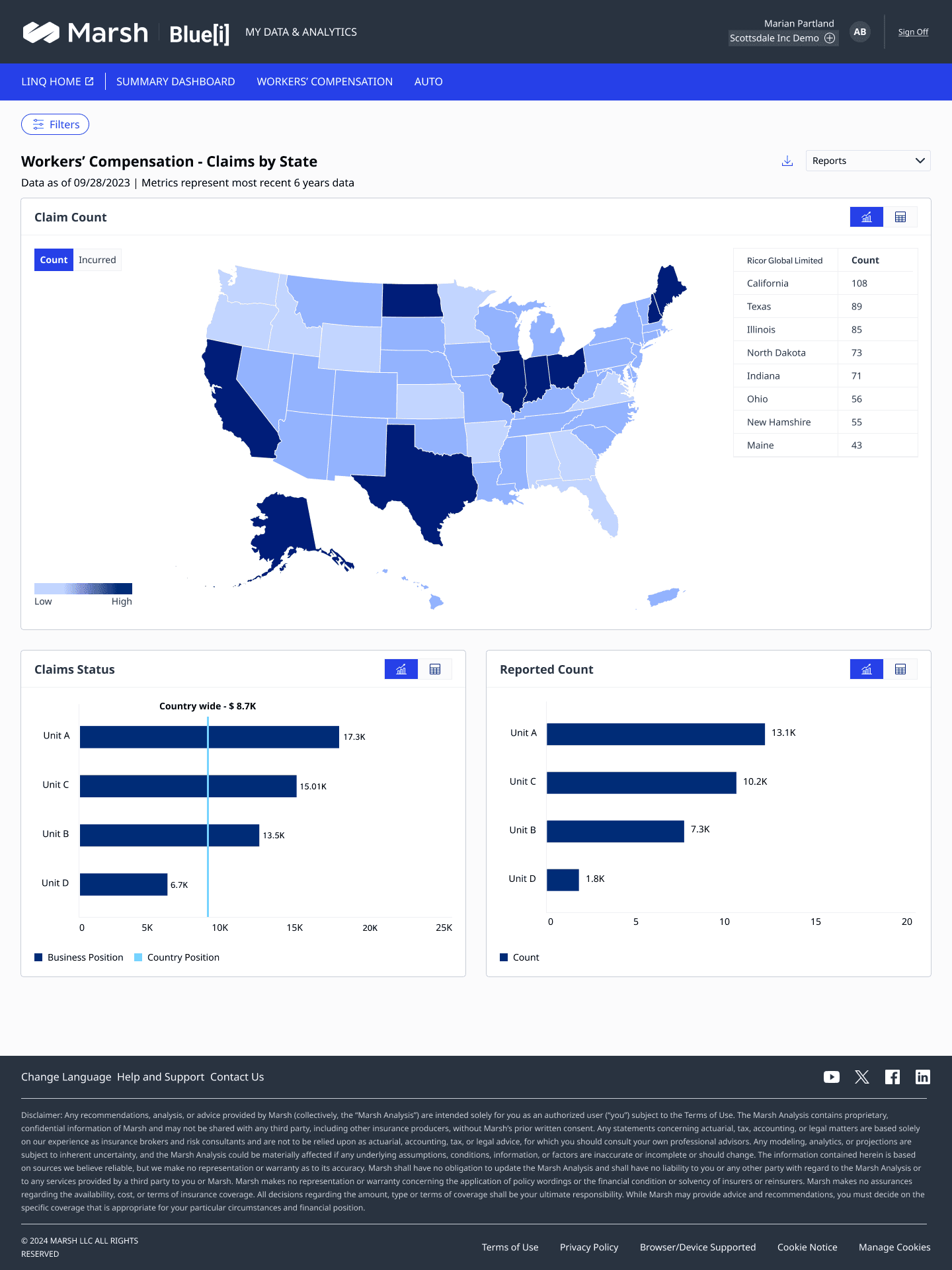
Map first, table second — not the other way around
Early iterations led with a ranked table of states by claim count. Users could find their state — but they couldn't see the pattern. A cluster of high-exposure states in the Southeast is instantly visible on a map. In a table, it's invisible unless you read every row.
The choropleth map became the primary view. The ranked table sits alongside it for precision lookups — but the map does the heavy lifting of pattern recognition at a glance.
Exposure hotspots visible before a single number is read
Table retained for precision — sorted, filterable by state
Colour scale uses the design system data palette — not arbitrary hues
03 · Decision — Filter Drawer
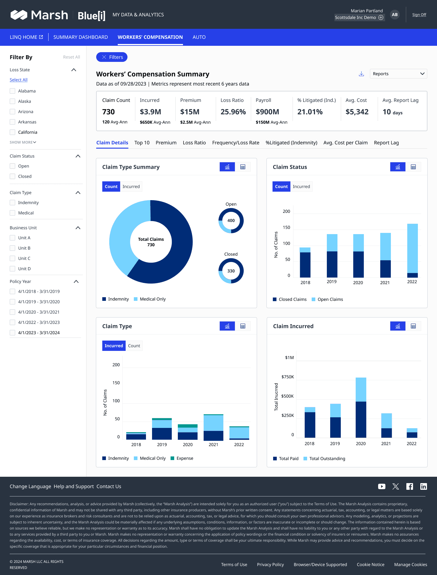
Slide-in, not modal — filtering without losing context
Two other products in the suite used a modal for filtering — which meant the dashboard disappeared the moment you wanted to refine it. Users couldn't see what they were filtering while they were filtering it.
The slide-in drawer overlays the dashboard content rather than replacing it. Users can see the impact of their filter selections on the KPI strip as they make them — reducing trial-and-error and making the relationship between filter and data tangible.
Dashboard remains visible while filtering
Non-destructive — dismiss to return to unfiltered state
Standardised across all 5 products via design system
Interaction principles — across all screens
KPIs always visible
The top metric strip never scrolls away — the headline numbers are always in view regardless of which chart the user is exploring.
Count and amount coexist
Both perspectives on the same data live in one screen. The toggle switches the chart view; the KPI strip always shows both.
Filters are non-destructive
The slide-in drawer overlays content rather than replacing it — users can compare filtered vs unfiltered at a glance by opening and closing.
Geography as a primary lens
State-level exposure is surfaced as a choropleth map, not buried in a table — because scanning a map and reading a table are fundamentally different cognitive tasks.
08 · Outcome
What it became.
5+
Products governed
4
Designers on one system
3
Product teams aligned
1
Design system — zero drift
What changed — and how
Design system
Governance across 5 products — zero drift
A single Figma SSOT replaced 4 isolated files. Component audits every other sprint caught drift before it compounded. By the time the system was fully adopted, the number of design inconsistencies reaching dev dropped to near zero.
Feature pipeline
Stakeholder intent survived the handoff
Before the feature brief process, design intent routinely got lost between stakeholder conversation and sprint story. After formalising the brief, POs had a structured doc to write from — and designers picking up stories had context without needing to re-excavate it.
Sprint execution
Fewer dev questions. Fewer rework cycles.
Mid-sprint PO check-ins caught scope drift on Wednesday instead of Friday. Annotation quality became the metric — fewer dev questions per story meant better Figma specs. The team shipped more confidently sprint over sprint.
AI-assisted workflow
Design-to-code — collapsing the handoff gap
Pioneered using Claude Code to convert Figma designs into production-ready frontend components. This made UX an active delivery partner in engineering sprints — not a step before them. The team is now exploring how to formalise this as a standard part of the handoff workflow.
How it unfolded
Month 1–2
Heuristic audit across all 5 products — identified 12 highest-friction workflows
Month 3
Figma design system v1 shipped — token foundation + first 8 core components
Month 4–5
Feature pipeline formalised — first feature brief written and PO-adopted
Month 6+
Sprint cadence stabilised — weekly rhythm embedded across all 3 product teams
Ongoing
AI-assisted design-to-code workflow in active use — accelerating legacy UI migration
What I learned
Leading vs executing
The hardest thing about holding both layers simultaneously is knowing when to zoom out and when to zoom in. Strategic thinking done in the wrong moment creates disconnected visions. Execution done without strategic grounding creates technically correct but directionless work.
Design systems are social, not technical
The tokens and components were the easy part. Getting 4 designers to adopt the system — and trust it enough to pull from it instead of going rogue — required governance rituals: reviews, audits, and deprecation notes that made the system feel safe to depend on.
The brief as a forcing function
Writing a feature brief forced me to validate my own thinking before handing it to a PO. If I couldn't articulate the problem clearly enough to write the brief, I didn't understand it well enough to design it. The brief was as valuable to me as it was to the team.
Outcome — final shipped screen or team moment
A final shipped dashboard view, a team photo, or a before/after comparison showing the impact of the design system.
Some artifacts in this case study represent conceptual recreations of work completed during the engagement. Real customer data, personally identifiable information, and pre-release product details have been anonymized or replaced with representative placeholders to respect client confidentiality.