MSCI App Platform
Investment Analytics
MSCI is the world's most trusted source of ESG, climate, and financial data. I was brought in to enhance the platform experience — working with internal stakeholders to surface what wasn't working, and delivering high-fidelity designs across the full investment workflow.
Company
MSCI Inc.
Role
Senior UX Designer
Scope
UX Design · Hi-Fi Mockups · Platform Enhancement
Timeline
2021 – 2022
The Platform
One workspace.
The entire investment lifecycle.
From screening an idea to generating a risk report — every step connected, in one place.
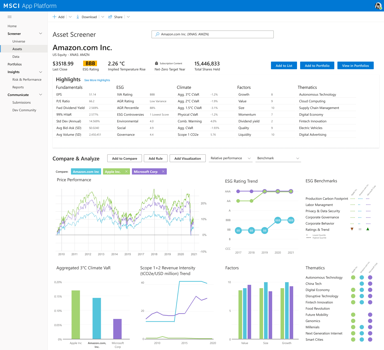
ESG, climate, factor, and fundamental data on any security
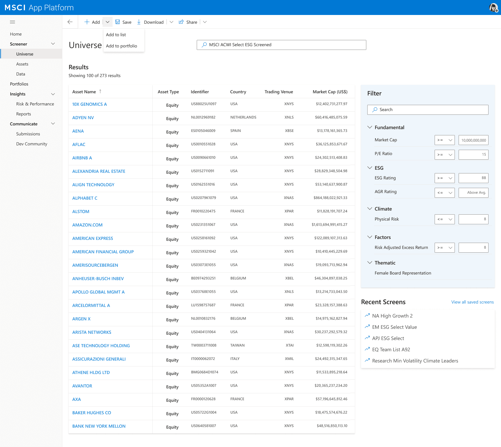
Filter 215+ equities by any signal combination, save as reusable screens
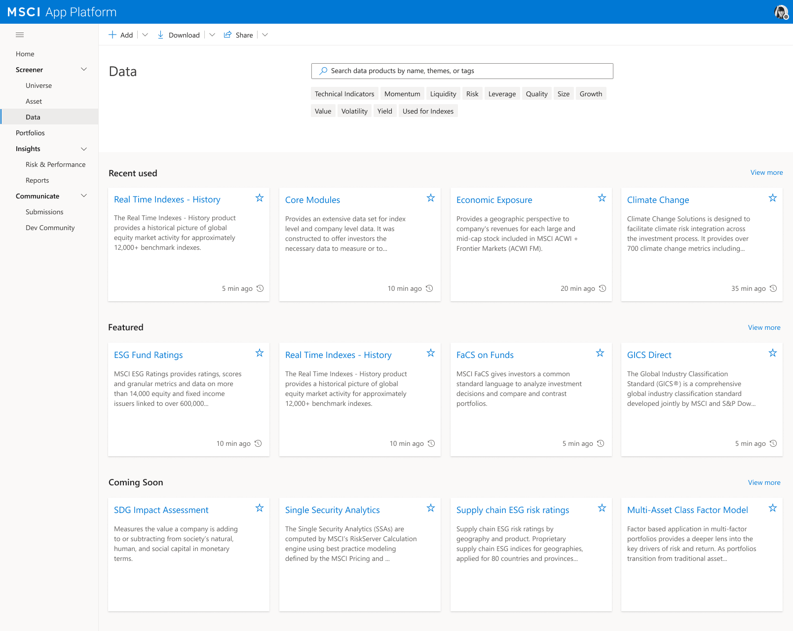
Browse and subscribe to MSCI data products without leaving your workflow
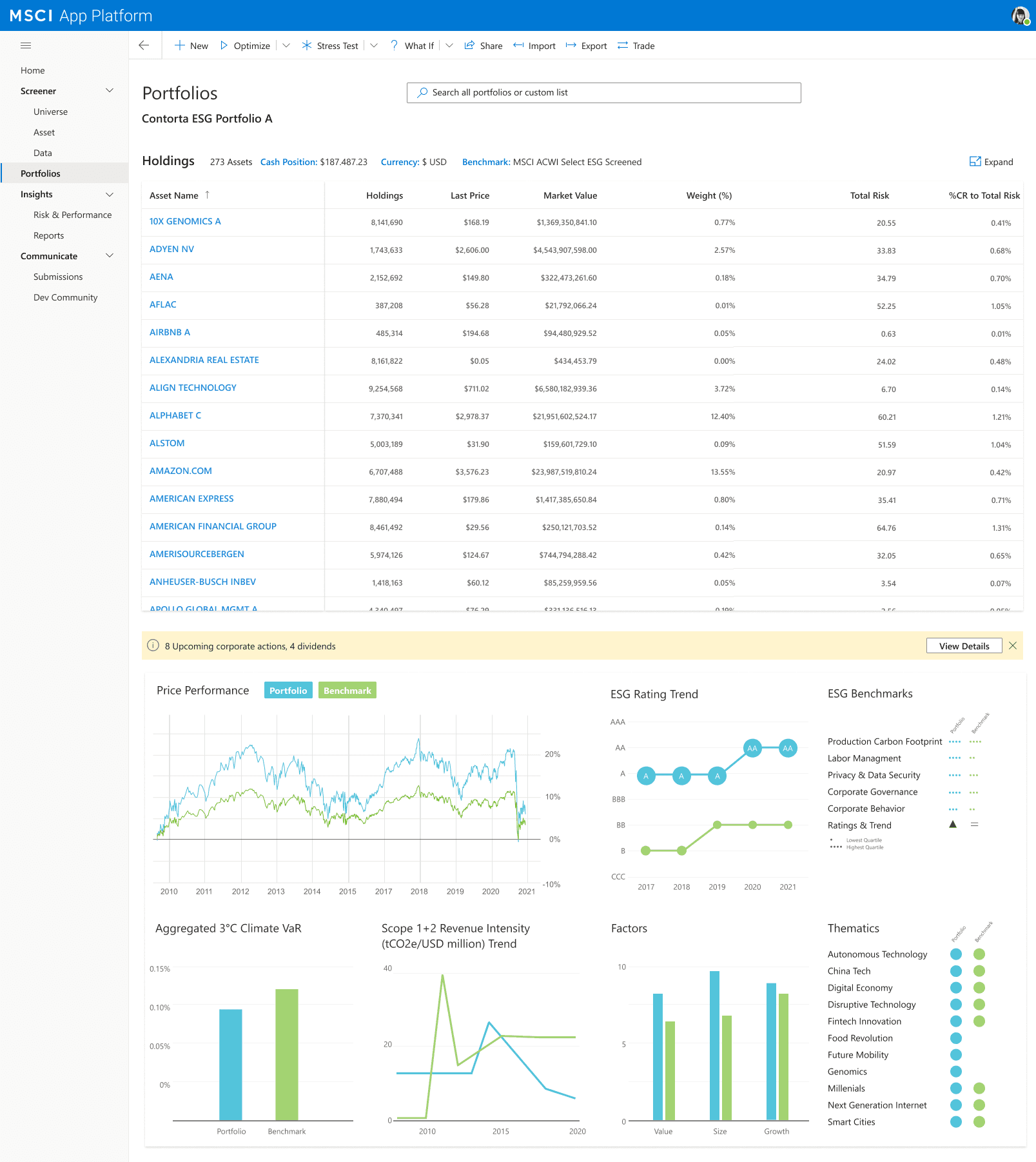
Holdings with ESG, climate, and risk overlays — all in one scroll
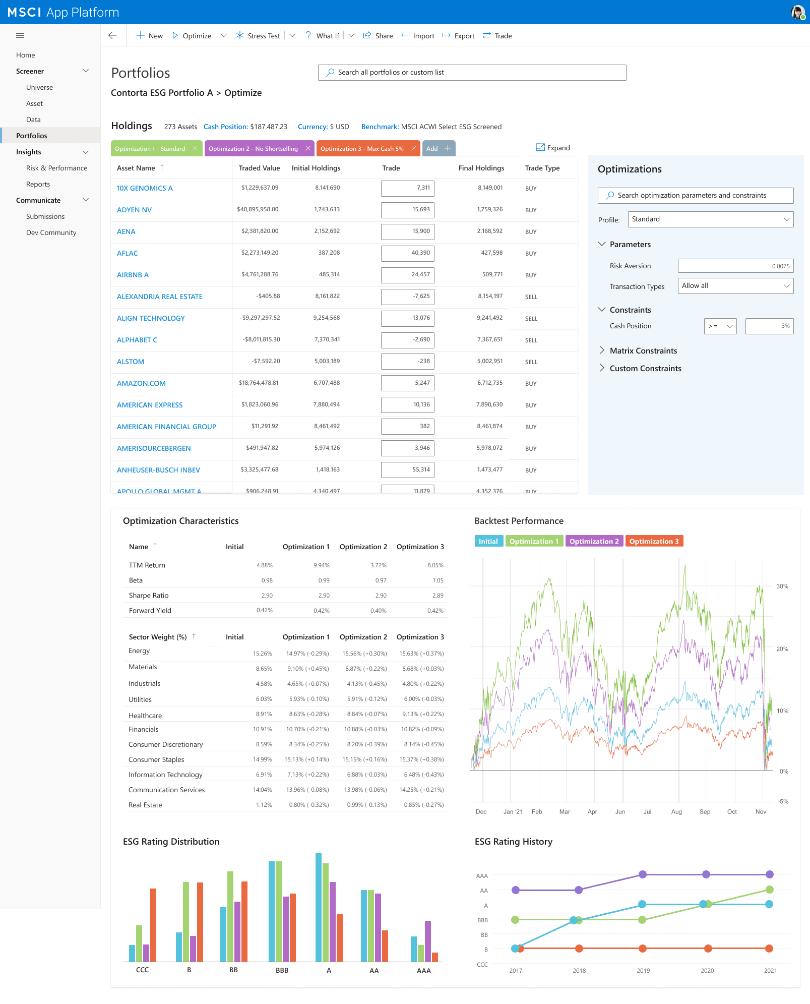
Four optimization scenarios compared side by side with backtest performance
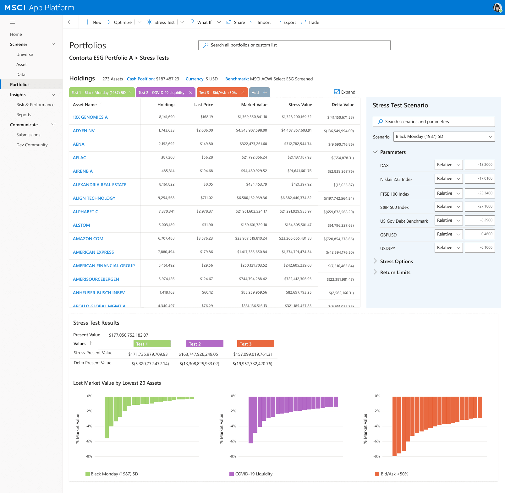
Historical crises and custom macro shocks — monetary impact by asset
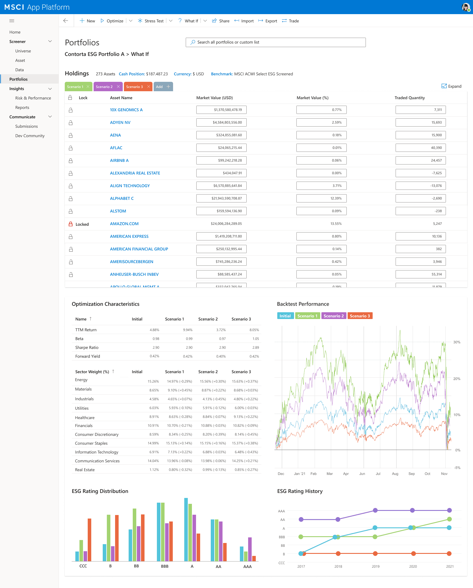
Scenario modeling with lock/unlock controls across four scenarios
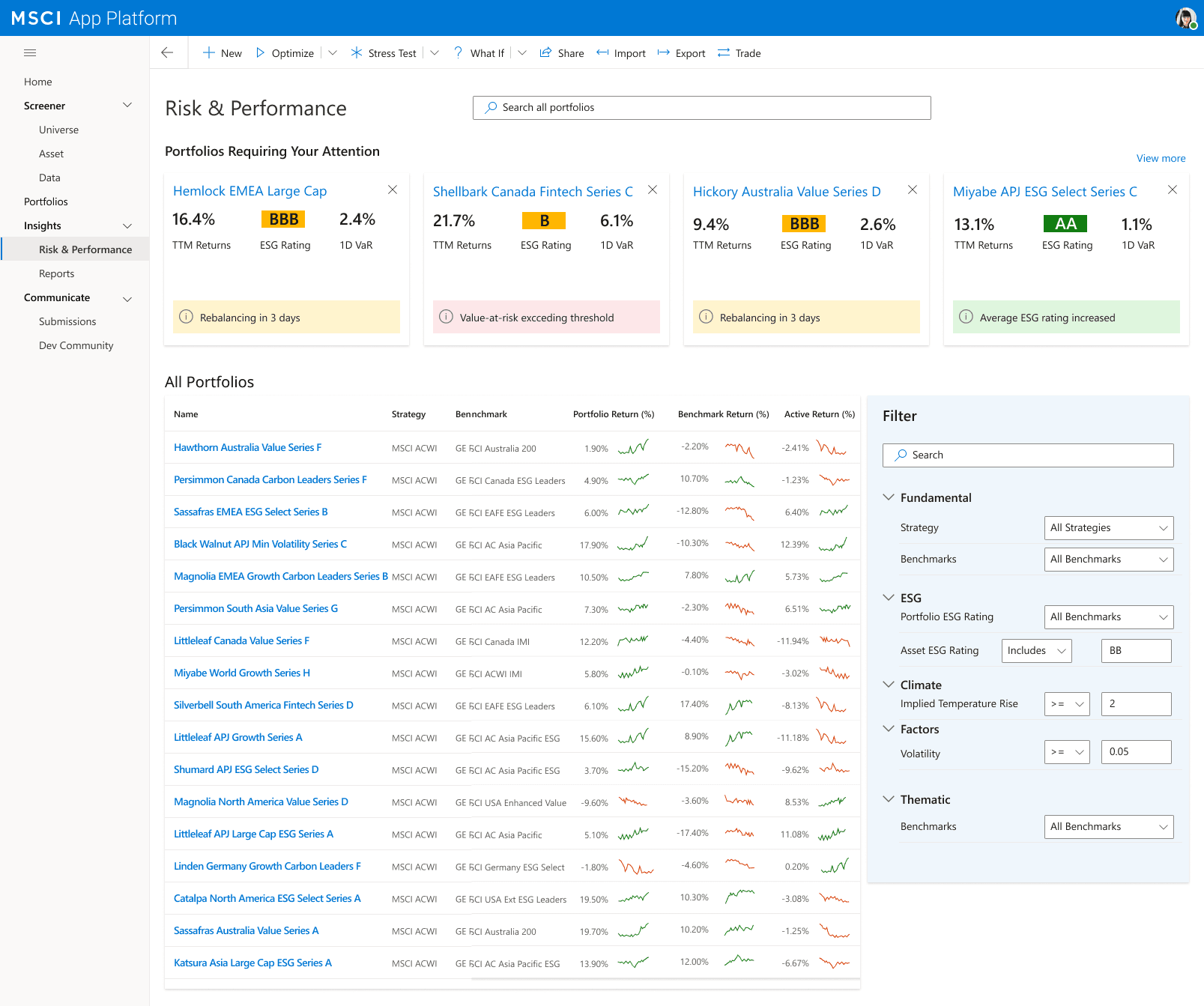
Alert-first monitoring — problem portfolios surface before you go looking
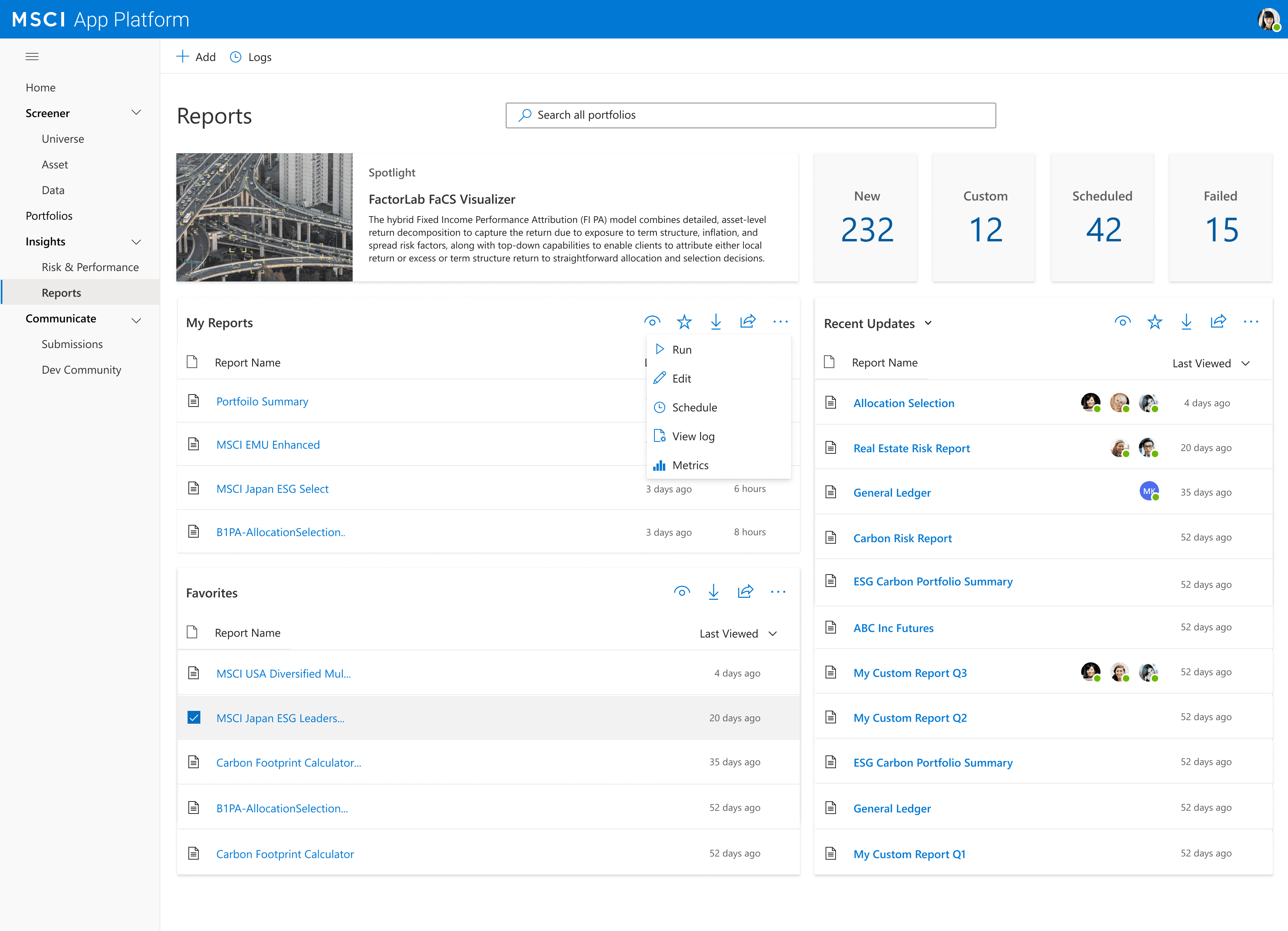
Scheduled and custom reporting, centralized with sharing indicators
My Approach
Designing without
direct user access.
In institutional finance, direct access to end users isn't always possible — confidentiality protocols exist for good reason. The craft is learning to design through the next best thing.
Internal experts as proxies
Worked through product owners, domain specialists, and subject matter experts as proxies for the portfolio managers we couldn't reach directly. Every requirement was validated through that chain — tied to a real workflow, not a feature request.
Expert review as the loop
Without usability sessions, design critique and heuristic analysis became the validation loop. Each iteration was stress-tested against one question: does this make an expert's eye land on the right thing first?
30+ screens, React-ready
Delivered 9 platform modules in Figma — annotated with component states, data binding, and responsive breakpoints. The deck served as both a stakeholder alignment artifact and a direct engineering spec.
Design Decisions
Five decisions.
Each proven by a screen.
Institutional finance UX isn't a simplification problem — it's an organisation problem. Every decision below was a direct answer to something that wasn't working.
01
Persistent analytical context
The same panel stack — Price Performance, ESG Rating Trend, Climate VaR, Factor exposures — follows you across every module. You never lose your analytical frame when you navigate.
02
The workflow is the navigation
Universe → Screener → Portfolio → Optimize → Stress Test → What If → Risk & Performance. The structure follows the natural investment decision cycle — you always know where you are and what comes next.
03
Alert-first risk monitoring
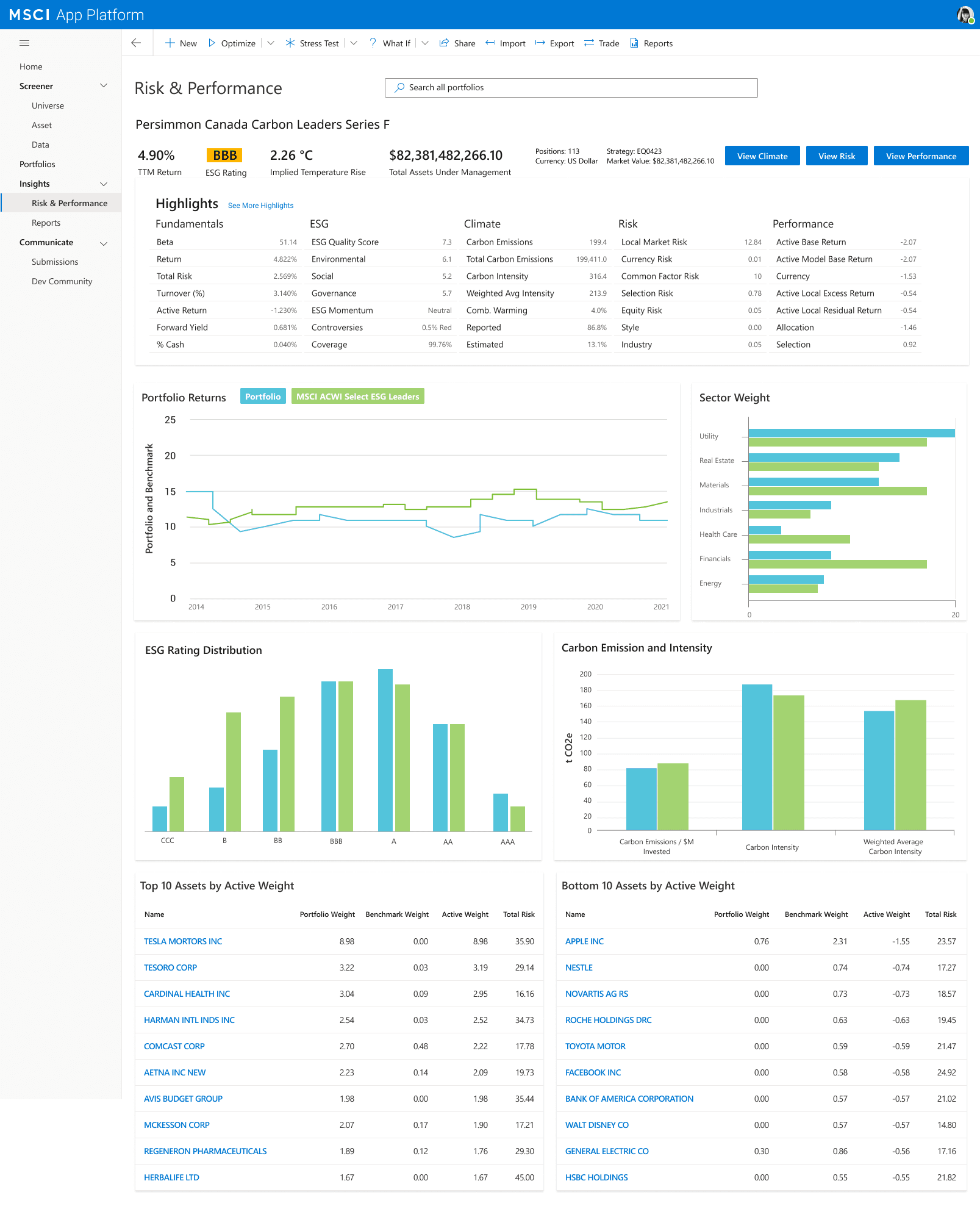
Problem portfolios surface at the top of the Risk & Performance view — before the analyst goes looking. ESG threshold breaches, value-at-risk exceedances, climate flags — all visible immediately.
04
Scannability over simplification
Analysts don't need the data explained — they need it organised. Every view was designed around one question: what makes an expert's eye stop here? Bold callouts, consistent colour semantics, anomalies surfaced first.
05
Data marketplace inside the workflow
Rather than a separate portal, the data catalog is a module inside the platform. Discover, preview, and subscribe to new datasets without ever breaking your analytical context.
The Artifacts
High-fidelity.
Every module, end to end.
Figma screens covering the full investment lifecycle — annotated for React handoff.
Outcome
One product.
Not nine screens.
The design work landed because the UX logic was consistent enough to be credible. The same principles that shaped the Asset Screener were visible in the Portfolio Optimizer and the Risk & Performance Hub — it read as one platform, not a collection of separate tools.
9
Platform modules
30+
Hi-fi screens
6
Data dimensions
React-ready
Spec fidelity
Reflection
Financial UX isn't a simplification problem — it's an organisation problem. The principle that unlocked this project was treating the analytical panel as a constant across every module. Once that held, every other decision followed naturally — and the platform started to feel coherent rather than assembled.
Some artifacts in this case study represent conceptual recreations of work completed during the engagement. Real customer data, personally identifiable information, and pre-release product details have been anonymized or replaced with representative placeholders to respect client confidentiality.