Design Systems · Marsh McLennan · 2025 – Present
Claims
Design System
Building Marsh McLennan's enterprise design system from zero — 34 components, 5 products aligned, one shared visual language.
34
Components shipped
5+
Products aligned
4
Designers governed
01 · The Problem
Fragmentation
compounds quietly.
Nobody planned for five products to drift apart. It happened sprint by sprint, team by team — until the gap between what design intended and what shipped became impossible to ignore.
Five products. No shared language.
Each product team independently implemented buttons, forms, and alerts — in slightly different ways, every sprint. Nobody planned the fragmentation. It just accumulated.
Built from scratch. Again.
Designers were recreating the same components every sprint — not because the patterns were wrong, but because no shareable version existed. The work was real. The output was disposable.
No accessibility baseline.
WCAG compliance was managed separately by each team — inconsistently, and without a shared standard. For a regulated insurer, that inconsistency isn't a design problem. It's a legal one.
Which file is current?
Developers asked this every sprint. The answer was always 'let me check.' A small exchange — but one that signalled a much larger structural gap underneath.
The trigger wasn't a design initiative. It was an engineering question that had probably been asked a hundred times before — but this time it landed differently: “Which version of this component should we build to?” The answer was: it depends on which product.
02 · Discovery
Before Figma,
five conversations.
Design systems built without upfront discovery become component kits. The research phase is where the system earns its authority — before a single token is named.
UI Inventory
Audit every component across all 5 products before opening Figma. Make the fragmentation visible — not as an opinion, but as evidence.
Designer Interviews
One question with every designer: "What do you rebuild every sprint?" The answers became the priority list for the component library.
Engineering Alignment
Agree on token architecture and handoff expectations before setting a single value. Naming decided jointly — not handed over.
Naming Convention
Modal or dialog? Chip or badge? A system with inconsistent names fragments the moment someone else uses it. Names first, designs second.
Scope Definition
Decide explicitly what phase 1 is NOT. Design systems fail most often from scope creep before they ship — not from bad components.
No Figma was opened until all five conversations were complete.
Discovery is not a phase you do before the real work. It is the real work.
03 · The Timeline
Built alongside.
Never instead of.
Five product teams kept shipping through the entire build. The design system was constructed in four phases over 24 weeks — invisible to sprints until it was ready to be adopted.
Discovery
UI inventory, designer interviews, engineering alignment, naming decisions, scope definition.
Foundation
Colors, typography, spacing, grid, border radius, shadow — the atomic layer every component inherits.
Core Components
Buttons, form fields, alerts, tables — the highest-frequency components released and available for adoption.
Extended Library
Navigation, data display, Chatbox, specialist components — the full 34-component system complete.
Track
Weeks 1 → 24
Design System
Discovery
Foundation
Core Components
Extended Library
Product Sprints
Continued uninterrupted — all 24 weeks
New features adopted the system immediately. Legacy screens migrated naturally as they were touched in normal sprint cycles — no full rewrite, no blocked sprint, no disruption.
04 · Foundation
Six decisions.
Everything inherits from them.
Before a single component was designed, the atomic layer was locked. Color, type, spacing, grid, radius, shadow — each one a solution to something the UI inventory had exposed.

Color System
One semantic palette replaced 5 teams maintaining their own shades of red for error states.
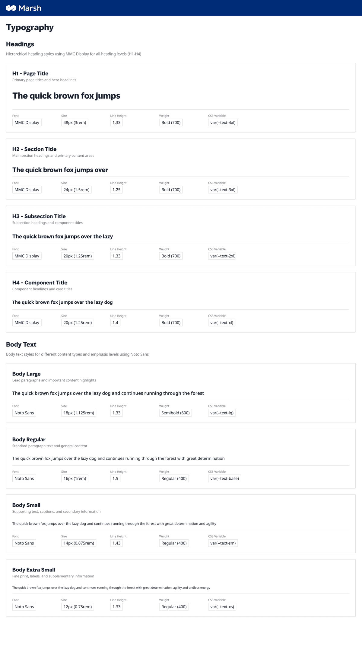
Typography
A 6-level scale, each with a defined role — no more guessing which size belongs to a label vs. a heading.
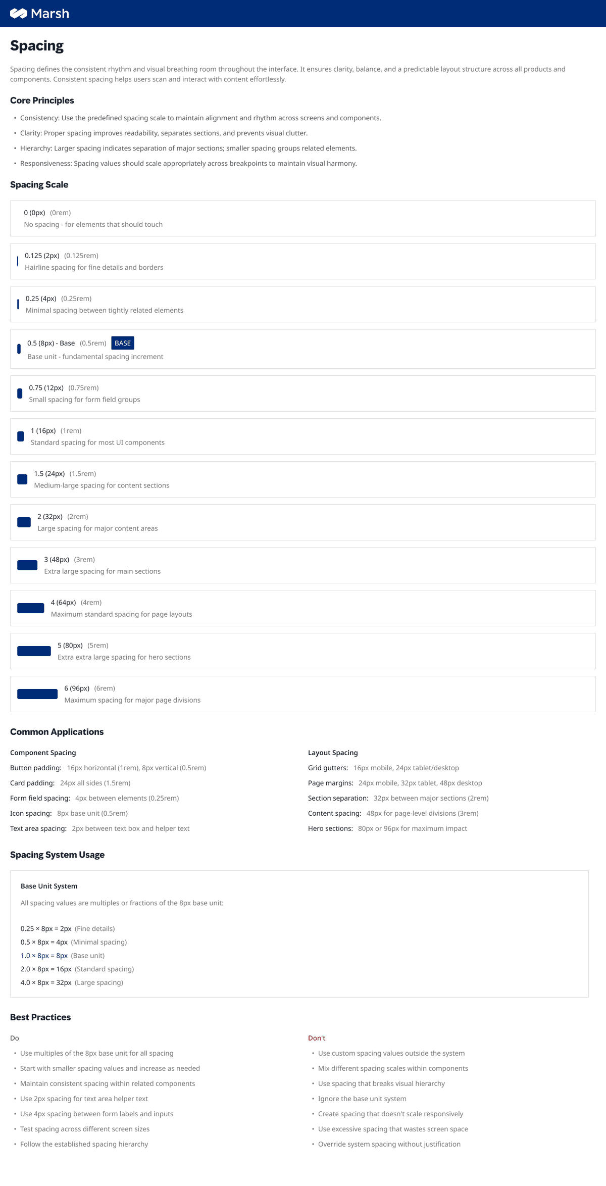
Spacing
4px base grid. Every gap in every product now traces to the same root value.
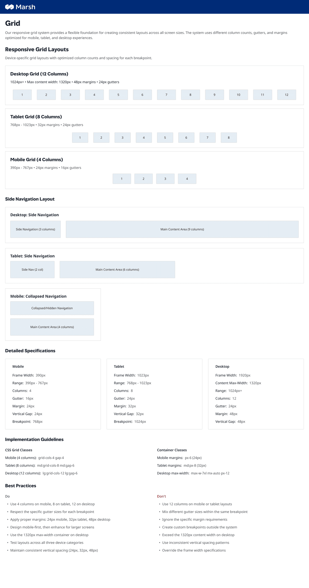
Grid
Responsive column system that made 'it doesn't line up' a non-conversation.
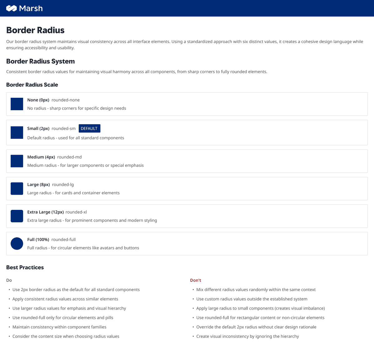
Border Radius
2px as the default. Simple, consistent, enterprise-appropriate — six steps from sharp to full.
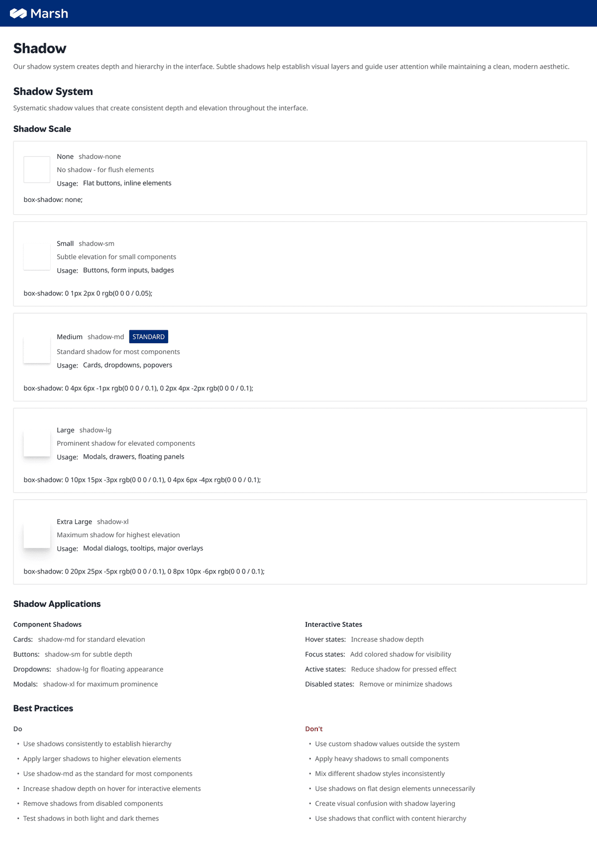
Shadow
Five elevation levels — enough to create hierarchy, not enough to create noise.
These weren't arbitrary aesthetic decisions. Each one was traceable to something the audit had surfaced — the foundation is the audit's answer, made permanent.
05 · Component Library
34 components.
Every one ships complete.
Every component in the library ships with variants, interaction states, accessibility guidance, and explicit Do's and Don'ts — written for other designers, not just for reference.
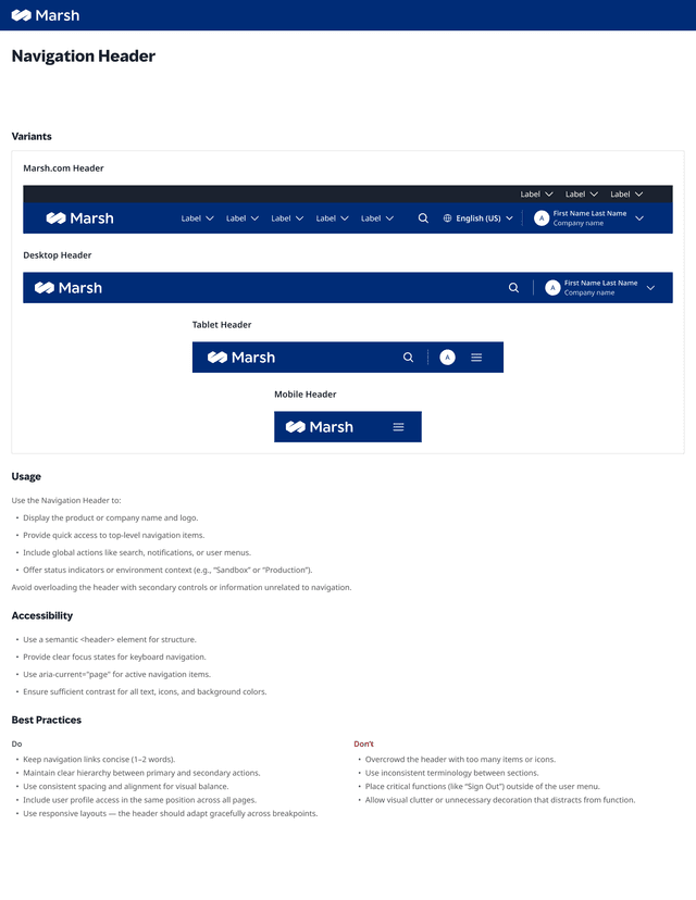
Navigation Header
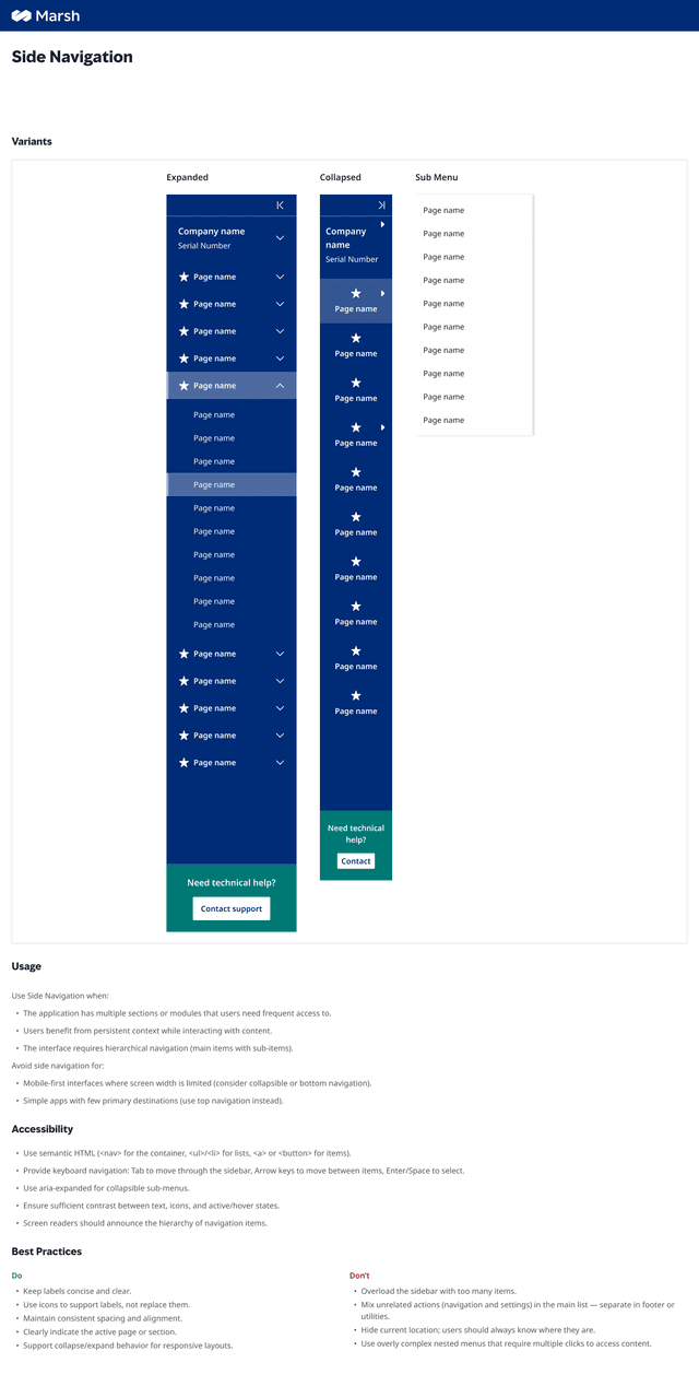
Side Navigation
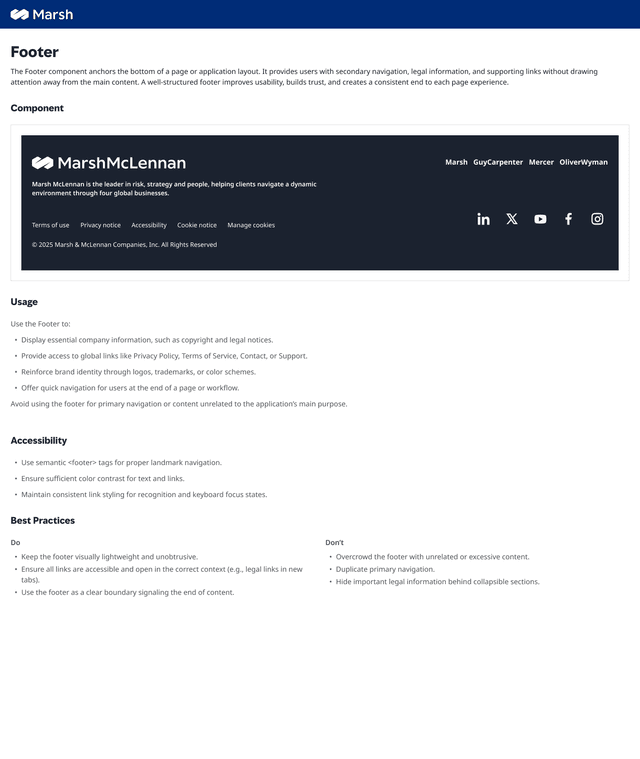
Footer
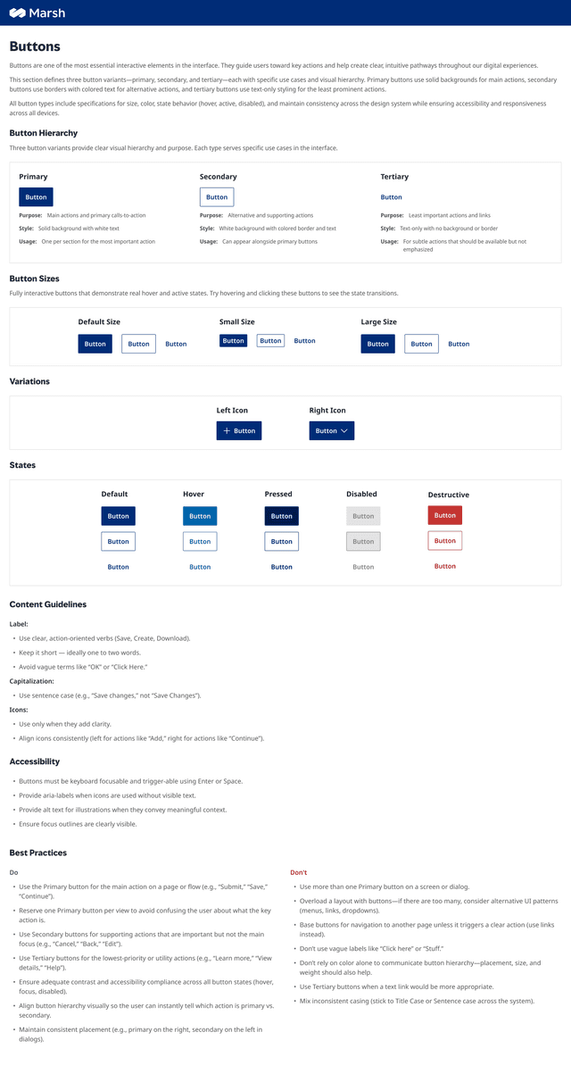
Buttons
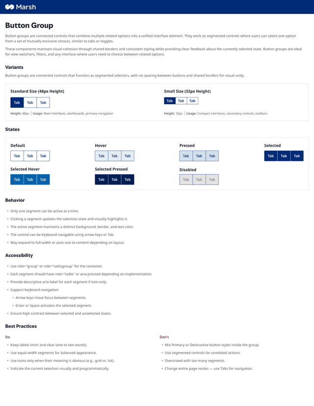
Button Group
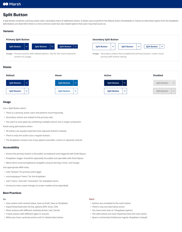
Split Button
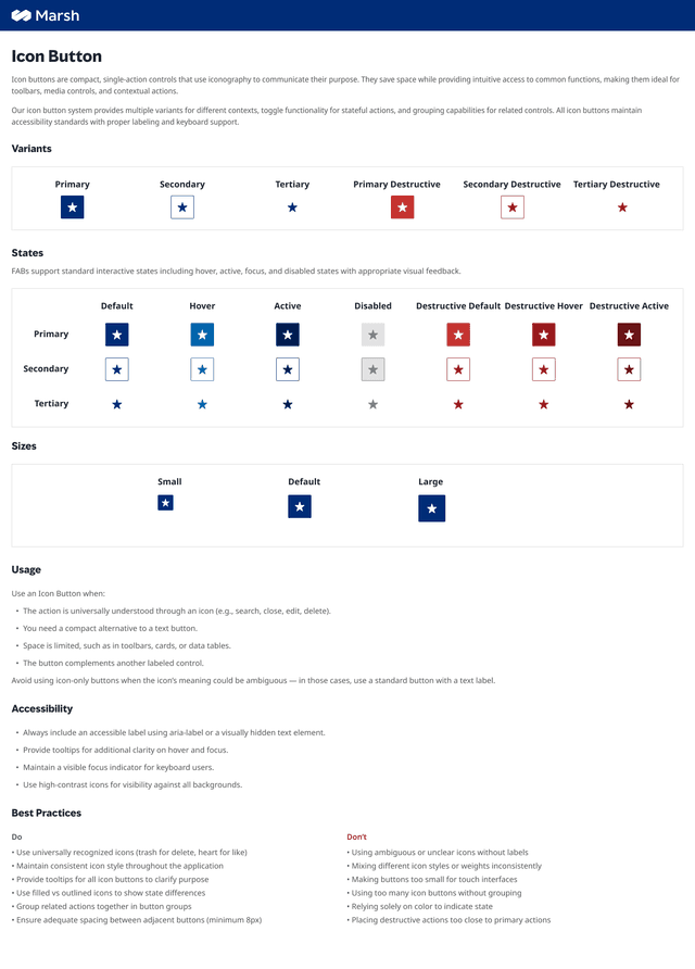
Icon Button
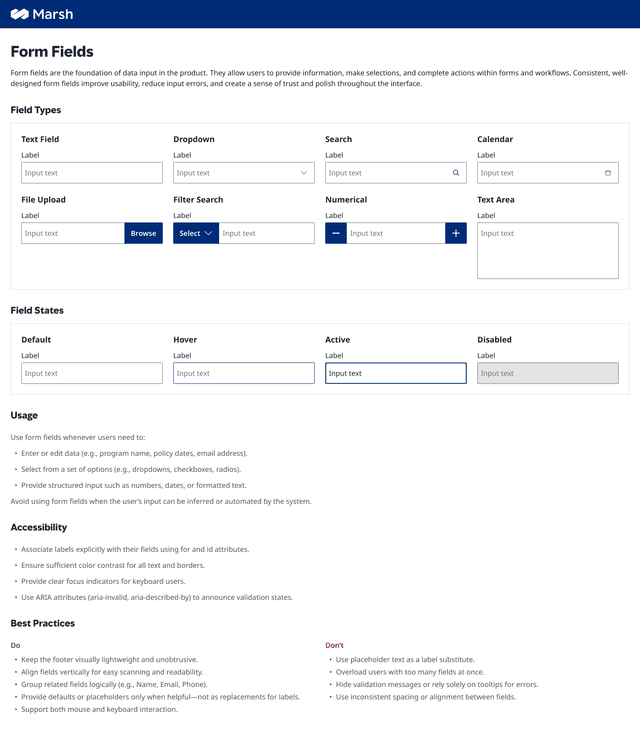
Form Fields
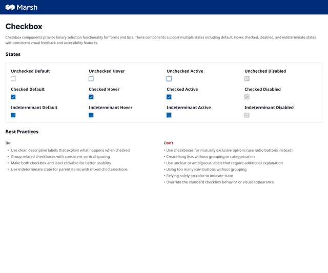
Checkbox
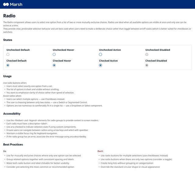
Radio
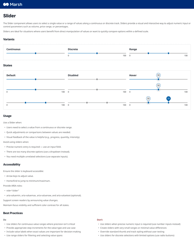
Slider
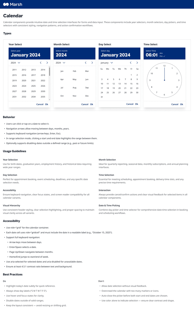
Calendar
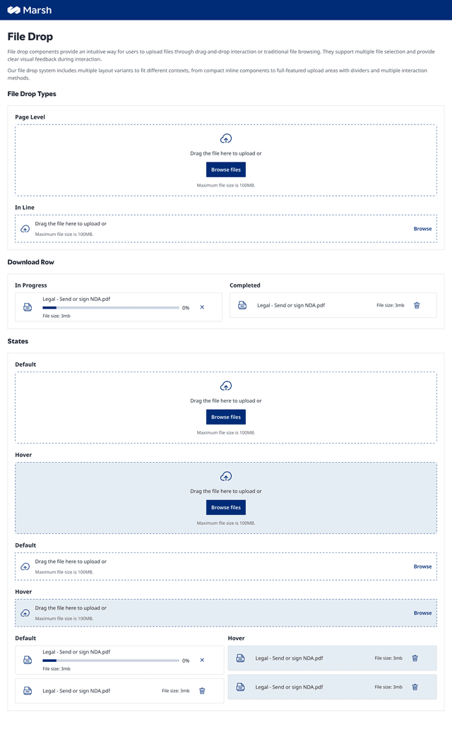
File Drop
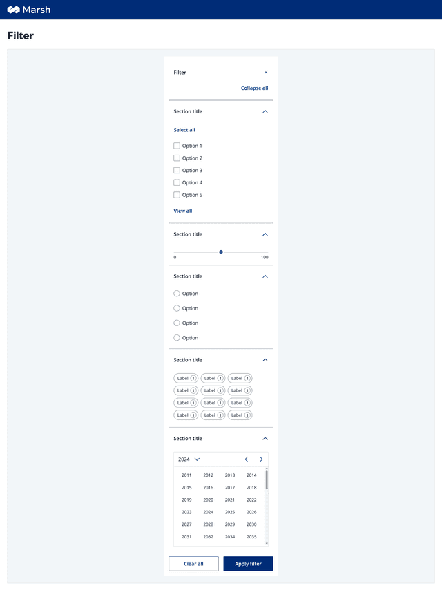
Filter
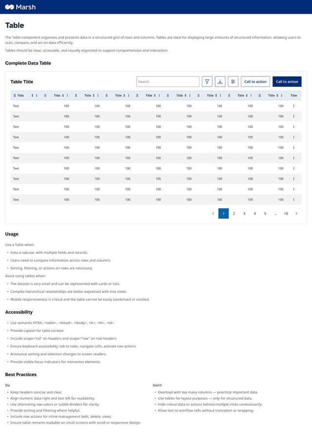
Table
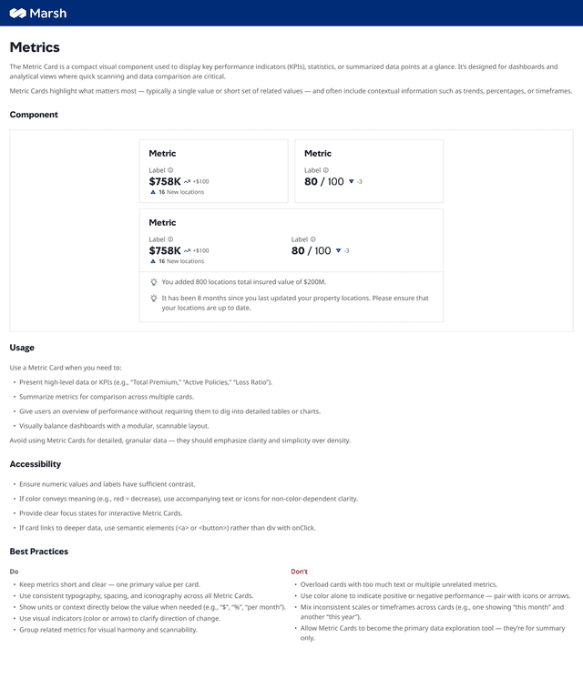
Metrics
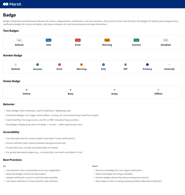
Badge
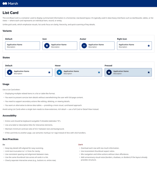
List Card
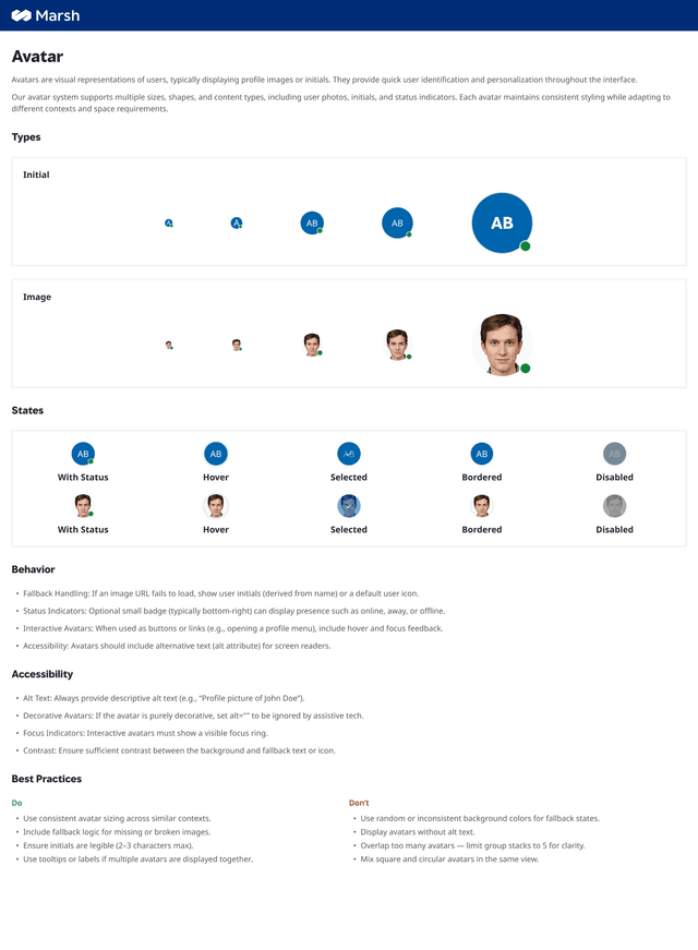
Avatar
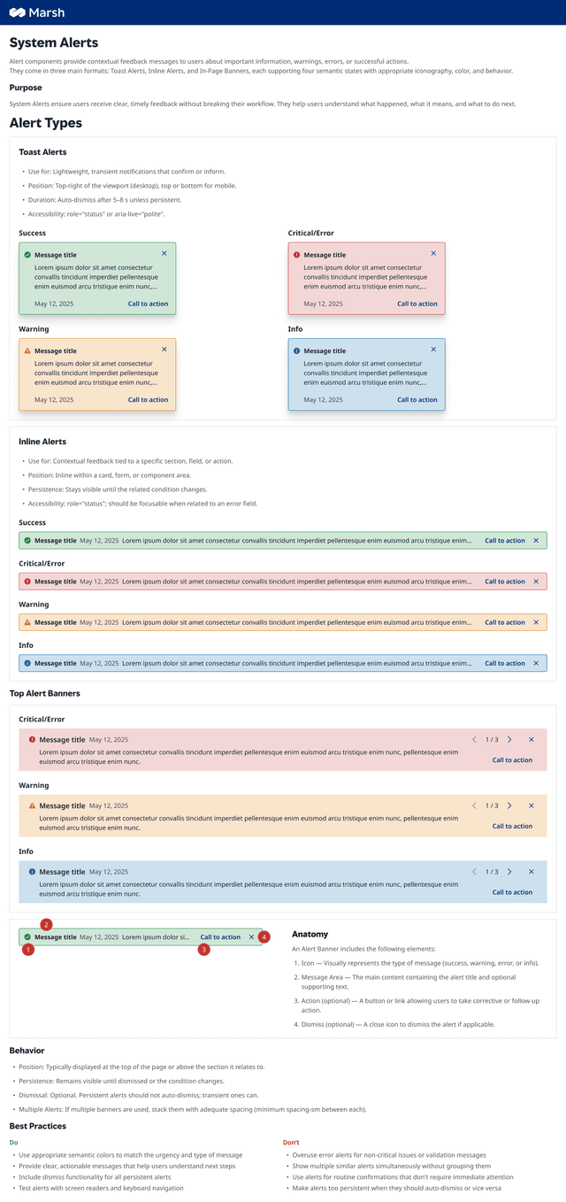
Alerts
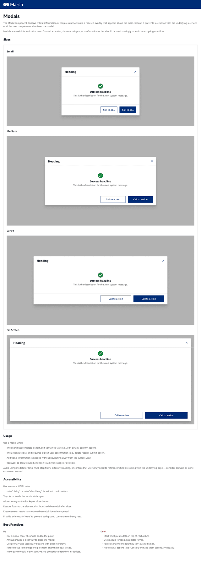
Modals
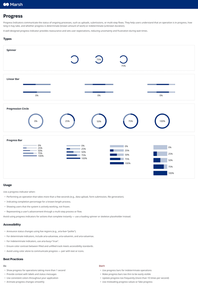
Progress
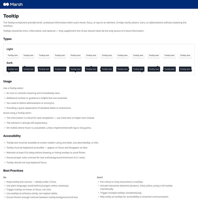
Tooltip
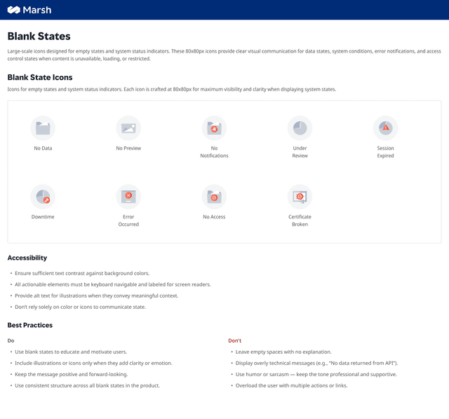
Blank States
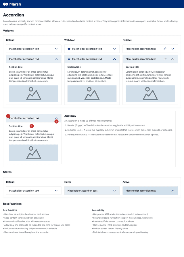
Accordion
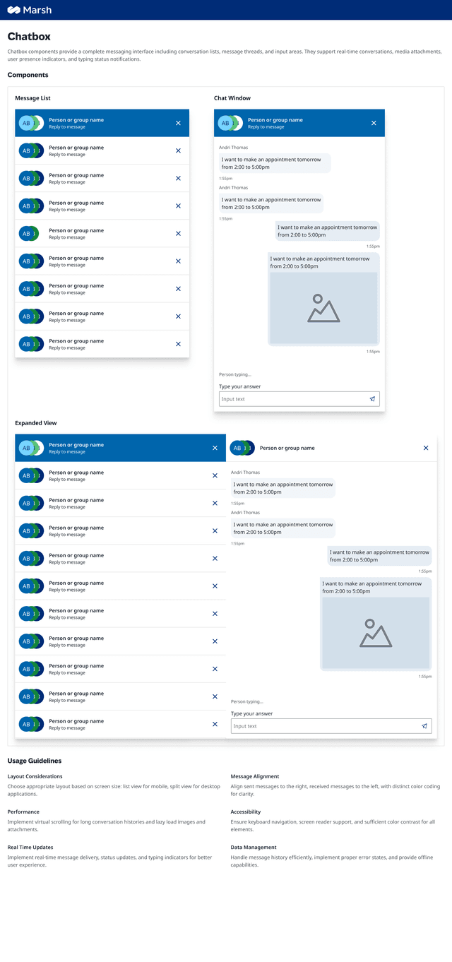
Chatbox

Icons
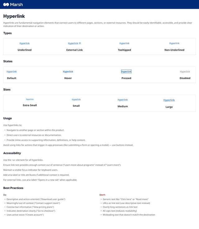
Hyperlink
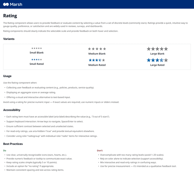
Rating
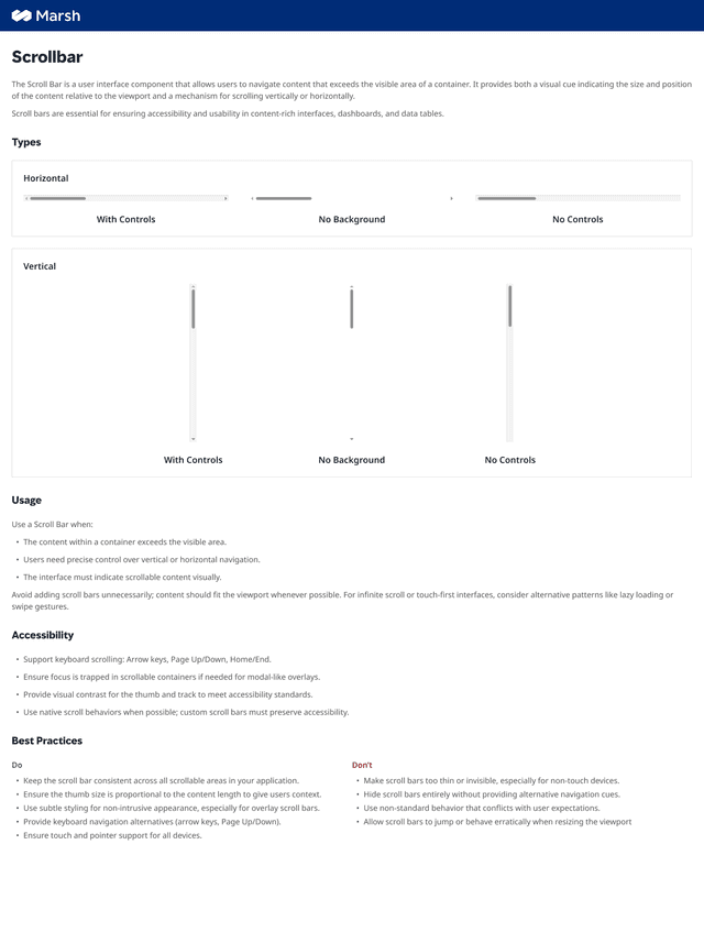
Scrollbar
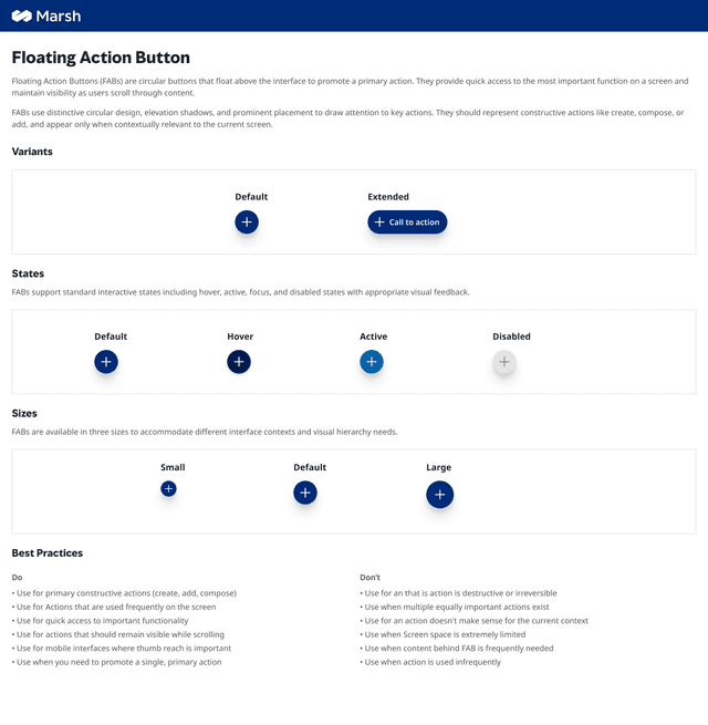
Floating Action
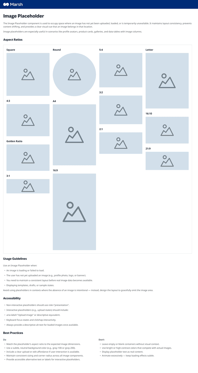
Image Placeholder
Every component built to the same standard — variants, states, accessibility, Do's and Don'ts. No exceptions.
34
Components
06 · Featured Components
Five components.
Worth looking at closely.
These aren't just polished screens. Each one solved a specific problem the previous system couldn't — and each one is used live across claims products today.
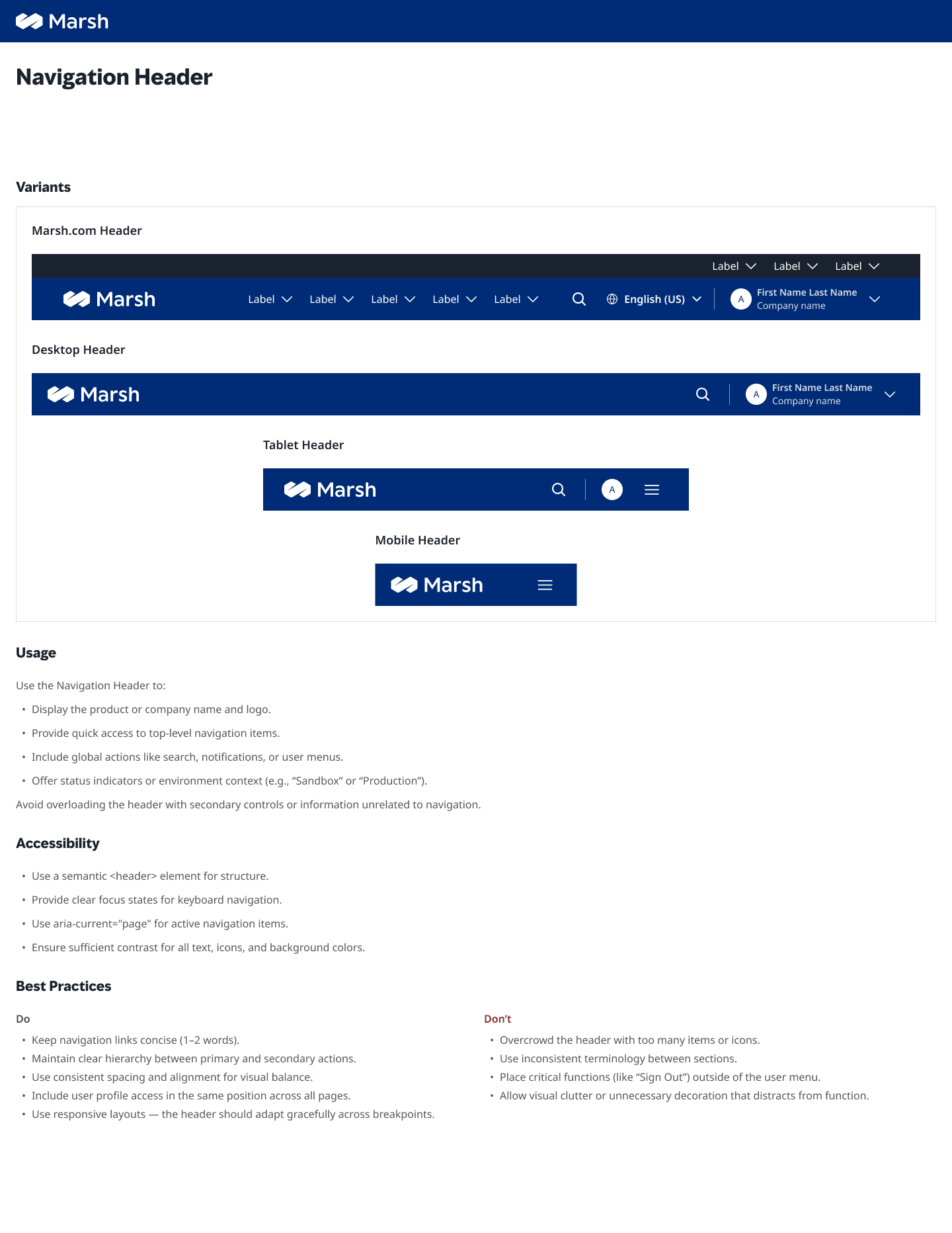
One bar. Every product.
The header had to work across five products with different nav depths, different user roles, and different viewport breakpoints — without visual fragmentation. A single token-driven layout handles all of it. Search, user context, and primary nav collapse gracefully to a single breakpoint, not a series of hacks.
Navigation Header
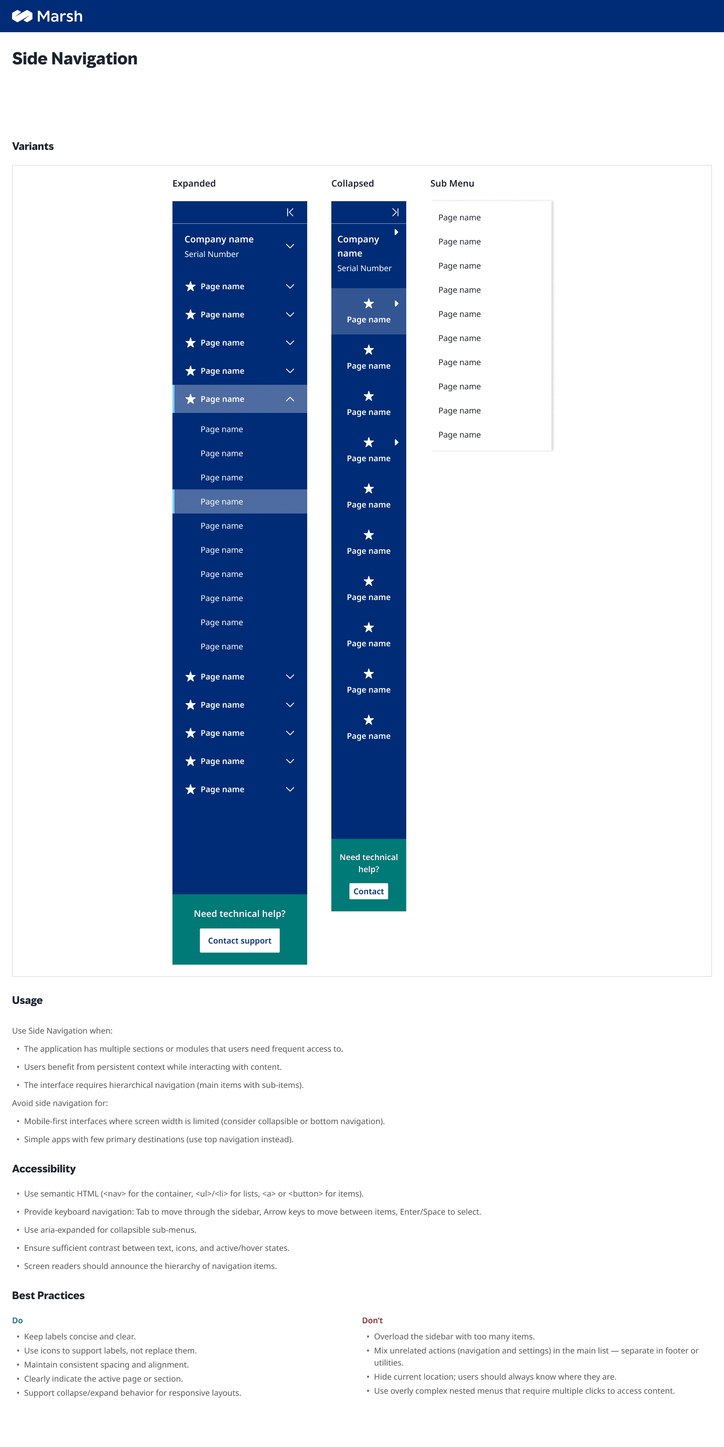
Collapsed by default. Expanded on intent.
Claims workflows are multi-step and context-heavy. The side nav needed to surface hierarchy without eating screen real estate. Icons-only at rest, full labels on hover or pin — built so developers implement once and the interaction handles itself through CSS state, not custom JS per product.
Side Navigation
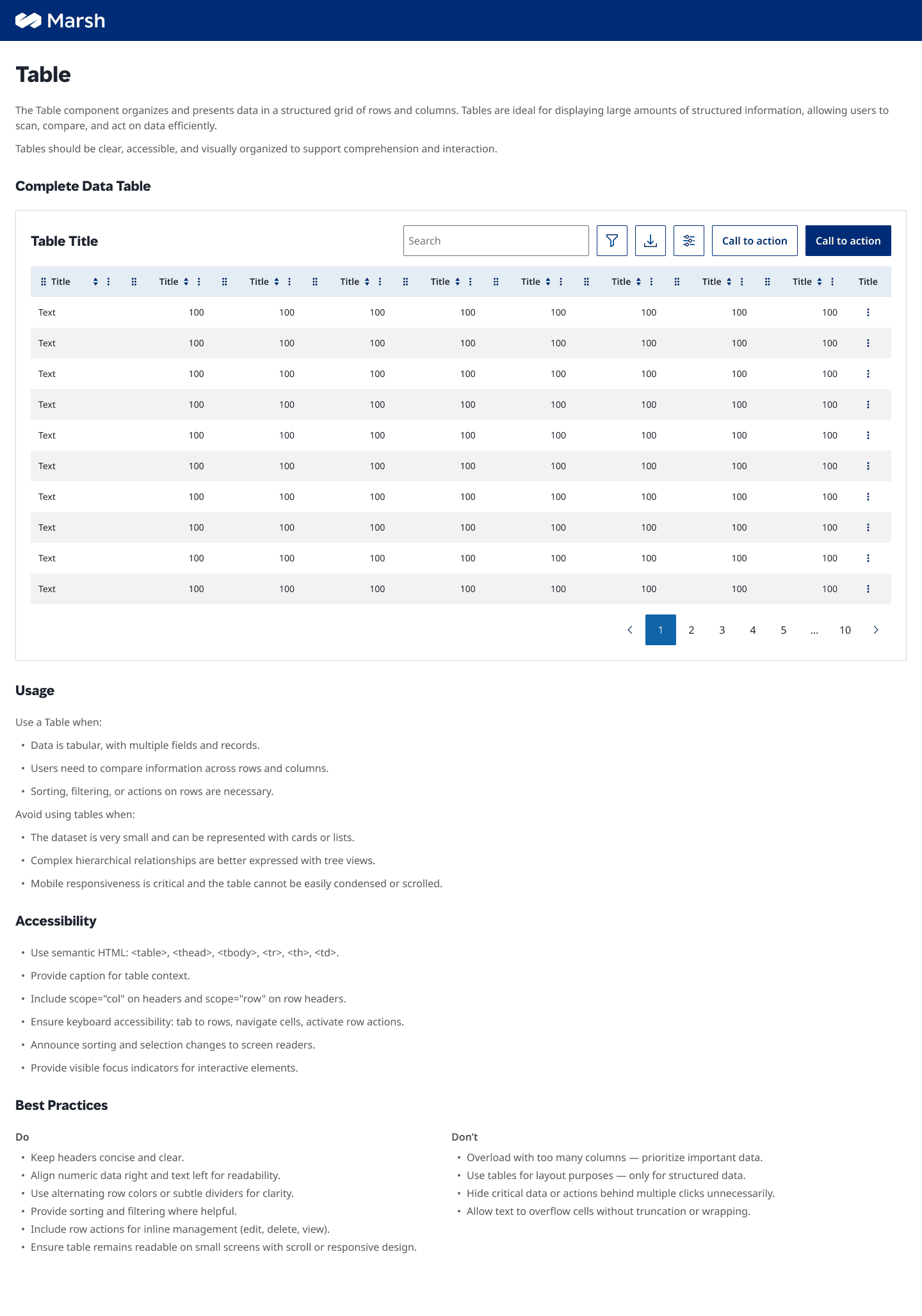
The most-used component in the system.
Claims processing is almost entirely table-driven. This component ships with sortable columns, sticky headers, row selection, inline actions, and empty states — all variant-toggled in Figma, all documented with Do's and Don'ts. Built once so no team has to re-solve it.
Table
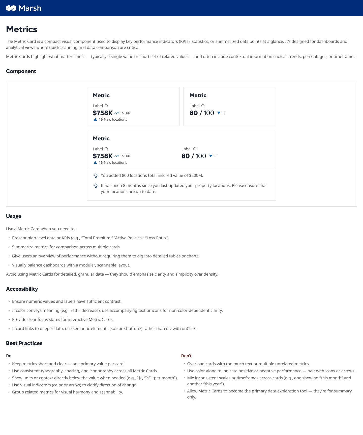
Numbers that read fast under pressure.
Adjusters and managers need KPI snapshots at a glance — claim volumes, SLAs, resolution rates. The Metrics component enforces visual hierarchy through type scale and color, not layout complexity. Trend indicators and delta labels follow a strict pattern so every dashboard reads the same way.
Metrics
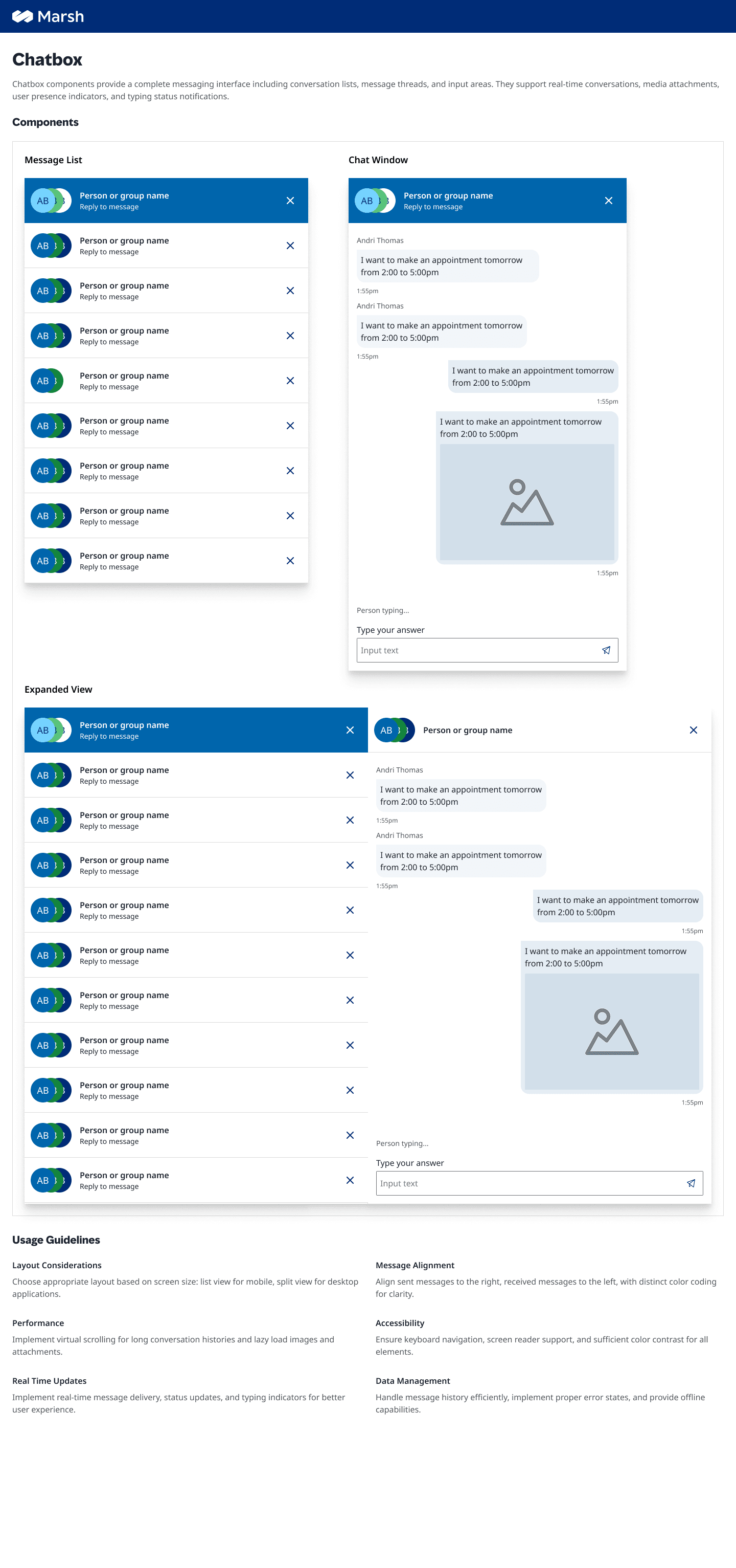
Built for an AI-first claims experience.
As Marsh's claims products began integrating AI assistance, the Chatbox became one of the most scrutinised components — both for usability and for brand trust. The component handles streaming responses, loading states, error recovery, and source attribution, designed to feel authoritative, not experimental.
Chatbox
07 · Design Decisions
The choices that
aren't obvious in the output.
Every system reflects its tradeoffs. These are the four decisions that shaped how this one works — and why those choices held up under delivery pressure.

Semantic tokens. Not raw values.
The temptation was to export a palette and call it a system. Instead, every color was assigned a semantic role — surface-primary, border-subtle, text-muted — and the hex value sits one layer below. When Marsh brand guidelines update, one token change propagates across all 34 components. No designer has to hunt down hardcoded values. No developer ships a one-off override.
“Tokens aren't just variables. They're a contract between design and code.”
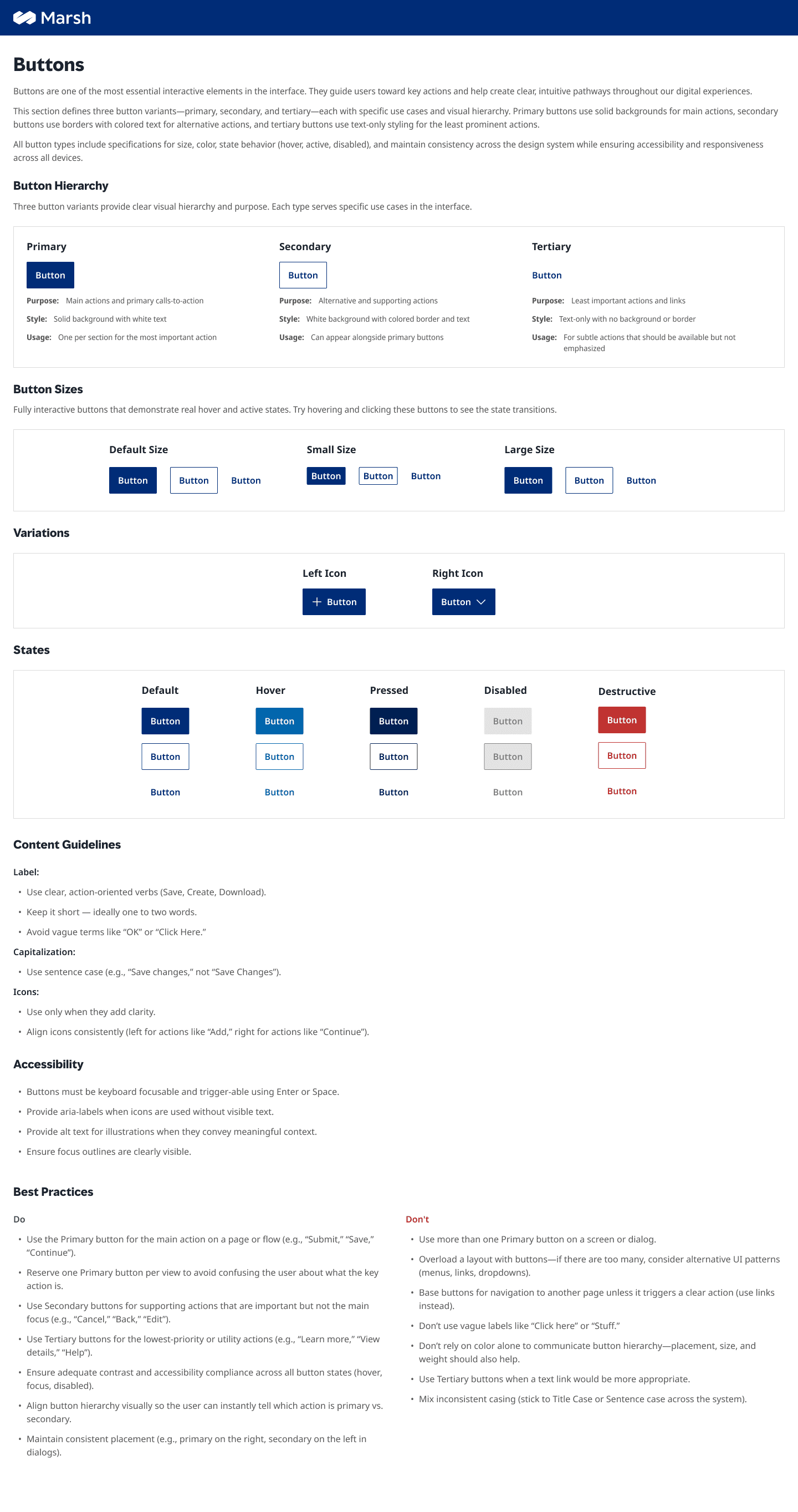
WCAG 2.1 AA built in. Not bolted on.
Accessibility was non-negotiable — Marsh McLennan operates in a regulated space where inconsistent compliance isn't a design critique, it's a legal exposure. Every component shipped with contrast ratios documented, focus states visible at 3:1 minimum, and keyboard navigation verified. The Do's and Don'ts in each spec sheet include accessibility cases explicitly, so teams couldn't unknowingly break compliance by assembling components differently.
“The spec sheet is a compliance artifact as much as a design guide.”
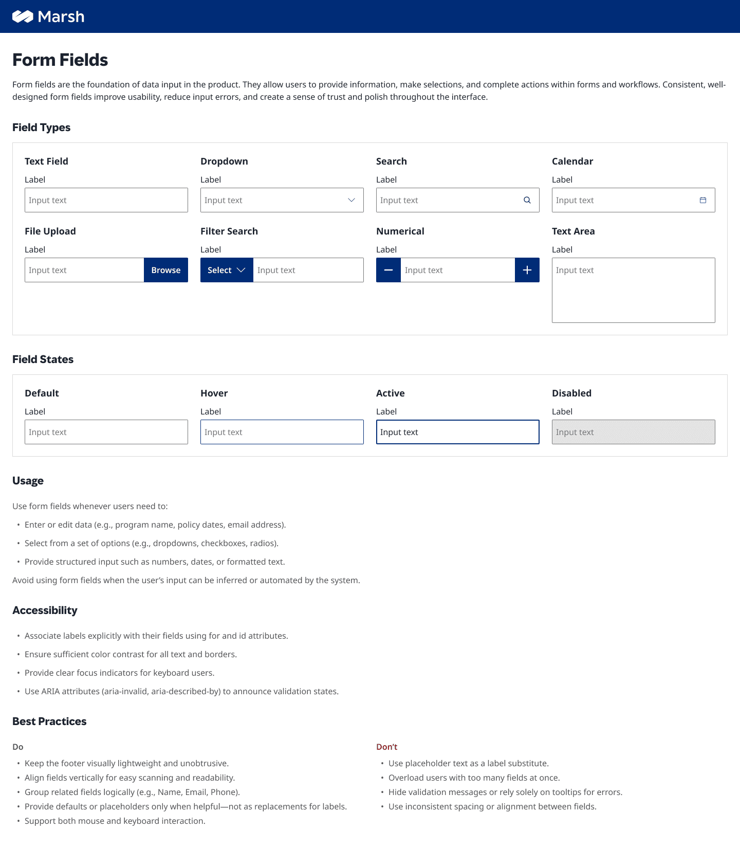
One component. Many variants.
An early audit found three different button implementations across two products. The fix wasn't to consolidate into one rigid component — it was to build one component with properties that cover every legitimate case. Size, hierarchy, state, icon placement: all toggled through Figma properties. The result was fewer components with wider coverage. Designers stopped requesting bespoke additions because the existing component already handled their edge case.
“Flexibility through properties beats proliferation through duplication.”
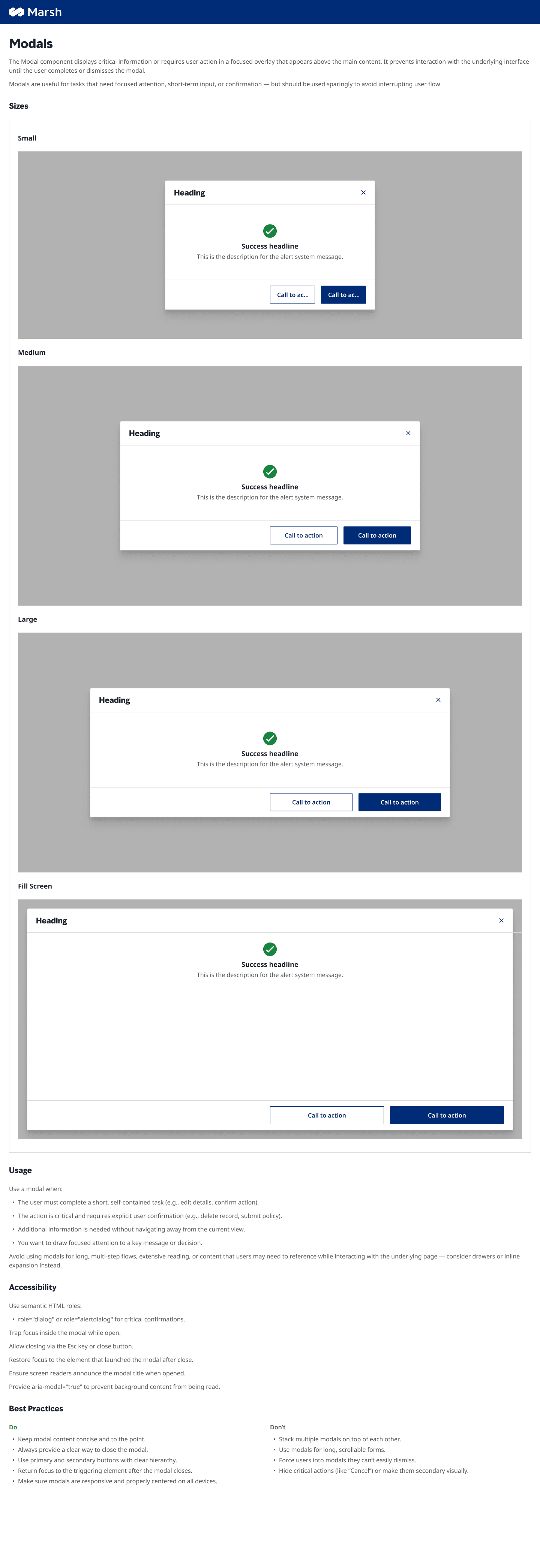
Usage docs shipped with the component.
Documentation written after the fact gets skipped. Every component in this system shipped with its usage guidance — Do's, Don'ts, interaction rules, and anti-patterns — written at the same time as the design. When a designer picks up Modals, the spec already tells them when not to use them, what to do instead, and how to handle edge cases. The system teaches itself.
“A component without context is just a screenshot. Documentation is the system.”
08 · Outcome
One source of truth.
Across five products.
The system launched alongside live product delivery — not after it. Here's what that produced.
34
Components shipped
Every one with variants, states, docs, and accessibility.
5+
Products aligned
One design language across Claims, Analytics, and beyond.
4
Designers. One source of truth.
No more forking. No more re-solving the same problem.
Before
Five products. Five interpretations of a button.
Designers rebuilding the same components every sprint.
No shared accessibility baseline.
New patterns invented when familiar ones weren't found.
After
34 components. One implementation across every product.
Designers spending time on product problems, not re-solving system problems.
WCAG 2.1 AA baked into every component by default.
New products onboard to the system — not to tribal knowledge.
The system isn't done — it's a living product. Every sprint, something new ships into it.
← Back to all workSome artifacts in this case study represent conceptual recreations of work completed during the engagement. Real customer data, personally identifiable information, and pre-release product details have been anonymized or replaced with representative placeholders to respect client confidentiality.